Fashion Brand ZAFUL Reveals New Logo Design
Fashion brand ZAFUL has revealed a refreshed logo design as part of a new advertising and marketing push that also sees the launch of the company’s first ever official TV commercial.
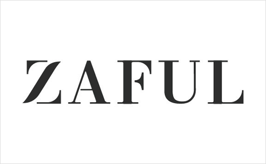
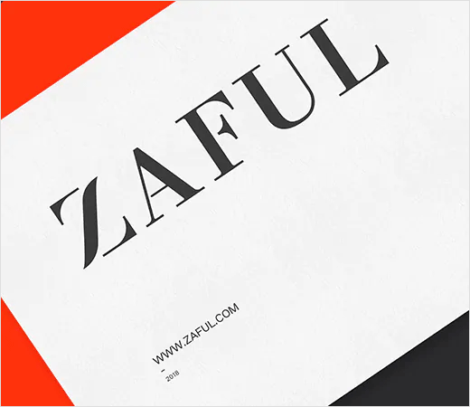
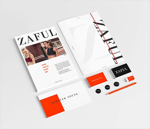
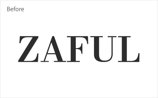
Designed in-house, the updated wordmark, which is set in an all-caps serif typeface, has a softer touch on the letter “Z” in an effort “to highlight the femininity and representation of all ZAFUL’s girls”, according to the Hong Kong-headquartered ‘fast fashion’ brand that makes clothes targeted at 18-25 year old girls.
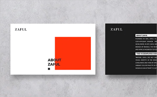
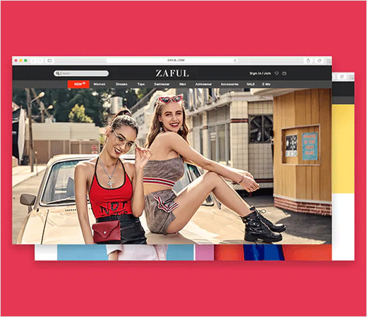
“Before, ZAFUL did not show much of its personality in the visual identity. In the design, we are trying to represent our consumers and fans by speaking directly to them,” explains graphic designer Tianyu Xia. “A much more vibrant colour palette in the product display and the website design is our attempt to get closer to the younger generation”.
The new look forms part of the Chinese-owned brand’s so-called “VI” design aesthetic.
“The VI exemplifies our ambitions, including what ZAFUL is trying to become and to achieve. Updating the logo and VI shows how ZAFUL is entering its new era and heading to a more personalised brand,” adds Tianyu.
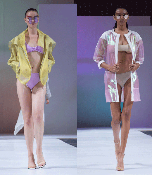
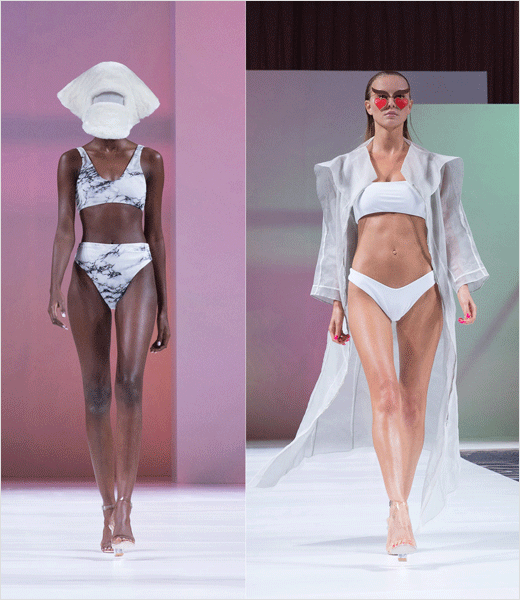
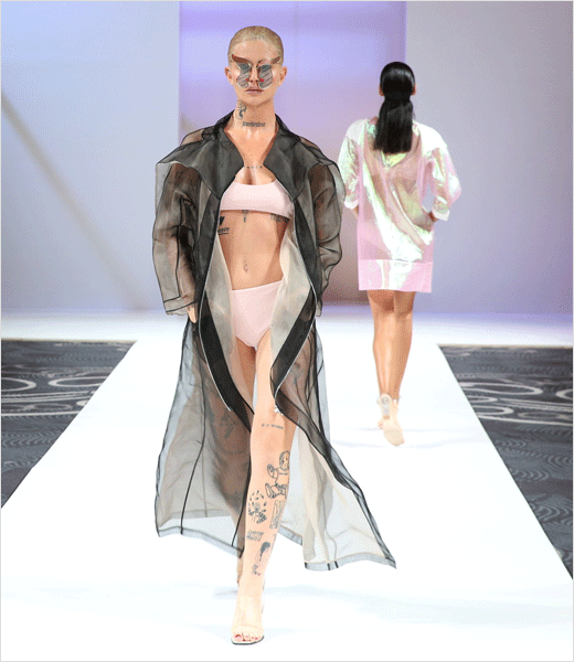
Founded in 2014, ZAFUL is currently trying to expand its commercial reach further westwards. For example, just this past week, it debuted its first ever London Fashion Week collection in a special collaboration with eyewear brand Victor Wong.
In 2018, the online womenswear retailer was ranked 34th in Top 50 China Export Brands by BrandZ, the world’s largest brand equity database.

Source: ZAFUL


