Chay Sells Rebrands London Sushi Restaurant, ‘Kulu Kulu’
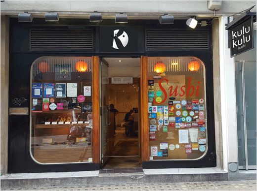
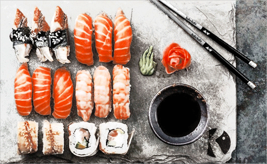
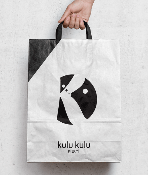
Graphic designer Chay Sells has created a new look for London-based sushi restaurant, Kulu Kulu.
The business name, which means “round and round” in Japanese, reflects the seating inside the restaurant that is organised around a conveyor belt which distributes freshly made sushi by a chef in the centre.
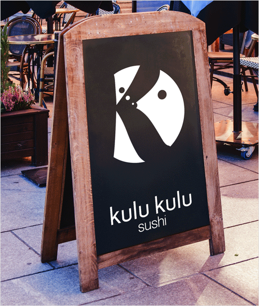
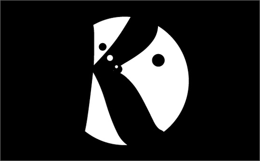
“The logo design is very simple but I think it works perfectly for the cause, it is built around circles to help demonstrate going around, as the name ‘kulu kulu’ suggests, with circles in the negative space helping create an image of a fish blowing bubbles in the letter ‘K’, the fish helps clarify that it is a sushi restaurant,” explains Sells.
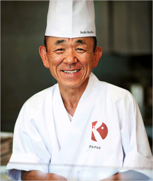
While the new branding adopts a predominantly black and white colour scheme, a red-coloured version of the new logo also features on the chef’s uniform as a visual reference to the red circle in the Japanese flag.
The identity further includes a text logo made from a simple, san-serif typeface, complete with a sliced letter “i” at the end of the word “sushi”, which Sells claims illustrates the “precision and accuracy” associated with the food preparation.
Chay Sells
www.chaysells.co.uk


