Carter Wong Rebrands Protean Electric
Electric automotive technology company Protean Electric has unveiled a new logo and identity designed by London-based studio Carter Wong.
The agency was first approached by Protean back in 2017, as the business sought to overhaul its identity that was deemed to be lacking “structure and clarity”.
“The previous visual identity was a little tired and had struggled to differentiate between company and product branding both internally and externally,” explain the designers.
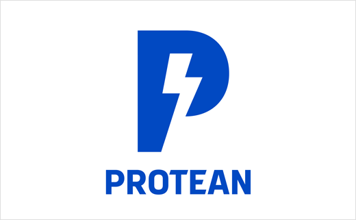
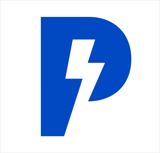
As a result, the overarching identity for Protean has been refreshed with a more distinct and recognisable brand mark showing the letter ‘P’ incorporating a lightning bolt in negative space.
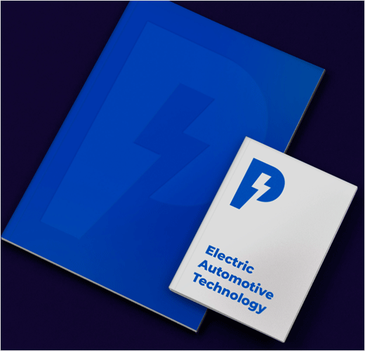
Designed to be flexible across multiple touchpoints, the logo can also be used on its own or supported by the brand name Protean and strapline “Electric Automotive Technology” as and when needed.
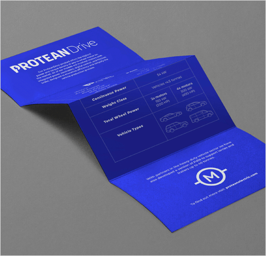
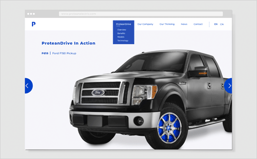
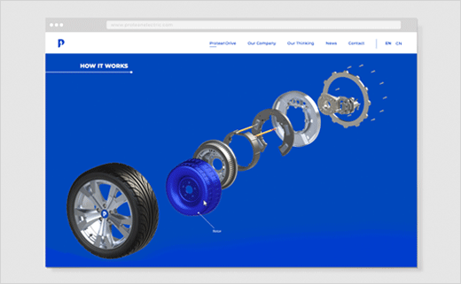
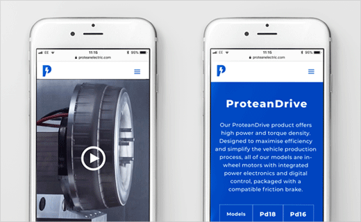
The company’s first product – an in-wheel electric motor with integrated digital drive – will operate under a separate brand identity, named “ProteanDrive”, with the core brand logo incorporated into the wordmark. Individual models within ProteanDrive also adopt the ‘P’ logo as part of their identity.
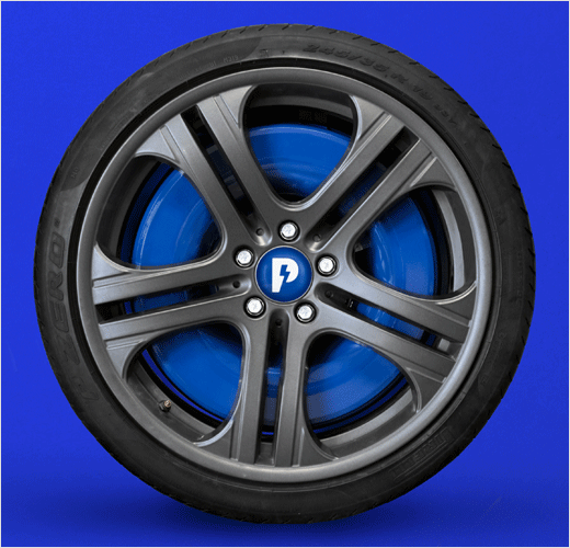
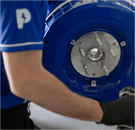
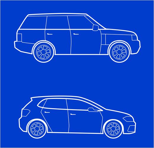
“The single ‘P’ is strong enough to stand alone and as such, has now been incorporated into the centre of every vehicle which carries Protean technology,” says Sarah Turner, managing director at Carter Wong.
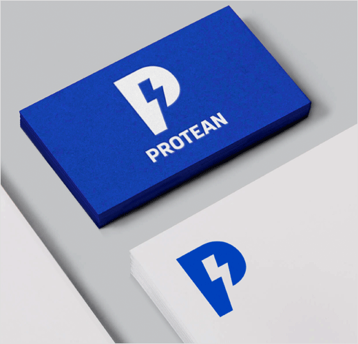
In terms of colour, the designers stepped away from the previously-adopted green tones that were utilised to demonstrate the company’s ‘eco-credentials’, and have instead opted for a blue hue to “reflect the electricity at the heart of the brand offer”. The tone is the primary colour used across all Protean touchpoints, from the website to social media.
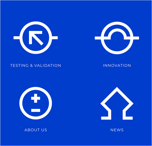
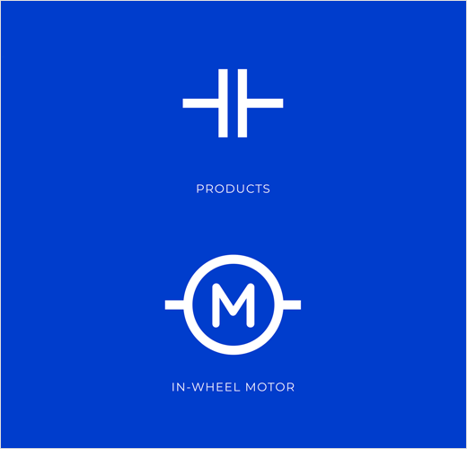
In addition, iconography taken from a circuit board has been introduced across the brand identity, with secondary meanings behind each visual. For example, a battery symbol shown on the ‘About Us’ page represents the people who power the brand.
The designers have also gone for Google font Montserrat as the brand’s main typeface, claiming that is often used across both the tech and auto industries, and so it will therefore feel familiar to consumers in both markets.

Carter Wong
www.carterwongdesign.com


