Camden Market Gets New Identity Design by Ragged Edge
Camden Market’s new brand and visual identity were revealed this week by integrated branding agency Ragged Edge.
Parent company Market Tech approached Ragged Edge to define and create a brand that would appeal to a broad millennial audience and work both on and offline.
Originally opened in 1974, Camden Market is often identified with alternative culture and remains London’s fourth most-visited tourist attraction.
As part of the design process, Ragged Edge says it spoke to more than 100 stakeholders including stallholders, residents, workers and tourists.
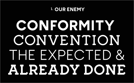
“The market’s commitment to originality shone through and this led to a powerful brand idea – Unfollow Convention – as relevant to the Snapchat generation as it was to the market’s entrepreneurial heritage,” explain the designers.
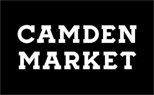
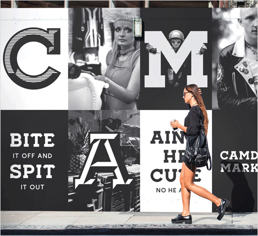
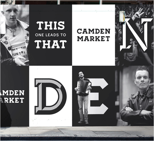
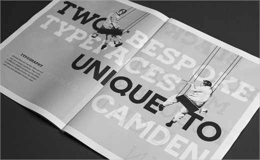
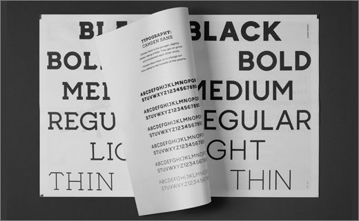
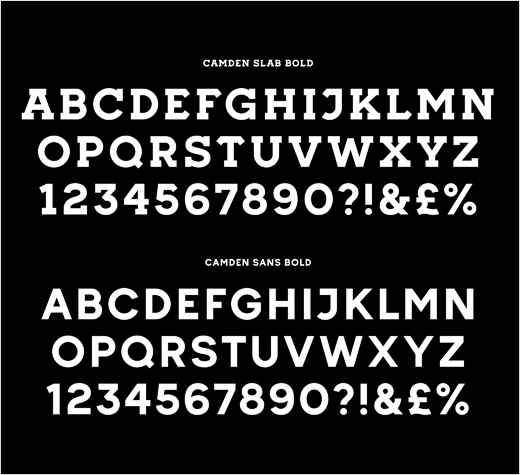
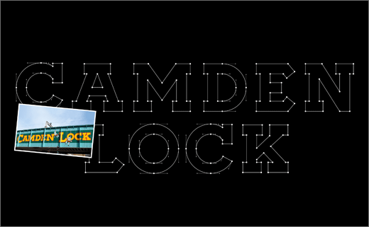
For the visual identity, the agency says it took inspiration from the hand-painted Camden Lock sign on the bridge, using the letterforms as a template to create two bespoke typefaces for the brand: Camden Slab and Camden Sans.
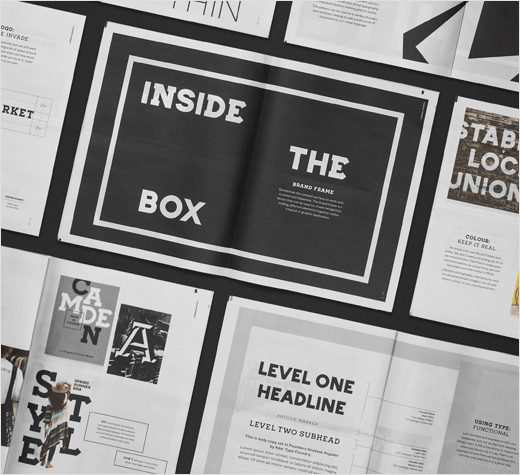
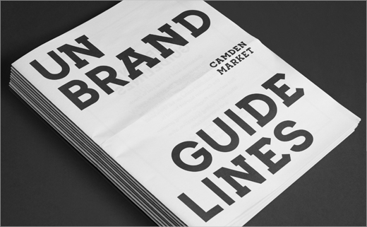
“Camden Market has a rich history of breaking the rules. It’s always been a place where people are free to express themselves and their ideas. We didn’t want to impose a corporate brand system because that wouldn’t have been true to the market’s spirit. Instead, we set out to create a kind of ‘unbrand’ – a toolkit for self-expression,” says co-founder of Ragged Edge, Max Ottignon.
“Just as important was the simple black and white palette, chosen to cut through the noise of the market. Colour comes from the rich and varied content, with the brand playing the role of the curator.”
Ragged Edge
www.raggededge.com


