Buffalo Sabres Reveal New Logo and Uniform Designs
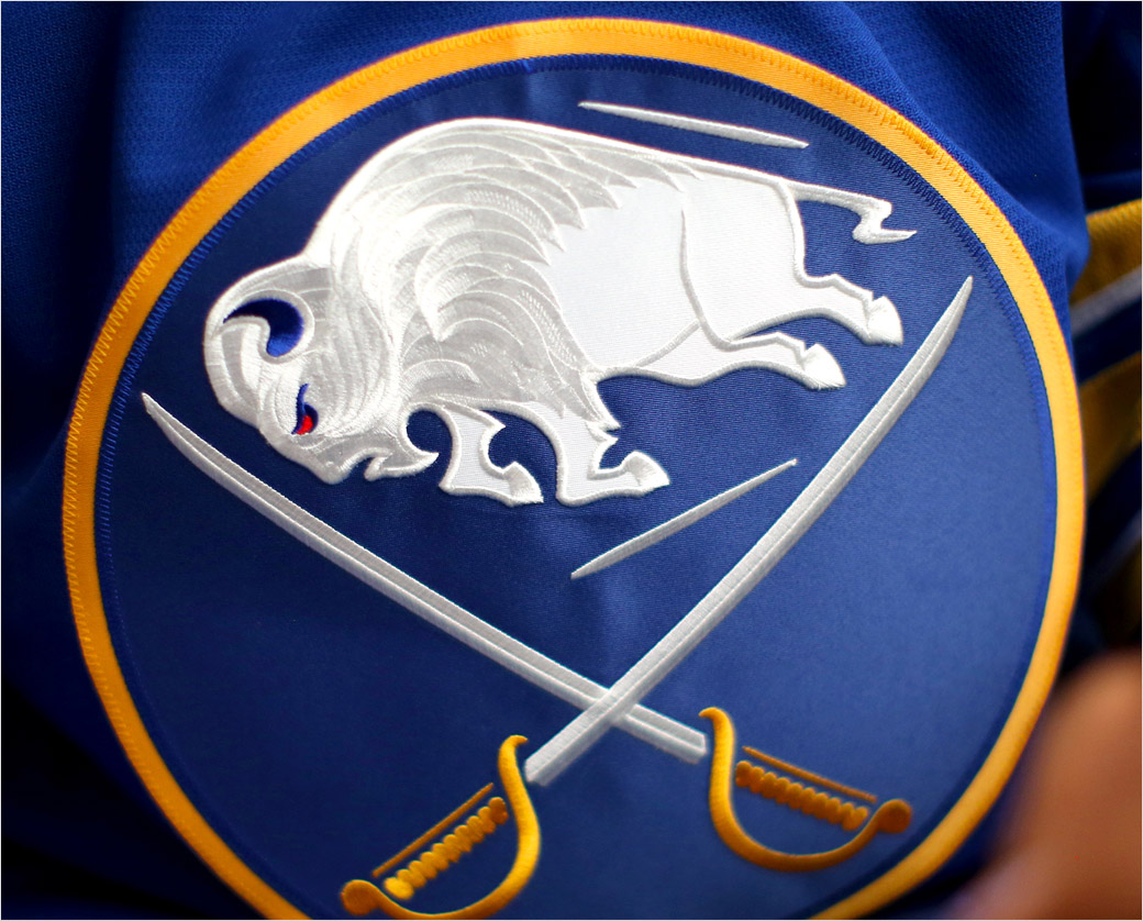
NHL ice hockey team the Buffalo Sabres have revealed new retro-inspired home and away uniforms featuring a refreshed logo design.
The redesigned jerseys mark a return to the original royal blue, gold, and white colour scheme worn by the team for 26 years starting in 1970, which was the Buffalo, New York-based club’s inaugural year.
“Our goal throughout this process has been to create a timeless uniform system that respects team heritage and looks boldly towards the future as well. Returning to our beloved royal blue was just the start – we wanted to create something truly unique. To do that, we needed to identify key elements that harken back to what’s made this franchise so special through the years,” said the club on its official website.
Adding: “The inner neck collar is our way of paying homage to our hometown, touching upon the City of Buffalo’s official crest. This team enjoys an unparalleled bond with the community at large, so it felt appropriate to honour that within the jersey itself.”
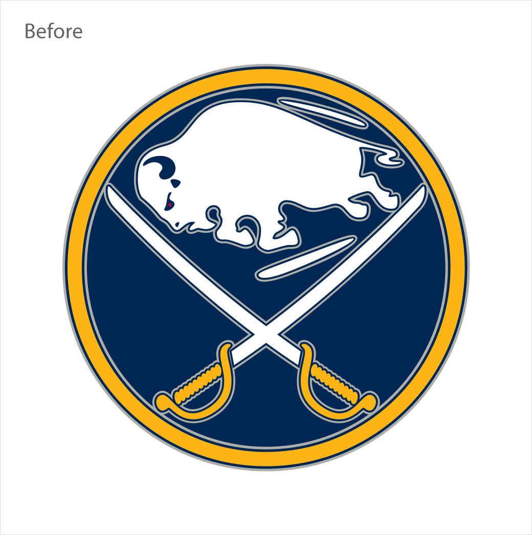
With regards to the crest and main logo, it is claimed to have been simplified from the original, with silver outlines removed in order to create a “sleek modern” look; the buffalo’s legs and hooves now also have sharper edges, while the head area says goodbye to a ear-hole that previously sat between the eye and horn.
Additionally, details that were first seen on the team’s 50th season jersey crest have been carried over to the uniform system, most notably the stitching pattern in the buffalo.


Source: Buffalo Sabres


