Bruce Mau Design Creates New Look for The National Ballet of Canada
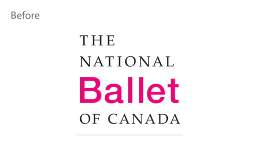
The National Ballet of Canada (NBOC) has rebranded for the first time in nearly 20 years with design by Toronto-based studio, Bruce Mau Design (BMD).
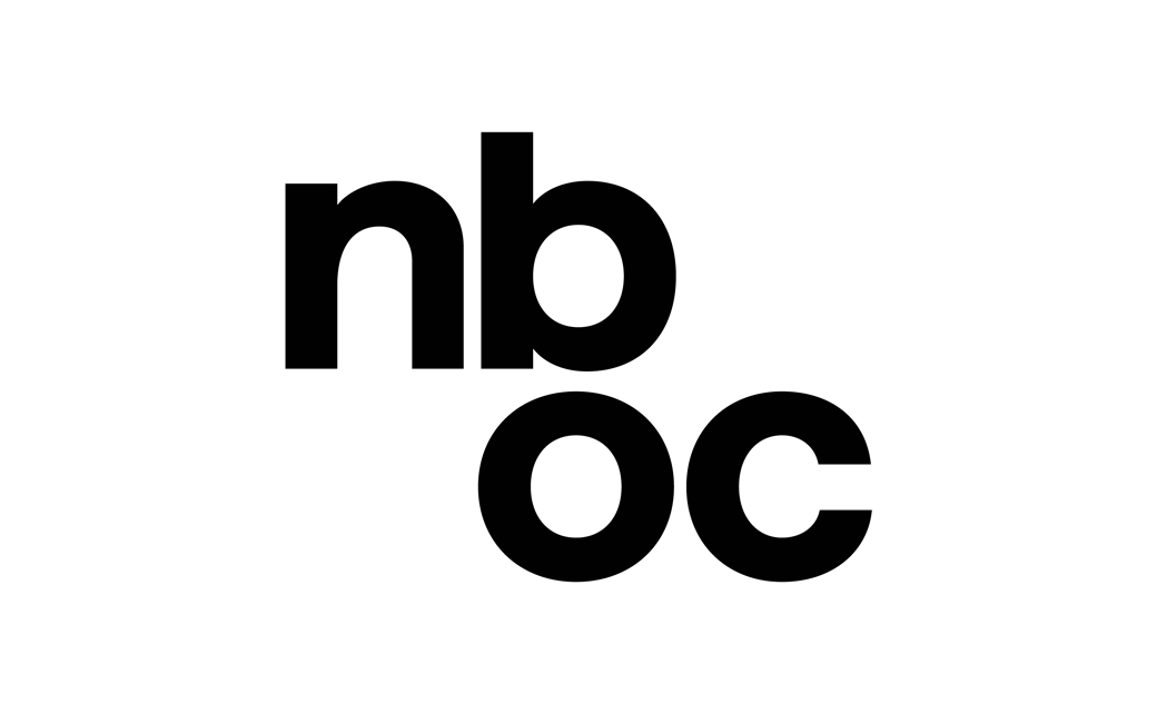
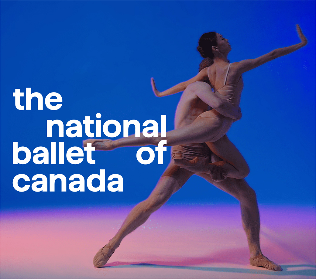
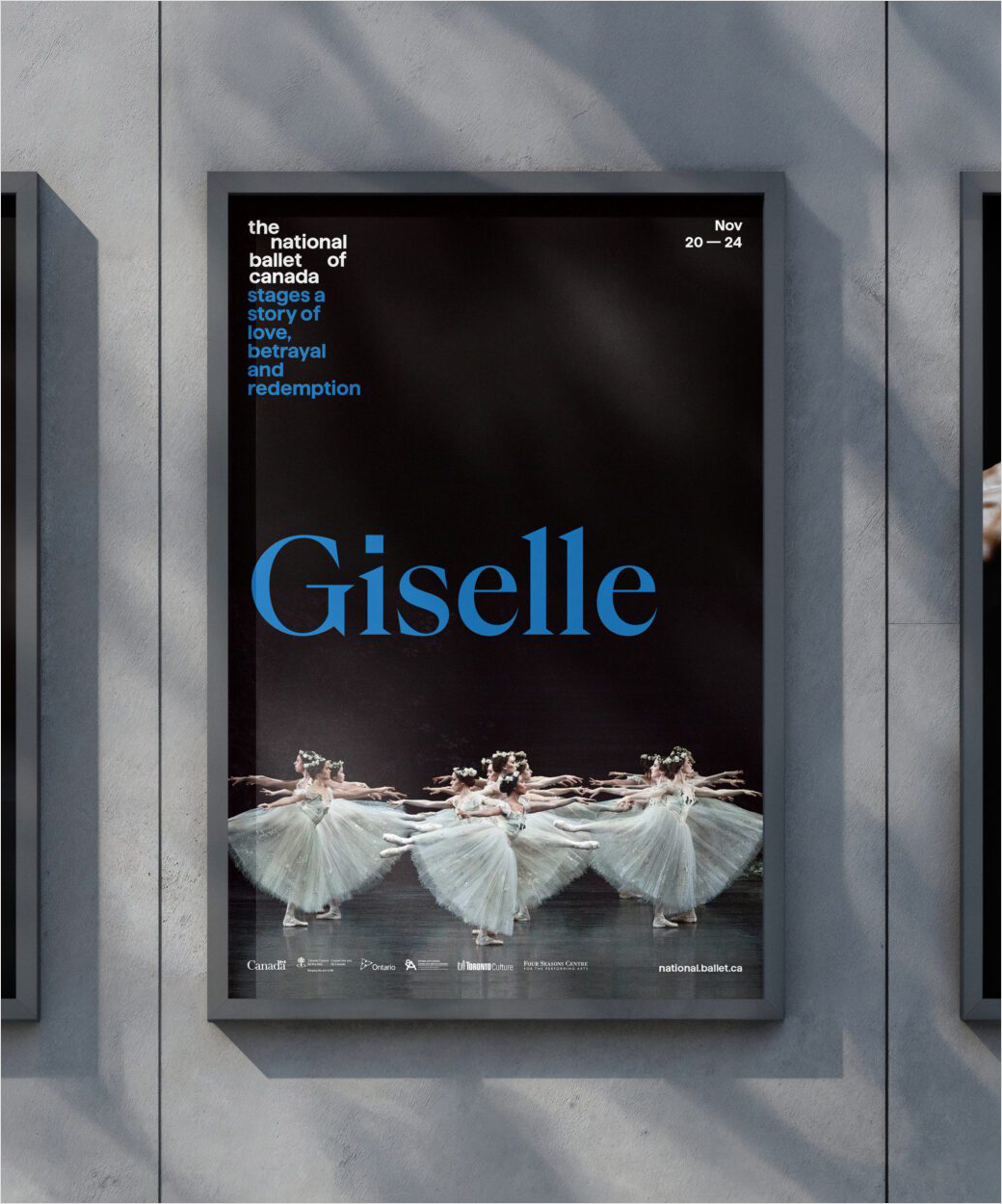
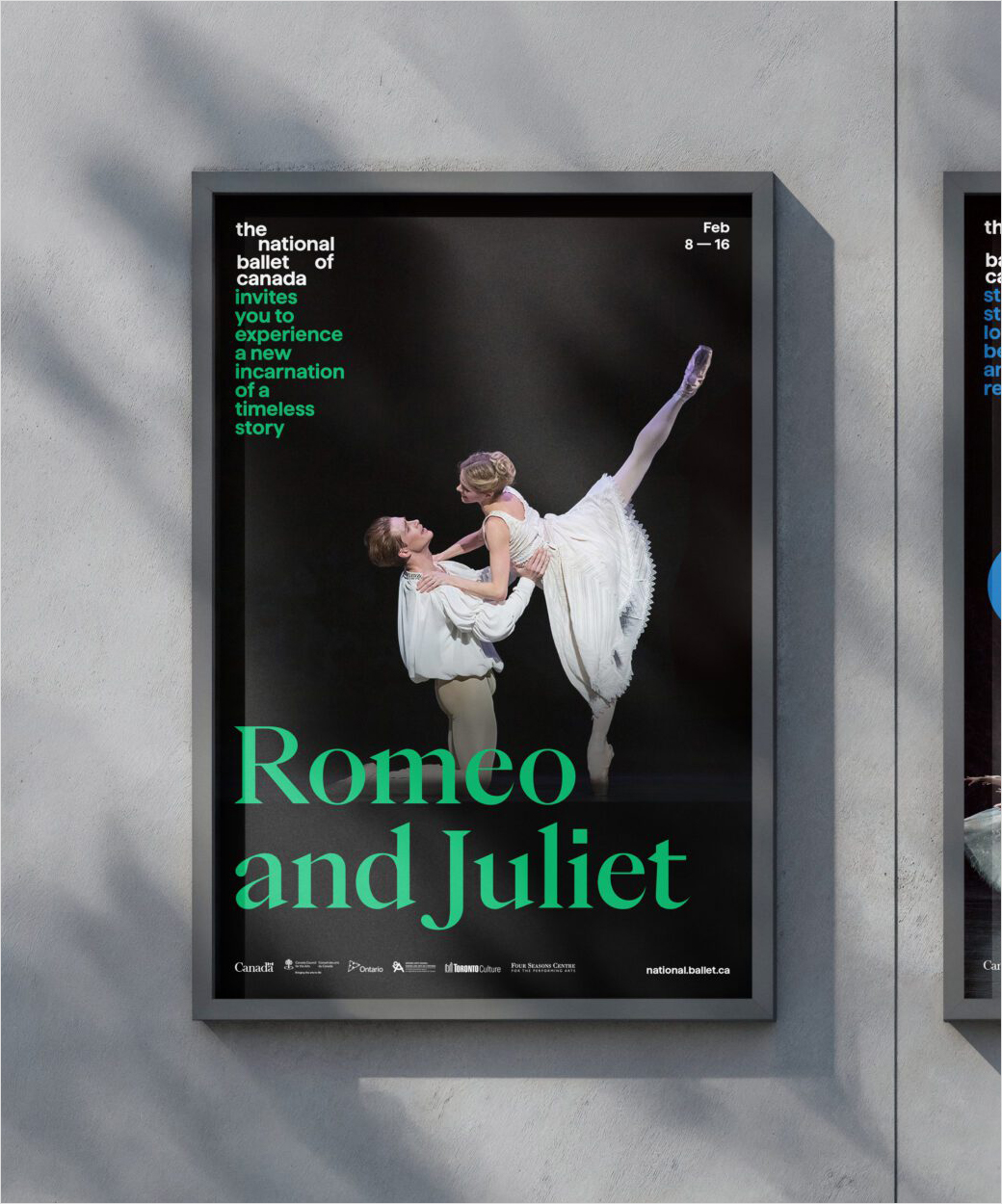
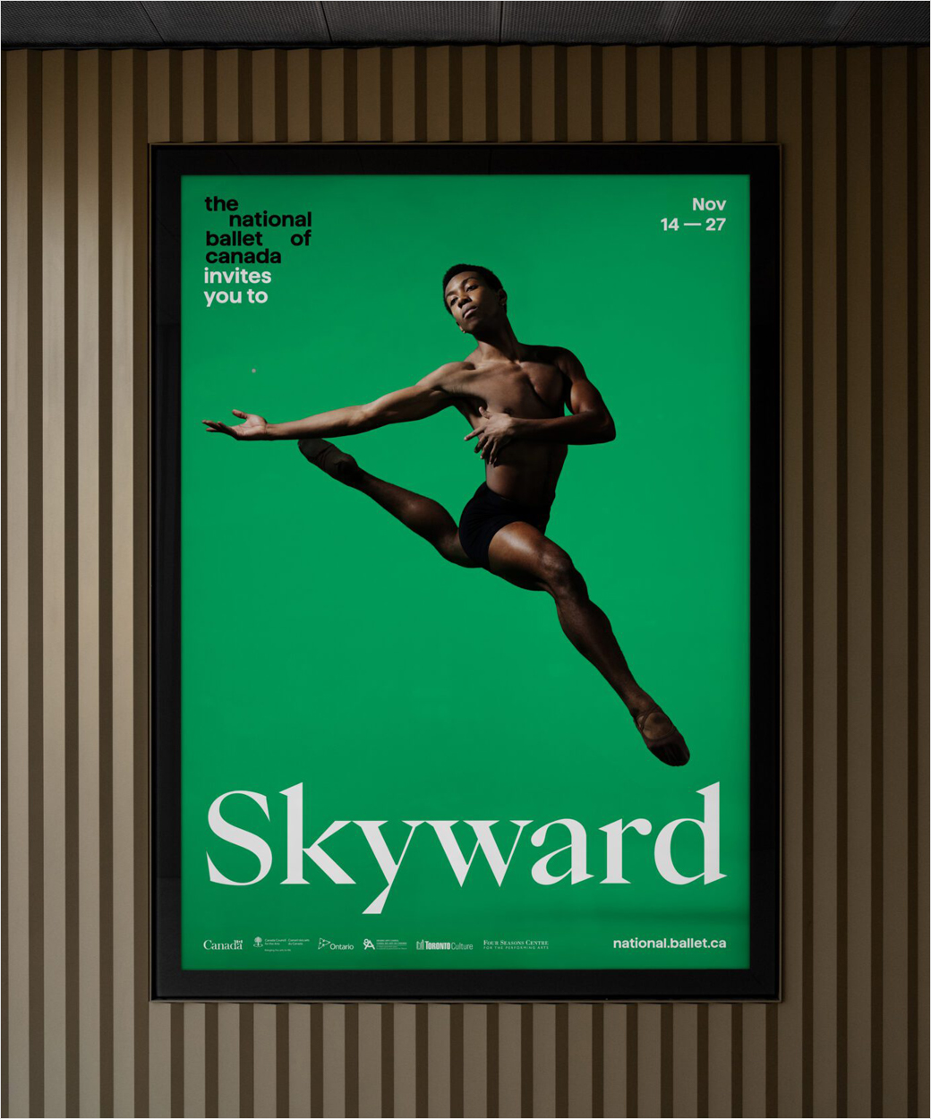
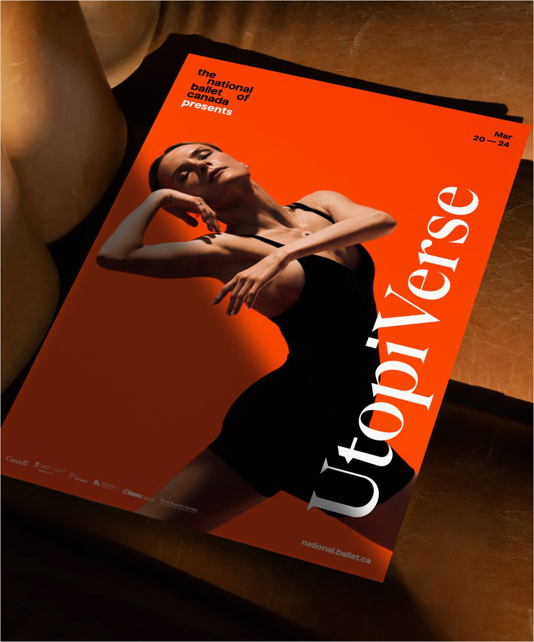
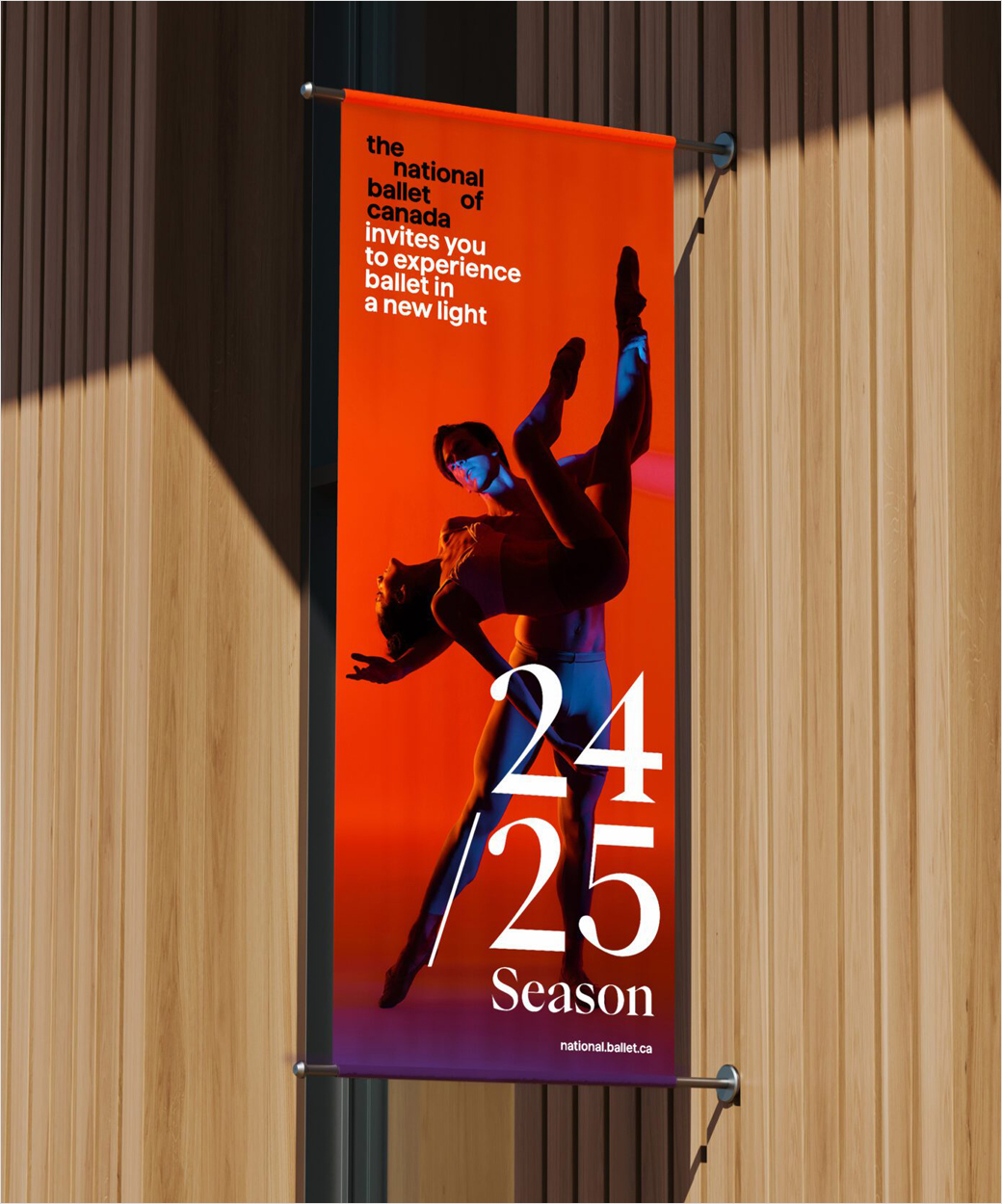
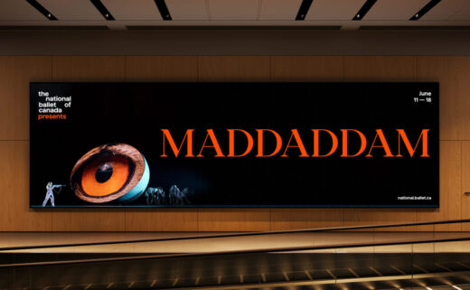
The refreshed visual identity includes a new wordmark, icon, typeface, and colour palette.
The new logo is specifically claimed to function as a foundational piece of the NBOC’s modernised look.
“The logo is a wordmark that is also the beginning of a narrative,” explains Laura Stein, BMD’s chief creative officer.
Adding: “So type needs to flow seamlessly from the logo. We worked with Displaay Type Foundry to develop a glyph that would allow designers to type in the logo with a keystroke and simply continue typing to write the narratives. The tool allows anyone to easily use the logo and write a narrative without fussing with alignment, scale, leading, ensuring that it looks good every time.”
“Since the National Ballet is a dance company, it was imperative that the new identity should move. Motion and video elements figure prominently in this new brand and even the spacing within the wordmark conveys a sense openness and movement,” further comments the NBOC.
BMD also decided to move away from the brand’s older, dark pink to a set of “jewel tones”, as the designers were concerned the former may be construed as being “a gendered palette”.
The studio was additionally responsible for the art direction for photography, layout principles, motion behaviours, identity and motion assets and guidelines for how to use them.

Bruce Mau Design (BMD)
www.brucemaudesign.com


