Brandon Refreshes Logo and Packaging for Bridgedale Socks
Technical sock manufacturer Bridgedale has unveiled an updated logo and packaging design system.
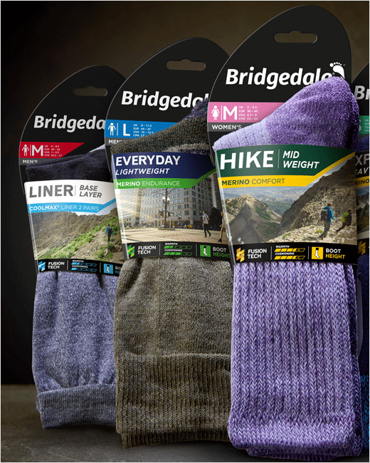
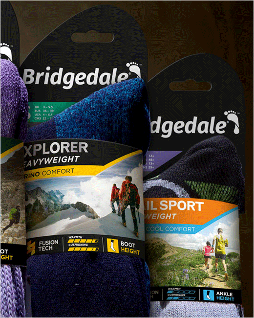
Created by Manchester-based agency Brandon, the new look aims to make it easier for shoppers to both find and choose the right product, as well as to better communicate the benefits of “Fusion Tech” – Bridgedale’s proprietary yarn and knitting technology that is claimed to set the brand’s products apart from those made by any of its competitors.
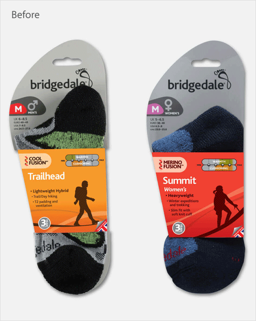
“Bridgedale’s packaging needed refreshing to better reflect Fusion Tech and to make it easier for shoppers to navigate the range,” explains Richard Taylor, managing partner at Brandon. “The identity and brand needed to be modernised to make it relevant to today’s audience, enable shoppers to easily pick the best socks for their needs and highlight the use of Fusion Tech to provide standout.”
As a result, the new packaging mixes photography with a series of visual cues designed to help shoppers choose between the different types of sock in the Bridgedale range. The revised graphic elements are claimed to make it easier than before to tell apart socks of different weight, purpose – such as comfort or endurance, warmth, cushioning, sizing – and whether they’re for men or women.
“Communicating everything in a way that shoppers can decode quickly is hard without making the packaging look too busy. Agreeing on a hierarchy of information with Bridgedale was key to helping us decide what to include. The result is a brand that shoppers will be much more likely to pick up and which has been brought bang up to date,” adds Taylor.
Brandon
www.brandon-consultants.com


