Brand Union Creates New Look for Charity, ‘The Parent House’
London-based agency Brand Union has rebranded The Parent House, a small charity headquartered in Islington that aims to reduce child poverty in the borough by empowering parents through education.
The charity hopes the new visual identity and positioning will help increase its visibility and appeal to new funders.
“The inspiration was to remedy a cluttered, disparate and confusing brand identity through introducing a sense of space and stillness,” explain the designers. “We simplified and opened up the logo in line with the charity’s pledge to provide open-door support for its parents. Our key element is the frame. Flexible and multiform, it acts like a photo frame to hold treasured memories, whether image or text.”
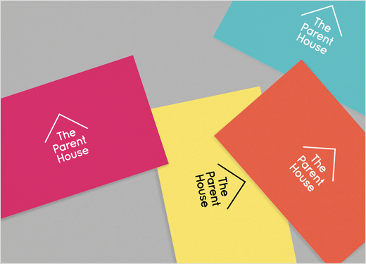
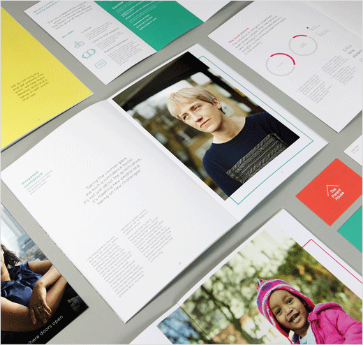
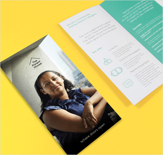
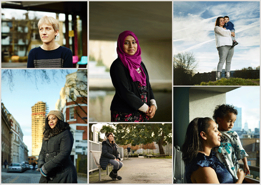
The logo, which also has an animated element, is accompanied by a bright and warm colour palette, whilst the new font is described as being “friendly, free and direct”. The new photography, meanwhile, uses real parents and locations.
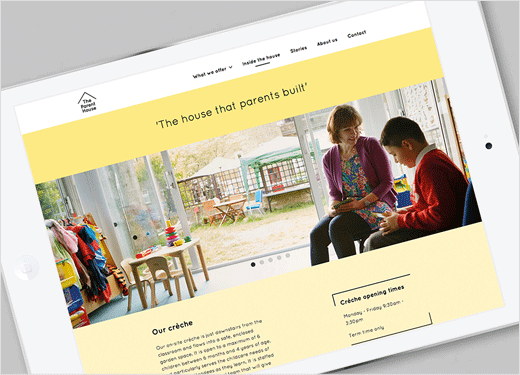
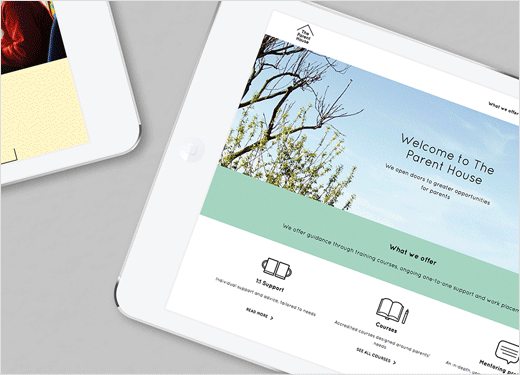
The Parent House’s new identity was rolled out in March of this year and included a new adaptive website as well as information booklets and leaflets, templates and office stationery.
Brand Union
www.brandunion.com


