Brand Union Creates New Identity for Scania
Global branding consultancy Brand Union has revealed a new identity for Swedish truck and bus manufacturer, Scania.
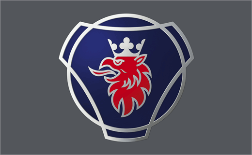
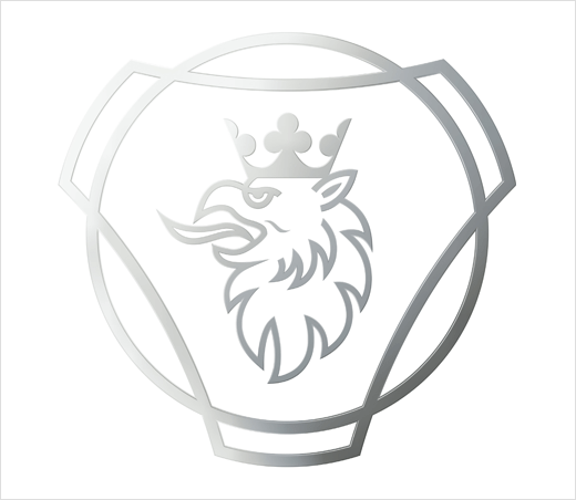
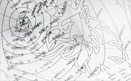
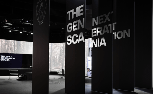
Created by the agency’s Stockholm office, the refreshed look features a modified griffin symbol as well as a custom typeface.
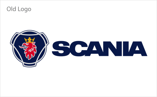
Introduced in 1984, the outgoing griffin mark was created by Swedish artist Carl Fredrik Reuterswärd, best known for his sculpture of a gun with a knotted barrel outside the United Nations buildings in New York.
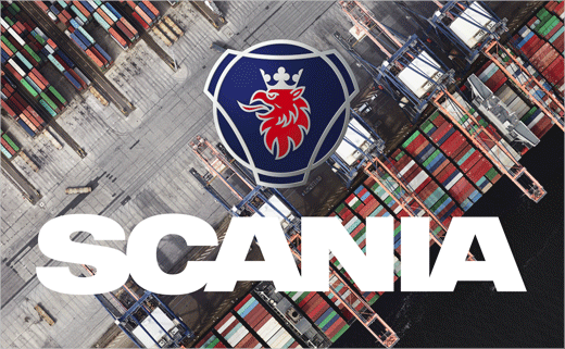
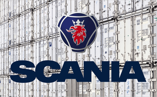
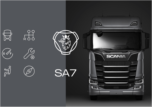
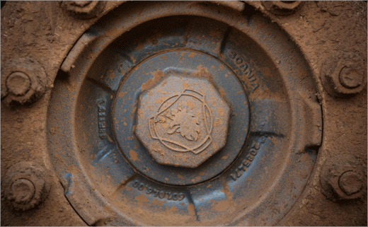
The new griffin emblem now takes on a more three-dimensional appearance, while its gold crown gives way to a silver-coloured one.
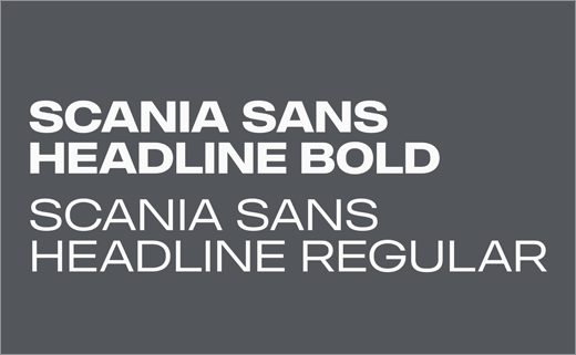
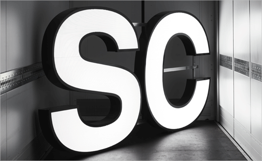
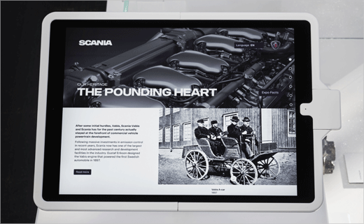
The designers have also replaced all of Scania’s existing typefaces with a new font family called Scania Sans that they say helps give the brand a more “unique voice”, and which has been inspired by the automotive company’s all-new brand strategy dubbed “One Scania”.
“Our initial brand audit showed the use of a variety of generic typefaces, a broad set of logos and an aged image style,” says Björn Studt, design director at Brand Union.
“The new identity is created with very few and powerful assets that are easy to use and implement, thereby unifying the brand experience,” adds Dan Herlin, Brand Union’s client director.
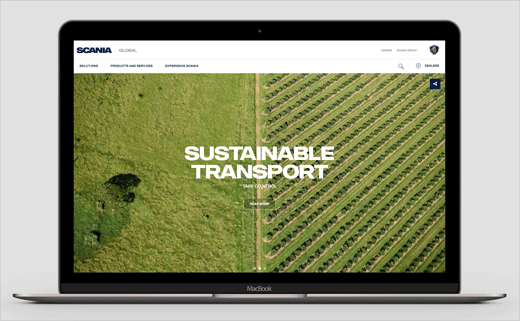
Additional elements of the updated visual identity include new, predominantly aerial-based landscape photography.
The new branding is currently being rolled out across 180 countries.

Brand Union Stockholm
www.brandunion.com


