Bluegg Helps MasterChef Finalists Create ‘Hokkei’ Brand
Digital design company Bluegg has revealed how it’s helping a pair of MasterChef finalists ‘revolutionise’ the Chinese takeaway.
The Cardiff-based consultancy created a complete brand strategy for Hokkei, the new Asian-inspired takeaway business by chefs and entrepreneurs Larkin Cen and Dale Williams.
Hokkei is the result of a partnership between former lawyer Larkin and recruitment boss Dale, who met on MasterChef and had the dream of opening an Asian takeaway in the Welsh capital based around fresh ingredients and no MSG.
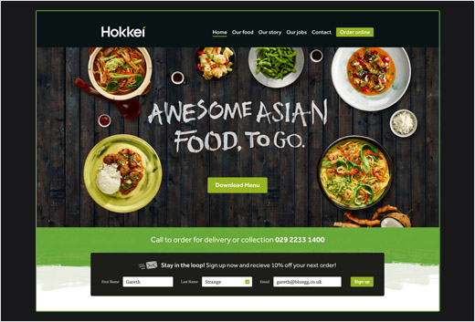
“Dale and Larkin came to us to help them translate into a business something they’d been planning since they met,” said Bluegg’s creative director, Tom Lloyd. “From brand strategy and tone of voice to illustration and web design, we’ve been involved throughout.”
Bluegg, who has worked with brands like Subzero ice cream and Barclaycard, spent six months developing the brand identity for the ‘game changing’ takeaway, based on the company’s experiences in design and marketing as well as on the team being consumers of the traditional takeaway.
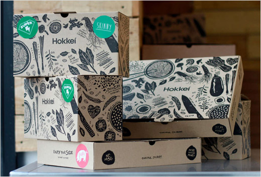
Bluegg helped the team, whose journey is being covered by new BBC programme Larkin and Dale’s Takeaway Revolution, run a taster pop-up at the Celtic Manor Resort in Newport, before developing an identity, packaging and brand application ahead of the opening of their stand-alone takeaway in Cardiff.
“We started by really getting to know the market,” said Tom. “We researched Asian food, culture and traditions, and looked in-depth at disruptive brands shaking things up in the food industry.”
Bluegg ran interactive workshops that fed into Hokkei’s menu and reviewed the way it took orders and priced dishes. Each meal was named and given its own brand, with signs in the shop asking “Which Hokkei box are you?”, and phrases like “I hope you’ve finished, because you’re holding me upside down” on the packaging.
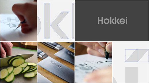
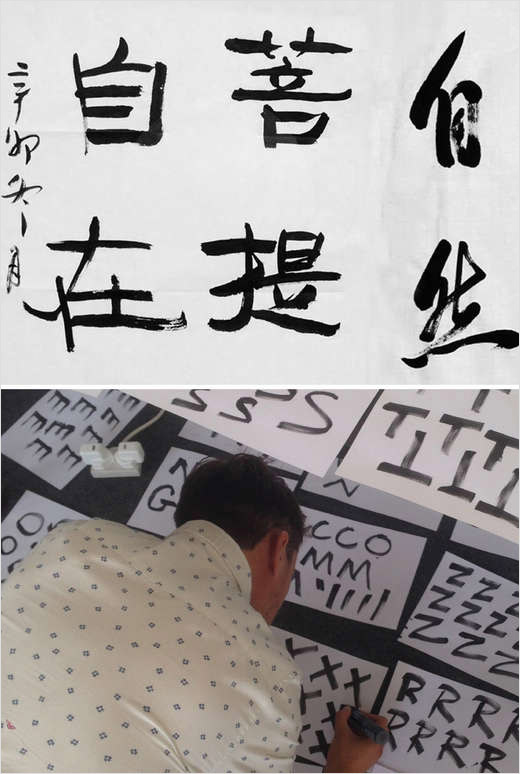
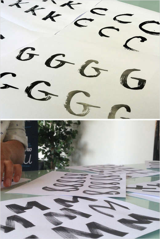
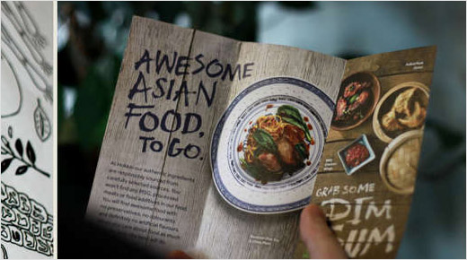
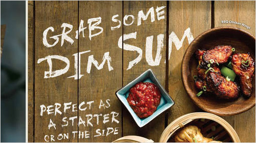
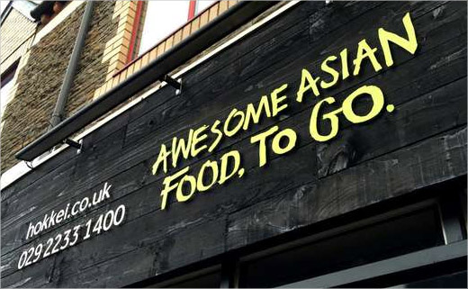
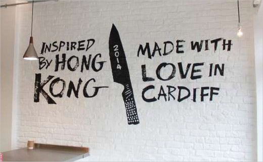
To link the Hokkei brand to its Asian roots, Bluegg researched traditional Chinese calligraphy as a basis for a bespoke typeface. “Our illustrator Gareth used a slanted ‘tittle’ on the letter ‘i’ as a nod to the traditional Asian chef’s knife and the method of ‘bias slicing’ ingredients on a 45° angle, often used in oriental cooking,” said Tom.
Bluegg
www.bluegg.co.uk


