Birch Benders Unveils New Logo and Packaging Design
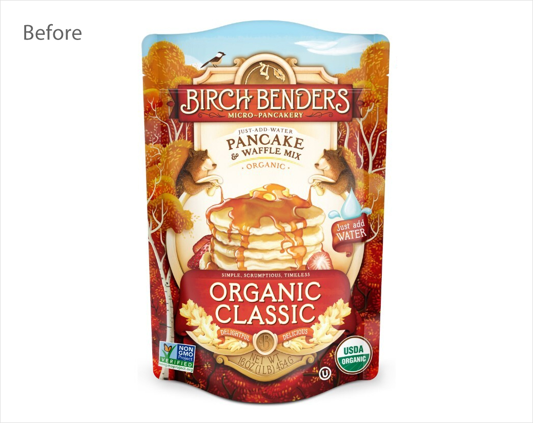
Pancake and waffle mixes brand, Birch Benders, has announced an identity refresh.
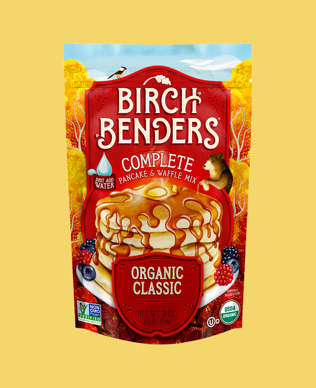
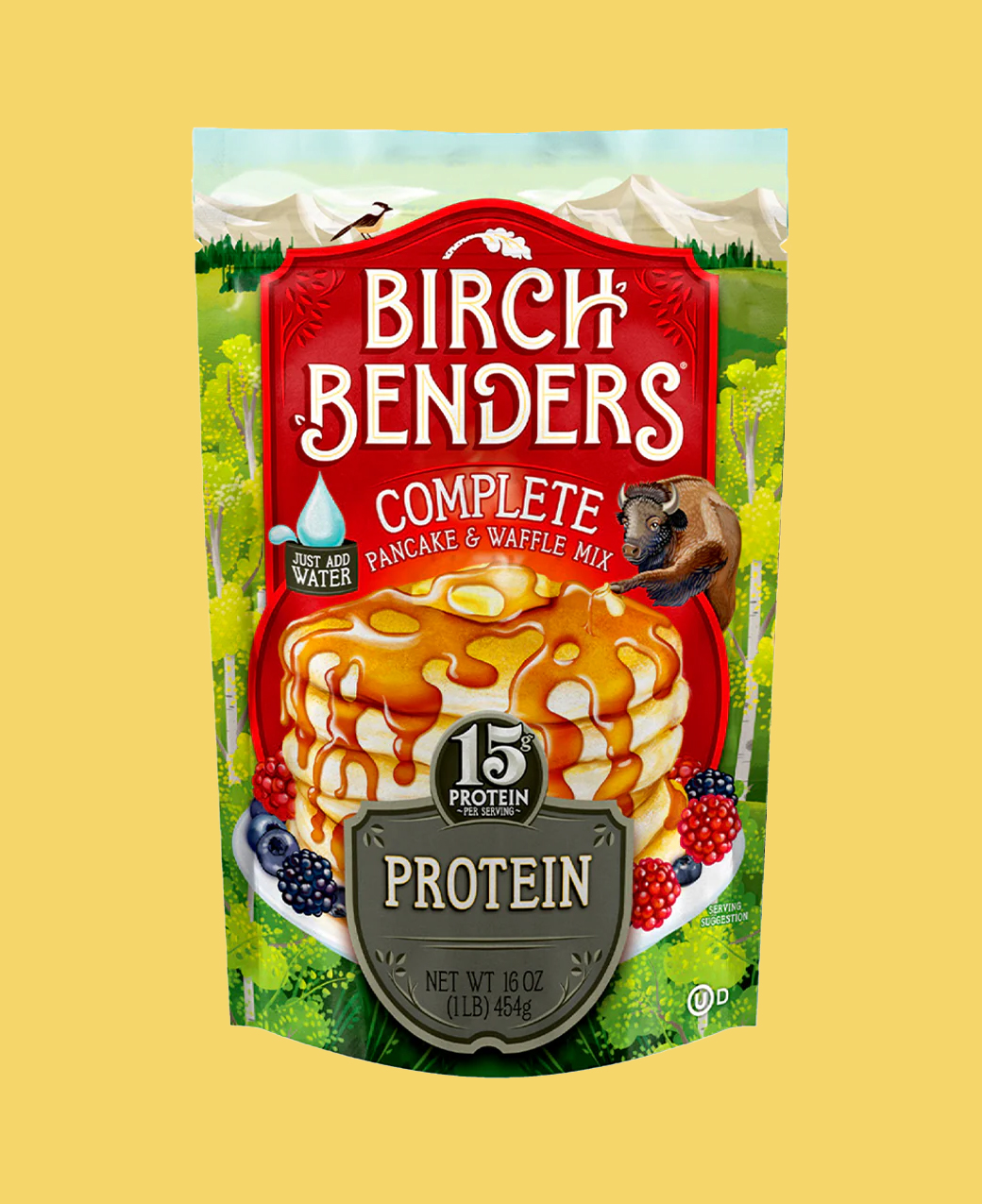
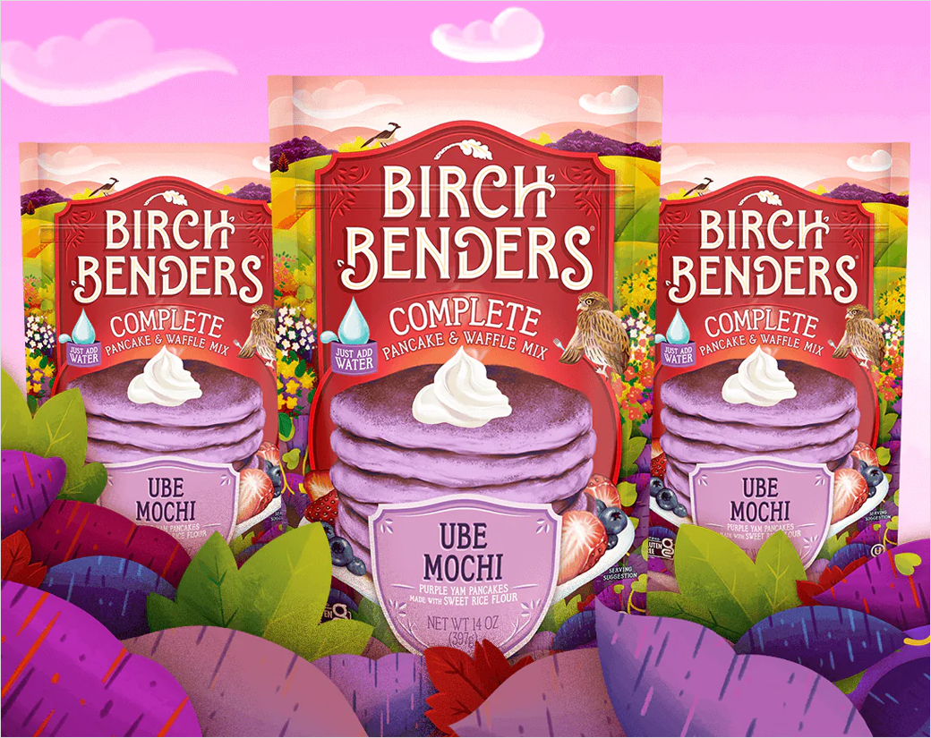
The new look – which is described as mixing “a new modern aesthetic” with “nature-themed scenery and fun-loving animal mascots that consumers cherish” – includes a revamped logo and new packaging.
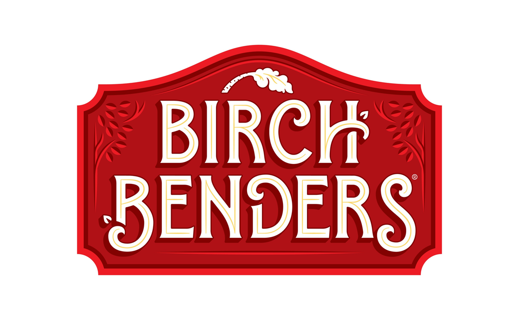
Set within a plaque, the letterforms of the redesigned logo are claimed to highlight the brand’s “natural whimsy”, while the small birch tree arching over the top is said to pay homage to founders Matt and Lizzy.
As for the packaging, each pack has been designed to tells its own story through the use of imagery.
“From the fiery orange leaves of an autumn birch to the periwinkle sky over the mountains, each of our illustrative product settings is a colourful gateway to a great big world,” says the American firm.
“We wanted this exciting rebrand to resonate with the core of what Birch Benders stands for – delicious, simple, and fun,” further comments the company’s chief operating officer, Dan Anglemyer.
Adding: “Our updated logo and packaging are designed to bring a fresh, vibrant energy to our products while honouring the whimsical elements that have been a hallmark of our brand.
The visual refresh is also been accompanied by updated recipes.
Source: Birch Benders


