Biles Hendry Designs Logo and Packaging for ‘OddPops’
Biles Hendry has created the identity and packaging for “OddPops” – a new savoury snack brand from UK baby-food company Ella’s Kitchen.
Aimed at 4-7 year olds, and pitched as a “healthier, tastier and better snack”, the triangular wheat and potato pieces are popped not fried and contain only natural flavours, with no artificial colours.
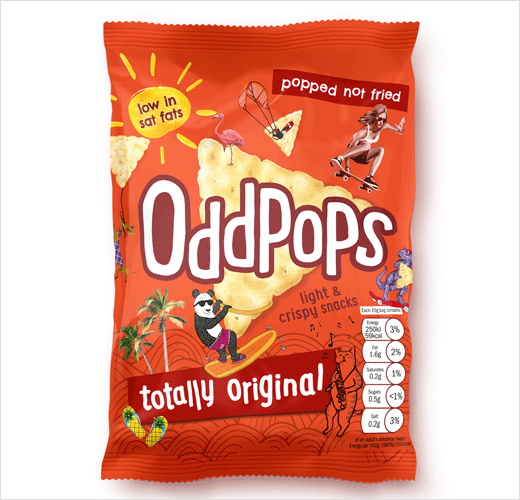
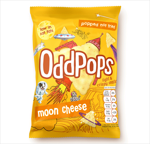
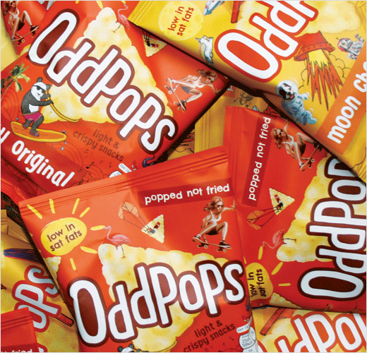
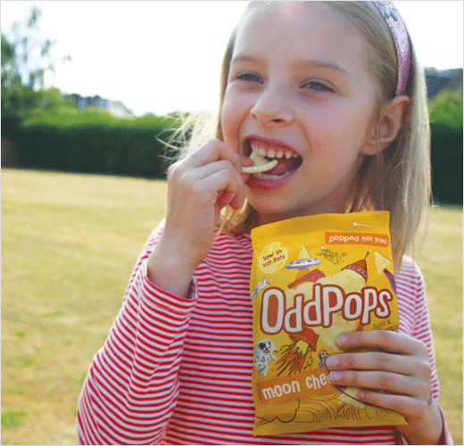
“The branding idea was borne out of the fact that these odd little triangular snacks are popped not fried, which led Biles Hendry to the name OddPops,” explain the designers. “The brand mark is simply the word OddPops in hand-drawn letters, which sit slightly unevenly, or ‘oddly’, off the baseline. On pack, this marries up with a large image of the snack to quickly and iconically communicate the nature of the product.”
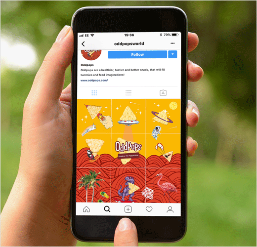
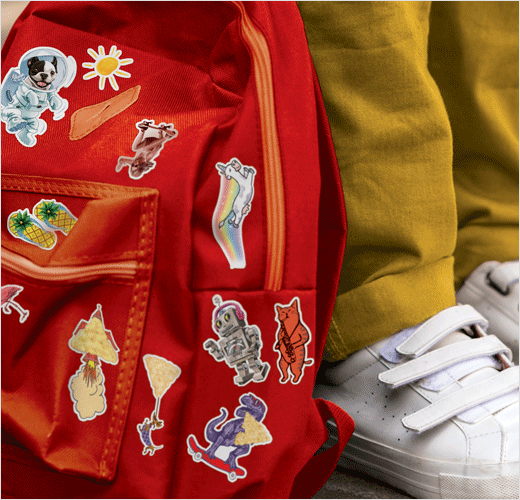
Anthony Biles, the agency’s creative director, adds, “It’s no coincidence that the designs have a dynamic ‘pop’ art visual approach – what better for popped snacks?! The designs feature a cornucopia of the different, the unexpected, the imaginative and the damn right odd, which kids love.”
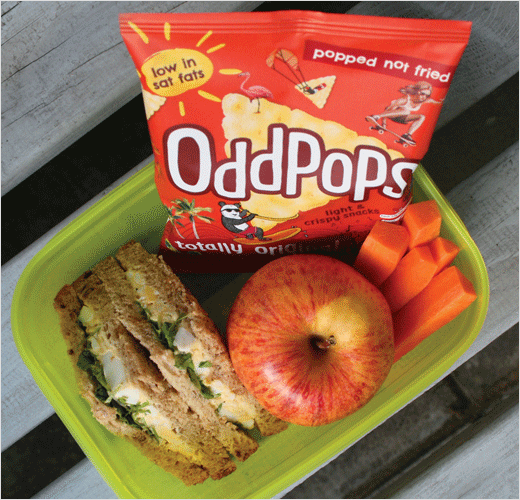
The designers also say it was equally important for the packaging to appeal to parents, as they are the purchasers. The packs therefore highlight key benefits, such as ‘low in fats’ and ‘popped not fried’.
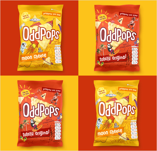
The new brand is currently being soft launched in 15g packs and two flavours – “Totally Original” and “Moon Cheese” – with plans for wider distribution in the coming months.
Biles Hendry
www.bileshendry.com


