Big Fish Reveals New Logo and Packaging for Thomas J Fudge’s
Branding consultancy Big Fish has refreshed the logo and packaging design for British biscuit maker, Thomas J Fudge’s.
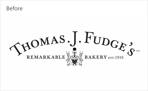
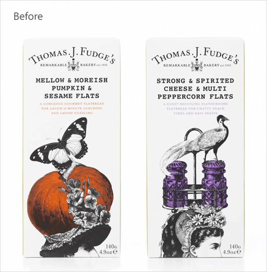
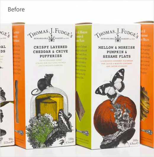
The London-headquartered agency actually rebranded the over 100-year-old business back in 2012 – repositioning it at the time from “Fudges” to “Thomas J Fudge’s Remarkable Bakery”.
The latest update is said to have come about as a response to increased competition faced by the company from other biscuit brands, including from a growing number of supermarket own brands; the Dorset-based manufacturer currently produces Florentines and crackers that retail in the premium segment of the UK biscuit market.
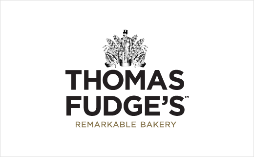
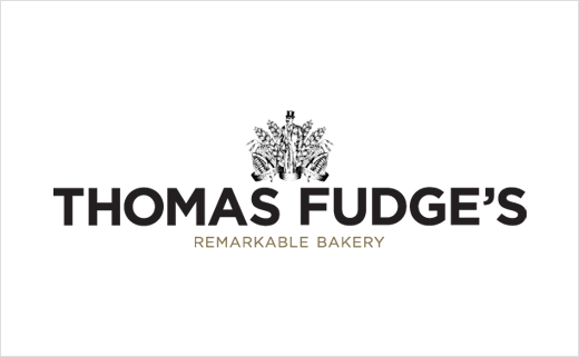
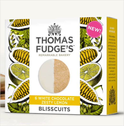
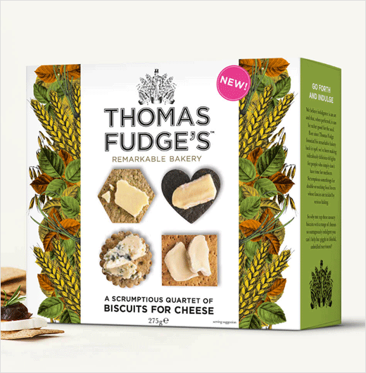
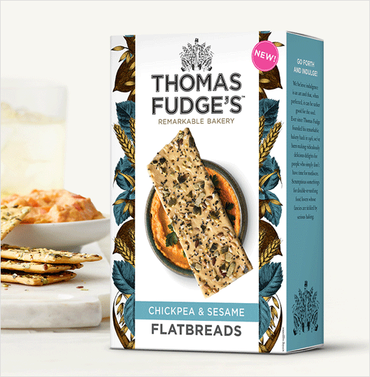
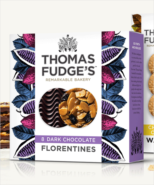
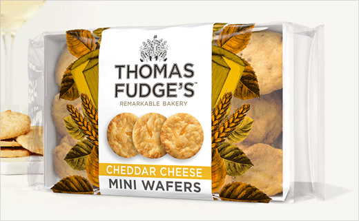
Key design changes include the introduction of an all-new crest featuring the brand’s namesake Thomas Fudge, who founded the company in 1916. The accompanying logotype also goes completely modern, adopting a bold, sans serif typeface that represents a sharp contrast to the old version.
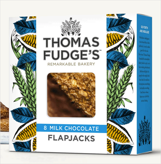
“The brief was to simplify the beautiful pack, accentuating the recipes for greater prominence. In the new look, the type is more straightforward; the extraneous ‘J’ has been lost; the overall presentation has been made more colourful; the ingredients emphasised to underline the indulgence,” explain the designers. “Fudge’s uncompromising approach to quality without shortcuts is now made all the more apparent. The overall message is crisply clear.”

Big Fish
www.bigfish.co.uk


