Berry Brand Driscoll’s Gets New Identity by Pearlfisher
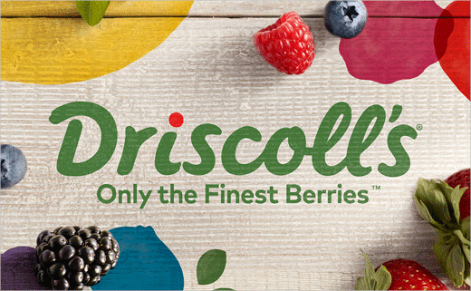
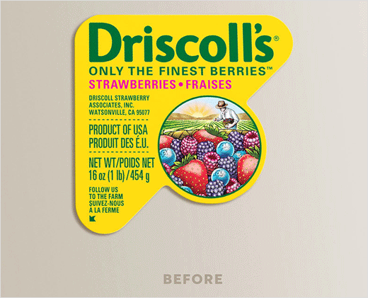
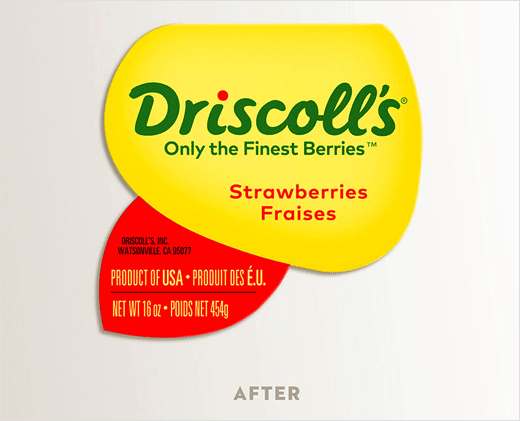
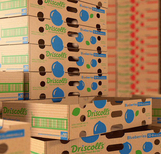
Pearlfisher has refreshed the logo design and visual identity system for berry brand Driscoll’s.
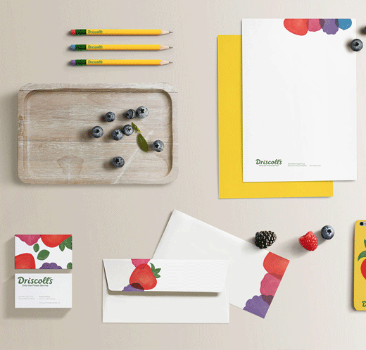
The new logotype uses hand-drawn cursive typography, with the dot over the ‘i’ changing colour within a custom “berry-inspired palette”.
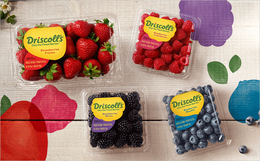
The logo’s main green colour has also been updated to make it more natural-looking, while Driscoll’s traditional yellow backdrop has been retained from the previous packaging design.
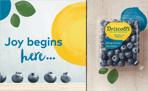
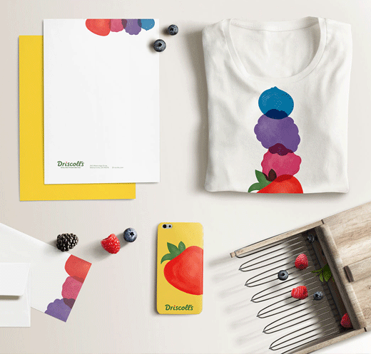
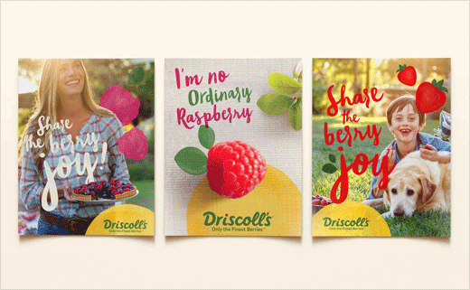
Described as “playful and appealing” by Pearlfisher’s founding partner and chief creative officer Jonathan Ford, the identity system further incorporates a series of custom prints and patterns of graphic berry forms, which are then combined with a library of lifestyle photography.
“Driscoll’s berries are universally loved, and wherever they are—pancakes, picnics, dessert, summertime—they make everything better. Our strategic challenge was to capture and express their unique brand of berry joy,” explains Karen Schnelwar, Pearlfisher’s head of strategy. “We created a suite of strategy tools—Brand Story, pillars and personality attributes—to do just that. The new brand positioning embodies the unique role Driscoll’s berries play— that when their berries are added to the mix, ordinary moments are made more special.”
Pearlfisher
www.pearlfisher.com


