Berocca Reveals New Logo and Packaging by Free The Birds
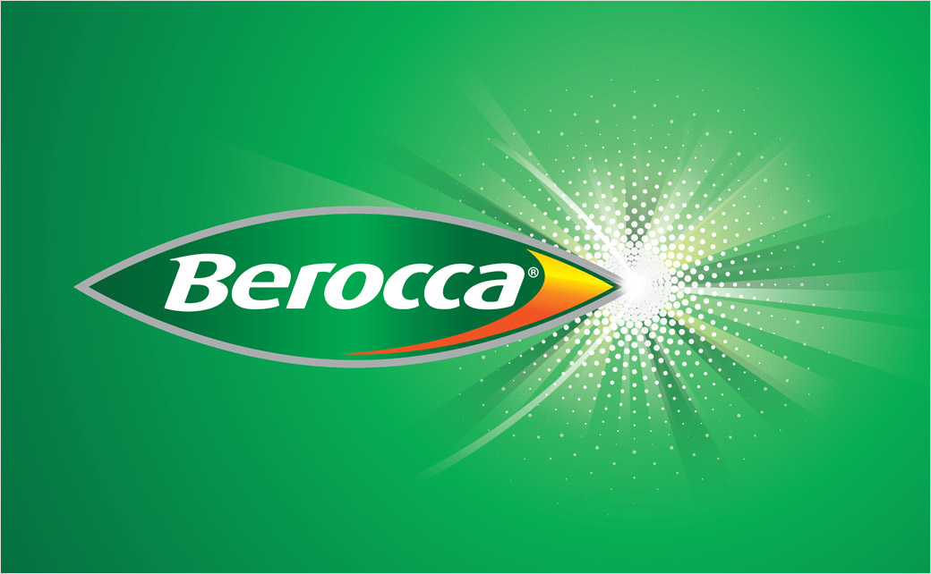
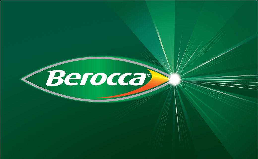
Creative agency Free The Birds has designed the new logo and packaging for Berocca, a brand of effervescent drink and vitamin tablets made by German pharmaceutical giant, Bayer.
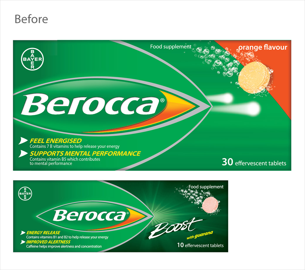
Established in 1969, Berroca is a well-known vitamin supplement that is readily available in most supermarkets, but the previous packaging design was deemed to ineffectively communicate the product’s level of efficacy.
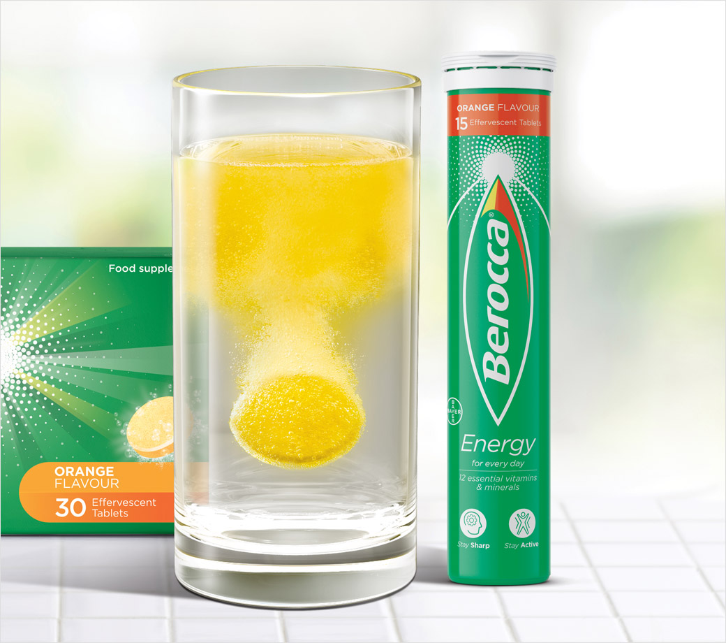
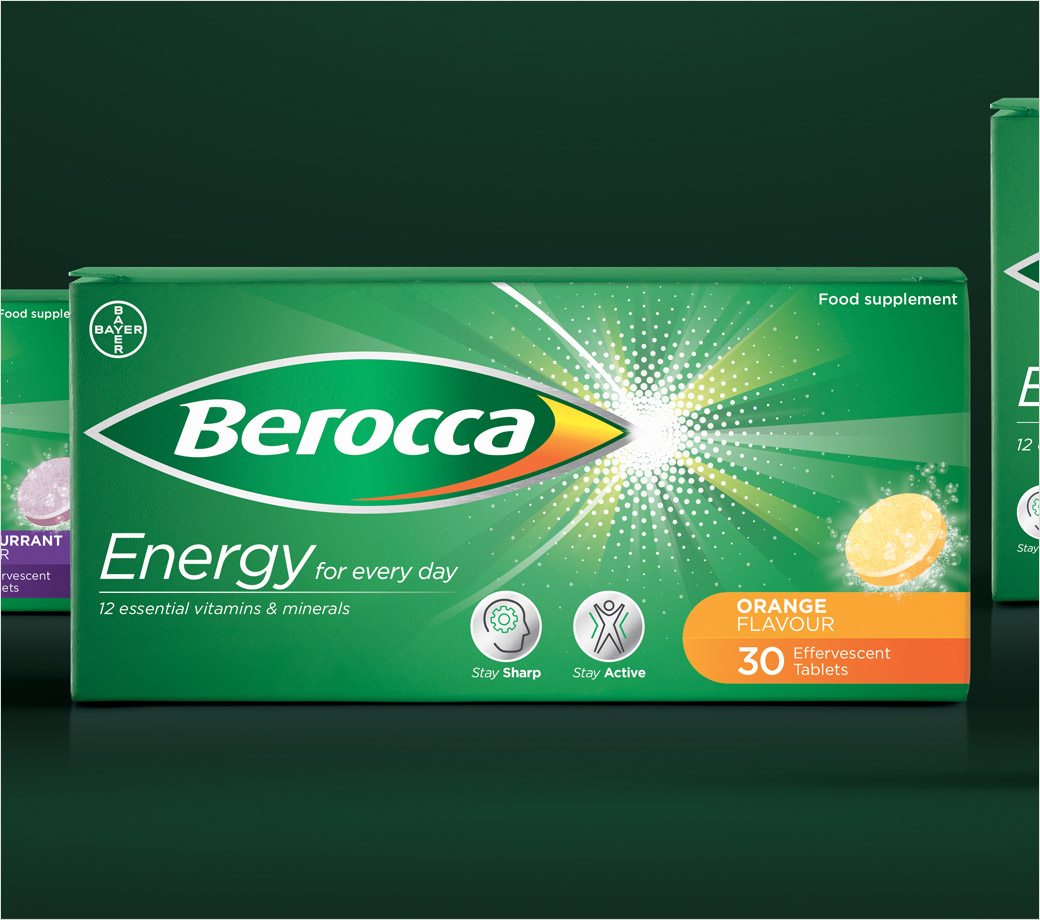
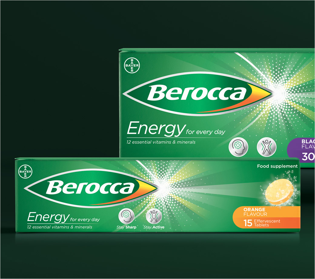
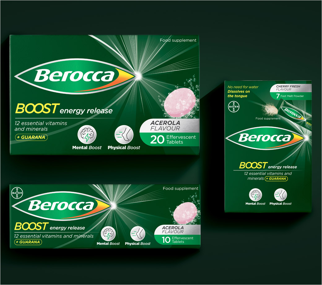
Free The Birds has therefore updated and created what it says is a more cohesive global packaging that is designed to reiterate the brand messaging “The Spark to Positive Energy” across the full Berocca portfolio.
“The original Berocca bullet has evolved into a more modern, confident device that holds the brand name on pack and has a stronger authority and brand presence on shelf. An energy burst symbol has been added alongside the logo to resemble the product’s health efficacy,” explains the design team at Free The Birds.
Additional details include a revised colour palette that is meant to improve navigation: primary Berocca colours (yellow, orange, light and dark green, silver, black) define the Energy and Boost ranges whereas flavour colour palette differentiates the lozenges across the portfolio.
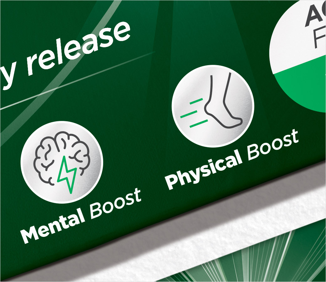
The designers also created bespoke galenic illustrations on packs to communicate the benefit of each product and the iconic Berocca fizz moment, which is a key asset for the brand.
All of the new brand assets are also used on the brand’s website and social media, keeping the branding consistent across all platforms.
“Berocca is a heritage brand that you can spot in almost every household. As such, the new brand identity had to retain the existing brandmark, but elevate its positioning on the consumer health market. The new global cohesive design framework stands out on shelf and emphasises the brand’s key messaging around positive energy,” says Nick Vaus, partner and creative director at Free The Birds.
“Our brand needed a refresh in order to further engage the consumers, who are putting self-care and wellbeing at the forefront of their shopping experience,” adds Chris Padain, Berocca’s vice president head of design and packaging.
The new branding and packaging for Berocca has been rolled out in the UK and France as key regions, and will be available across 70 markets in the coming years.
Free The Birds
wwww.freethebirds.com


