BBC Reveals New CBBC Logo
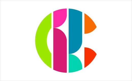
The BBC has unveiled a new logo design for CBBC, which marks the first refresh the channel’s look has received since 2007.
BBC management says the new logo was not designed to be overt. Instead, a “fun and unpredictable” approach was sought that didn’t “scream ‘Children’s TV'”.
“We wave goodbye to our very hard worked green and black logo (it’s been a sturdy companion for almost a decade) and say hello to a colourful and versatile identity that is box fresh and fit for purpose in a mercurial and constantly shifting media landscape,” said Controller of CBBC, Cheryl Taylor.
She added that the channel now has a “versatile and dynamic logo which works in every space and is designed to appeal to both ends of our broad age spectrum”.

Source: BBC


