B&B Studio Unveils New Logo and Packaging for Higgidy
B&B studio has created a new identity and packaging for British food brand, Higgidy.
The all-new look is based around the strategic positioning of ‘the best food always looks a bit Higgidy’, which the designers claim celebrates the hand-finished nature of Higgidy’s pies and quiches.
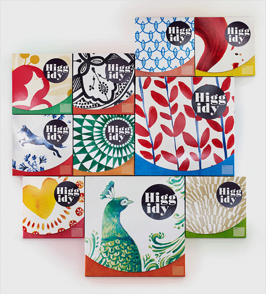
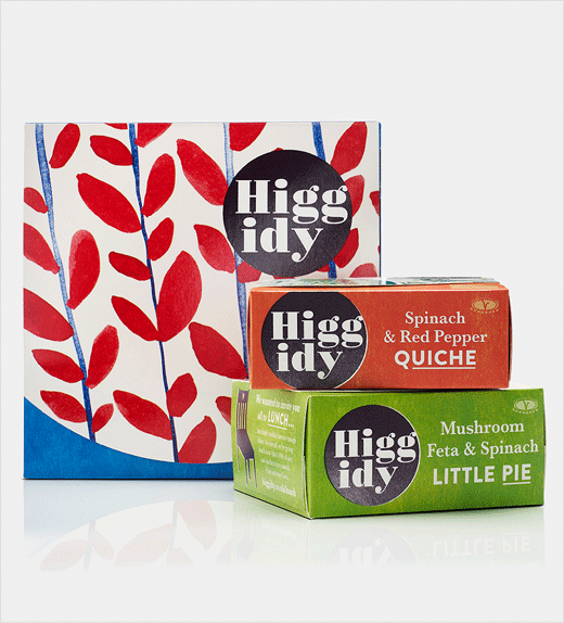
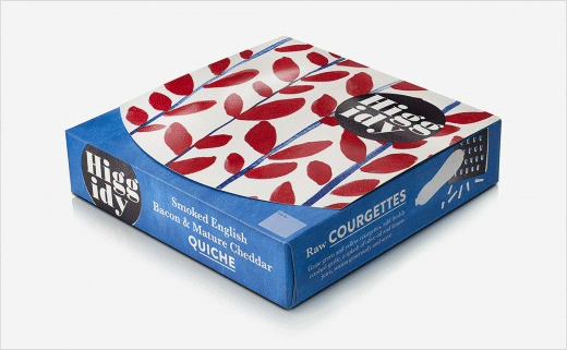
The packaging design for the brand’s 33 pies, quiches and sausage rolls, is said to have been inspired by a collection of ceramic plates. Illustrators collaborated to create abstract illustrations, inspired by the recipes, which appear cropped.
A new round logo, which breaks the name of Higgidy up across two lines, has been further artworked to look slightly different each time in an effort to emphasise the look and feel of Higgidy products.
“The packaging design was inspired by a lifestyle aesthetic born out of the beauty of imperfection, and the mismatched plates gave us the opportunity to tell a story around each recipe, either in terms of its inspiration, ingredients or associations,” explains Shaun Bowen, founder and creative partner at B&B studio. “We worked closely with founder Camilla Stephens to truly appreciate each recipe, then with each individual illustrator to ensure the story came to life in the most appropriate way.”
B&B studio was appointed after a strategic three-way pitch in January 2016. The new look Higgidy packaging is appearing in retailer stores from this month onwards and the consultancy is continuing to work with Higgidy to roll out an above the line campaign in spring 2017.
B&B studio
www.bandb-studio.co.uk


