B&B Studio Rebrands Honey Water ‘Just Bee’
B&B studio has created the new brand identity and packaging for Just Bee, a natural spring water that incorporates a single drop of honey.
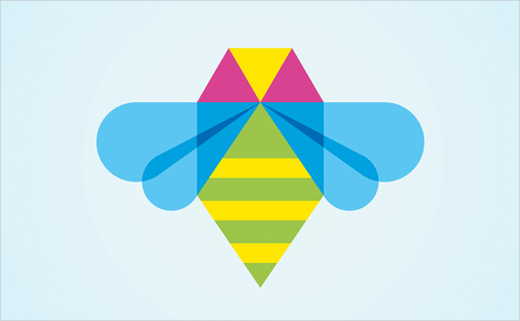
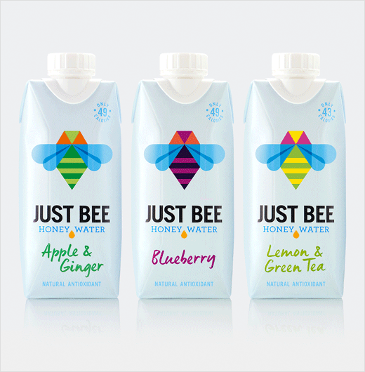
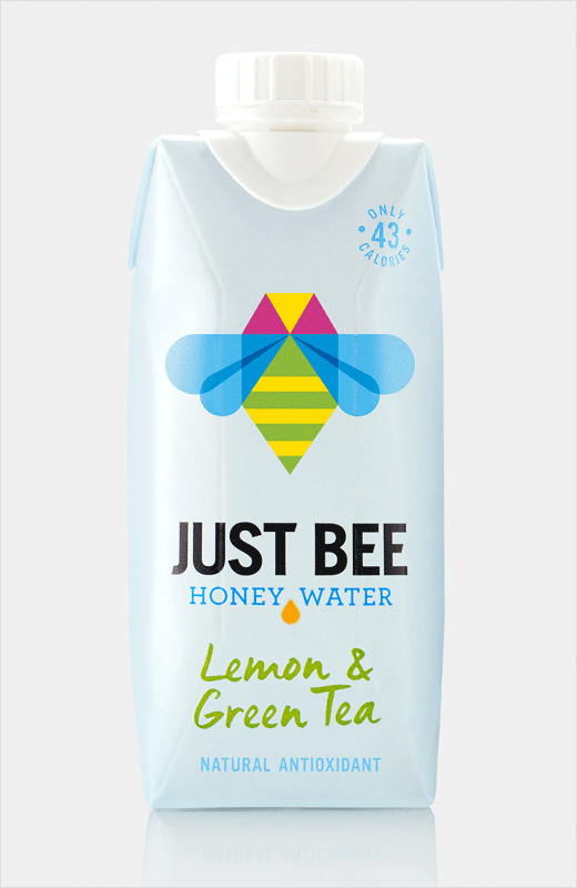
The new geometric bee icon is the main element of the design, with different colours used in the body to indicate one of the three different flavour variants and the wings a uniform ‘water’ blue to represent water. A single golden drop between the words ‘honey water’ illustrates that a only single drop of honey is used.
“A recent entrant into the growing flavoured and functional water market, Just Bee’s original packaging didn’t have the brand personality to stand out on shelf. As the power of honey is at the heart of the Just Bee proposition, B&B embraced the bee to bring the product story to life,” say the designers.
B&B studio’s Shaun Bowen adds: “The bee quickly became our hero, which has a lot of folklore associated with it. But we also had to ensure that the bee image was not reminiscent of bee designs found on honey jars. Our final bee icon is modern and crisp, but there’s a touch of warmth and friendliness to it, which the element of hand written style type for the flavour description also adds.”
B&B studio
www.bandb-studio.co.uk


