Baxter and Bailey Creates Identity Design for ‘Quietroom’
London-based communication design studio Baxter and Bailey has created a new visual identity for ‘thinking, writing and training’ consultancy Quietroom. Quietroom appointed Baxter and Bailey to the project following a three-way credentials pitch.
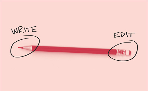
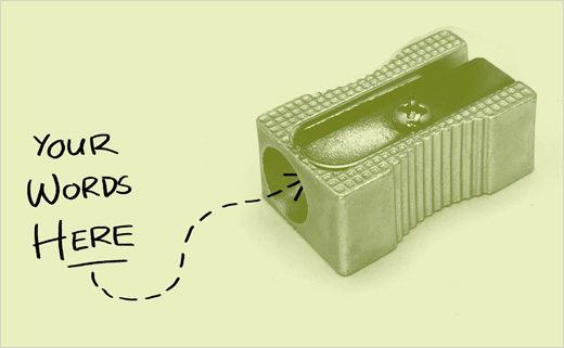
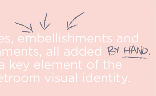
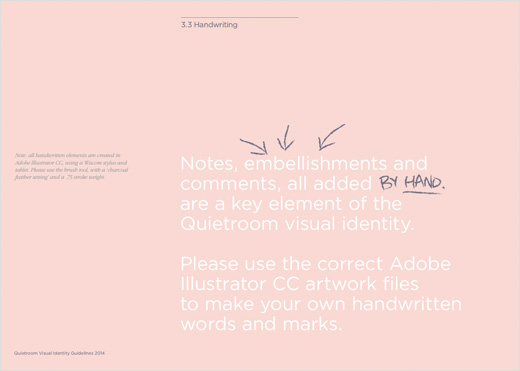
The visual identity roll-out has been applied to stationery, printed and digital collateral, signage and templates for in-house use. The redesigned website was designed by Baxter and Bailey, working in collaboration with digital specialists Turned Out Nice Again on design development and build. A suite of illustrations has also been developed to help bring a “playful” visual aspect to the new identity.
Matt Baxter, creative director of Baxter and Bailey, says of the project: “Quietroom do insightful, creative work with clients from some quite serious sectors: government, financial and energy for example. Their previous identity didn’t adequately communicate their offer and positioning any more. It was our aim to retain some of the irreverence and fun, which is very much part of their approach, but to help them look more professional and confident within these sectors.”
The next stage of the project will see Baxter and Bailey designing the Quietroom Quarterly, an ongoing printed publication which will be available through subscription via the Quietroom website.


Baxter and Bailey www.baxterandbailey.co.uk
Quietroom www.quietroom.co.uk


