Barcelona Football Club Reveals New Logo Design
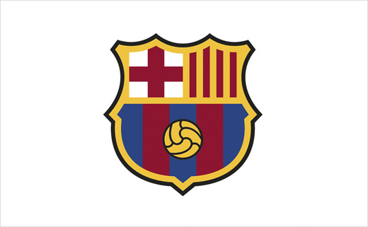
FC Barcelona has unveiled plans to change its crest in order to make the design more digital media-friendly.
The new proposal is effectively a mild refresh – an “evolution” and not a revolution according to the club’s bosses.
“Since the design was last updated in 2002, the context, society and technology have changed enormously, and the symbols identified with the club need to evolve too,” says the famous Spanish football club.
Adding that the update “stays faithful to the historical elements of the crest: the city, Barcelona; the country, Catalonia; the club, the ‘blaugrana’ colours; and the ball.”
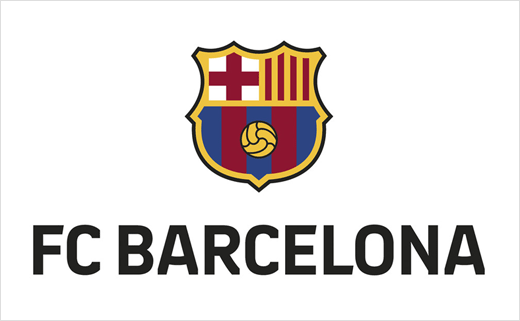
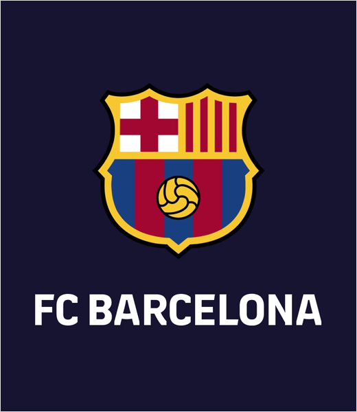
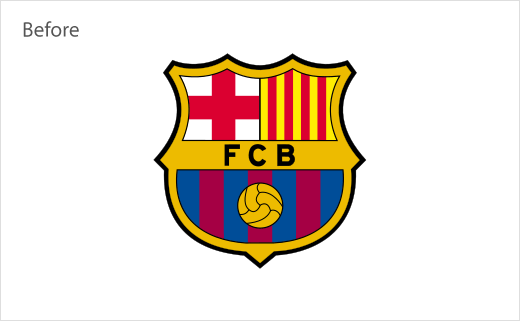
The most notable change is the absence of the FCB acronym, which is now superseded by “FC Barcelona” set in all capitals and positioned below the crest – and also fashioned from a bespoke typeface.
Other more subtle mods include the removal of black lines inside the badge, a cutback in the number of ‘Blaugrana’ stripes from seven down to five, and the football being more centrally positioned.
“The result is a more homogeneous, more harmonious, and brighter crest, while maintaining the same form and essence, thus guaranteeing more faithful reproduction in all media,” claims Barça.
Although the new design has already been approved by the club’s board of directors, it has yet to be approved by the team’s supporters who effectively own and operate the 119-year old club.
A vote is scheduled to take place on October 20th and should the revised logo get the thumbs up, it will to be introduced for the 2019/20 season.
If approved, no doubt we will see it being rolled out across multiple touch points, on everything from jerseys to lapel pin badges.
Source: Barça


