Bank of America Reveals New Logo Design
Bank of America has unveiled a refreshed logo design as part of a major new rebranding effort.
Currently the second largest banking institution in the U.S., and also part of the country’s so-called “Big Four”, the company’s new positioning is focused on the question, “What would you like the power to do?”
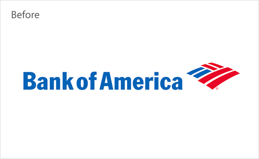
Accompanying the new brand proposition is a revised version of the bank’s famous red-and-blue “Flagscape” logo, which has been updated for the first time since 1998 when the Bank of America brand was first born following the merger of BankAmerica and NationsBank.
The latest design, which has been created by branding consultancy Lippincott, features a darker shade of blue as well as a new typeface, which also sees the bank’s name now appearing fully in capital letters.
According to Bank of America CEO Brian Moynihan, the new design reflects “a more modern brand that delivers both cutting-edge technology and high-touch solutions for clients.”
Source: Bank of America


