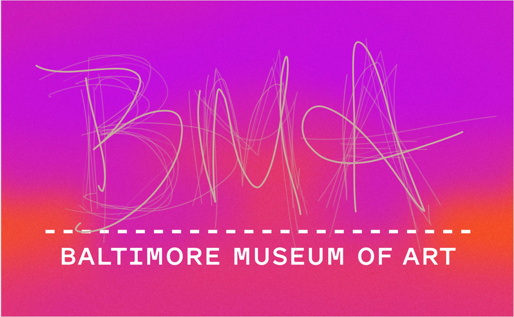
Baltimore Museum of Art Reveals New Logo and Identity
The Baltimore Museum of Art (BMA) has unveiled a new logo and identity as part of a major branding overhaul.
BMA’s marketing bosses reportedly spent four months in 2019 interviewing colleagues, trustees, docents, volunteers, museum visitors, Baltimore residents, and tourists in an effort to understand how the BMA is perceived.
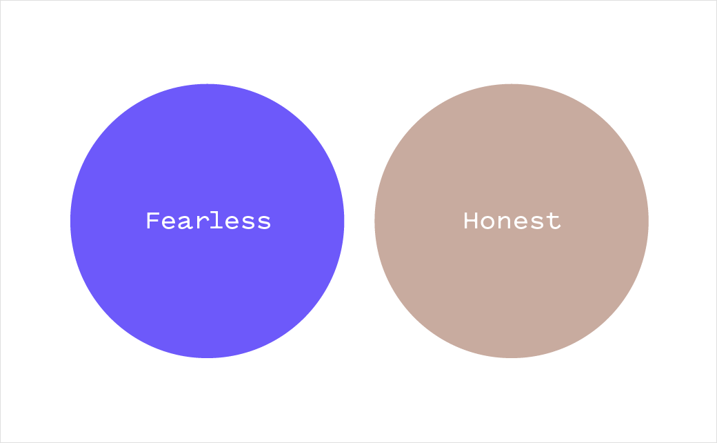
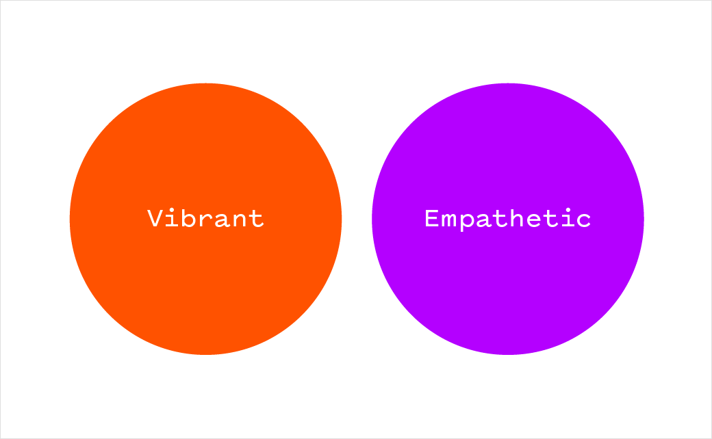
“We spent a lot of time in the neighbourhoods around the Museum, at our museum branch at Lexington Market, at the Inner Harbor, and at Penn Station talking to people about the BMA. We wanted to know what motivates people to visit and the pain points they experience when visiting, what compels them to seek out art, and what artistic encounters they remember most vividly,” says the over 100 years old American institution. “We took everything we learned to develop a new framework for talking about the museum. At the heart of this framework is the museum’s personality, defined in four traits: honest, vibrant, empathetic, and fearless.”
BMA subsequently partnered with design studio Topos Graphics and Baltimore-based graphic designer Bruce Willen to create the new look, which represents the first significant change to the organisation’s visual identity since 2005.
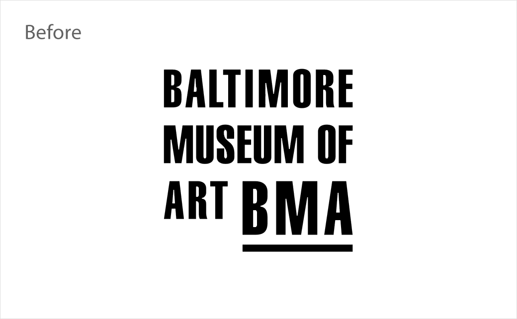
The refreshed logo is composed of two parts: At the bottom, the museum’s name sits beneath a dashed line, which is claimed to set up the museum “as a stage for creativity”; and above it are the letters “B”, “M”, and “A”, which are written by museum visitors and collaborators.
“The handwriting marks featured in Museum collateral will always change, drawing from a repository of submissions from visitors, staff, and anyone who interacts with the Museum. The number of handwriting marks will vary in each application, with some selected for recency and others because they resonate with a specific application,” says the BMA. “We wanted not just to represent, but to create a means for a multiplicity of voices to come together. The logo celebrates the richness of the BMA community. The logo becomes more legible when the marks overlap and join together, and there is strength and beauty in the cacophony of hand marks.”
Additional details include a new colour system said to have been inspired by a William Sergeant Kendall painting, Mischief, which was the first piece of artwork donated to the museum upon its founding in 1914.
“Topos calculated the average colour value of the work and the resultant tan hue became the starting point for our institutional colour system. From there, they developed a colour value for vibrant by fully saturating the honest hue. The orange-red is arrived at by relating to the mischief colour, and the orange-red colour became the colour equivalent for vibrant. Empathetic, a warm purple, is represented by an analogous region on the colour wheel to the vibrant colour. Finally, for fearless, a rich, brilliant blue,” explains the BMA.
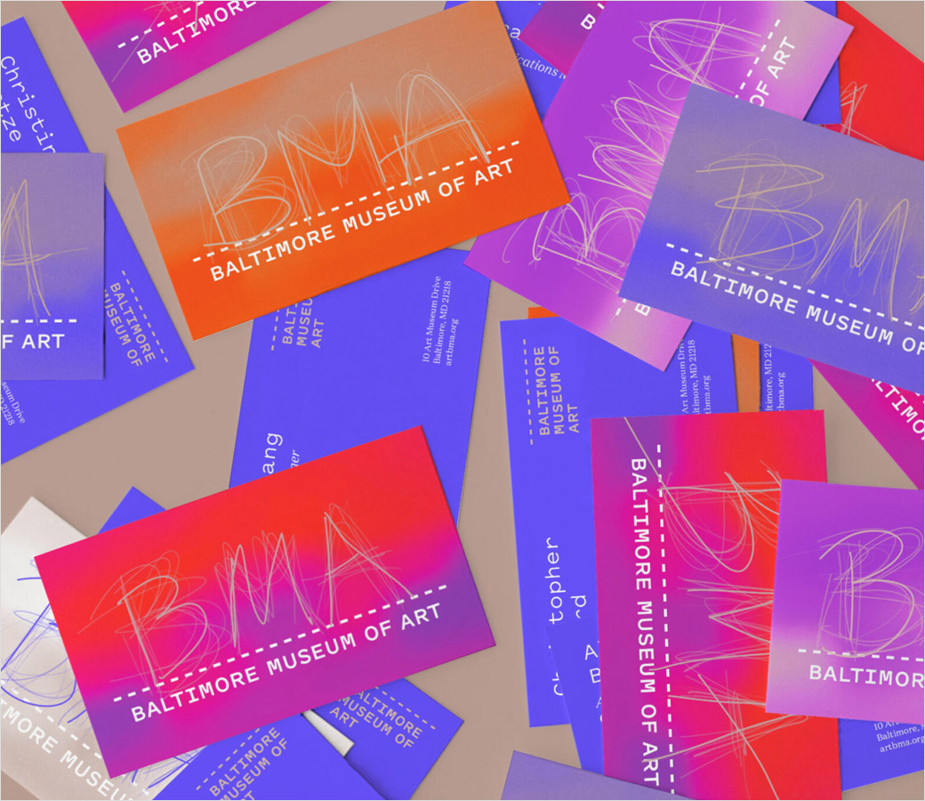
Another aspect of the identity are so-called “haptic backgrounds” that are claimed to represent a “visual interpretation of the BMA’s haptic and collaborative approach to programming and interpretation”.
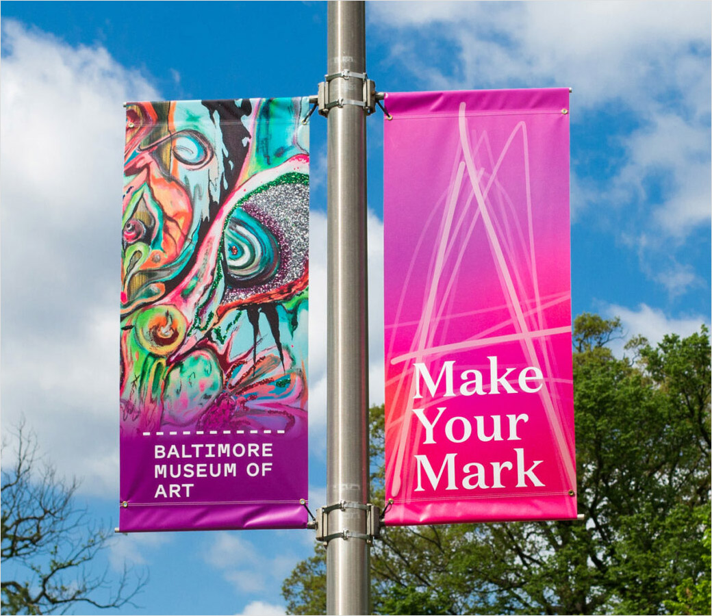
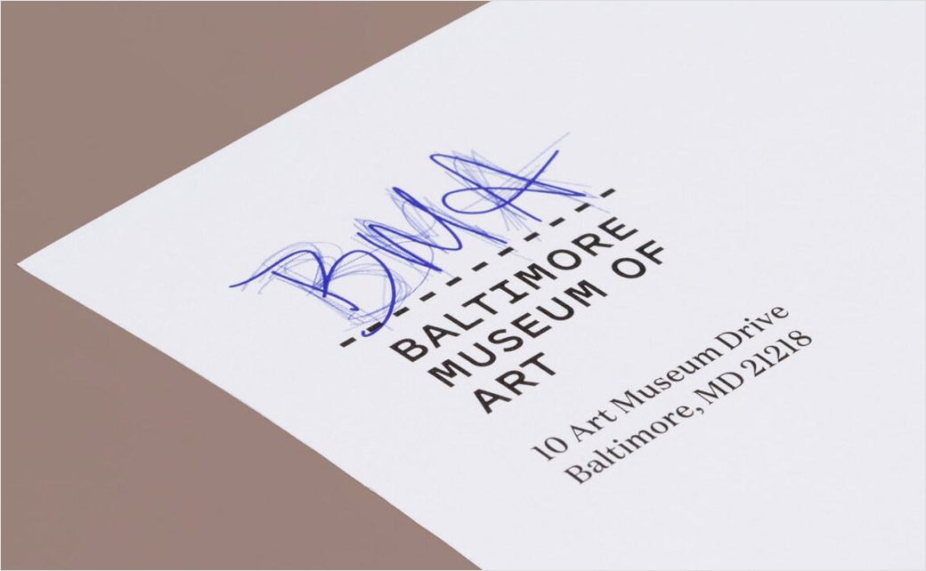
The backgrounds provide a base for a range of collateral, from brochures to stationery to the new website.
Source: BMA


