Bakery On Main Introduces New Logo and Packaging
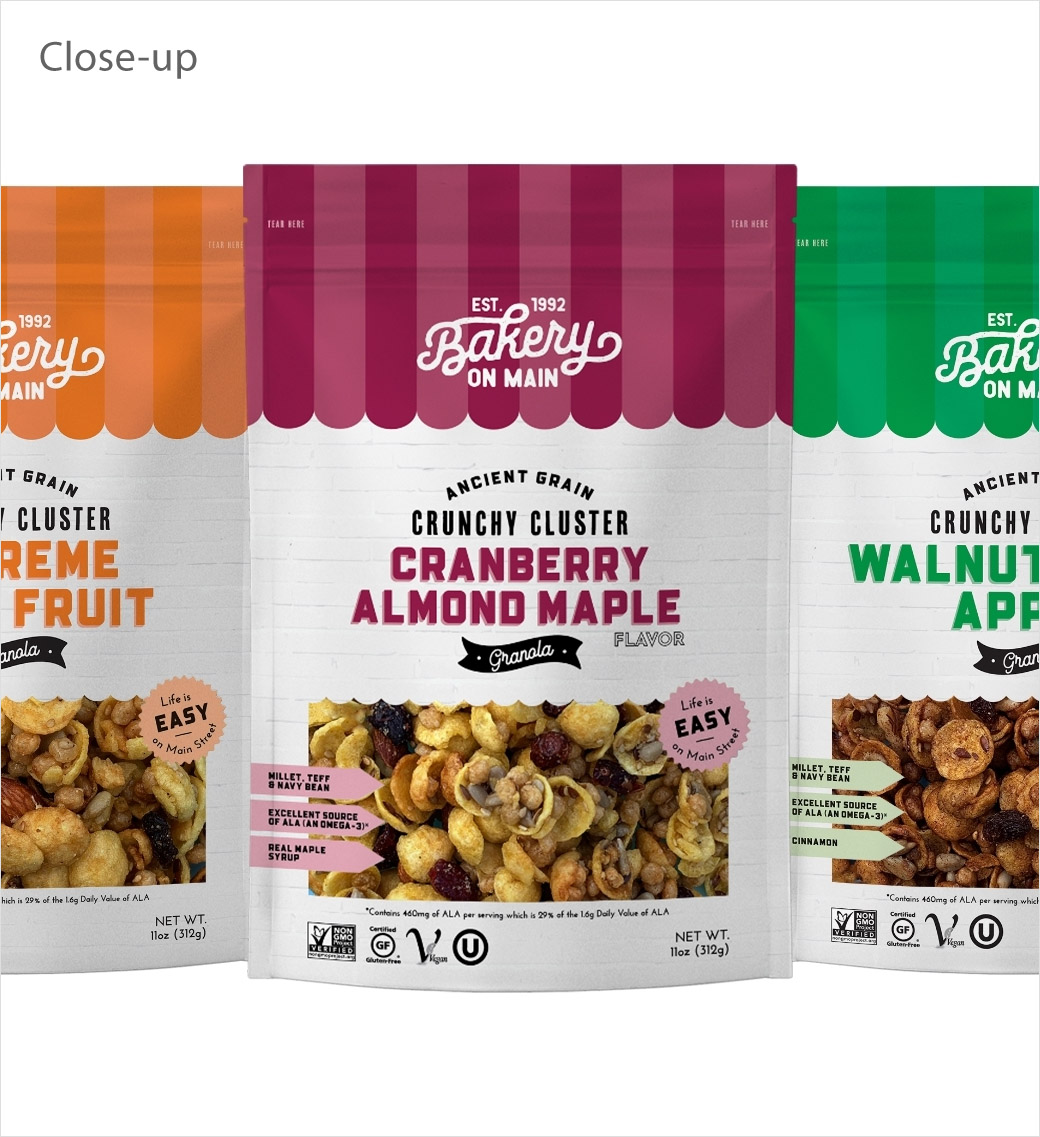
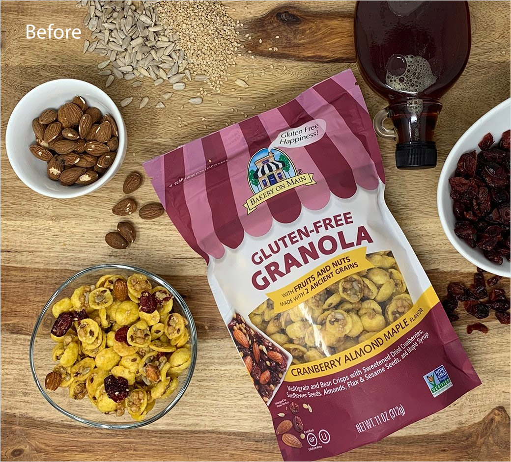
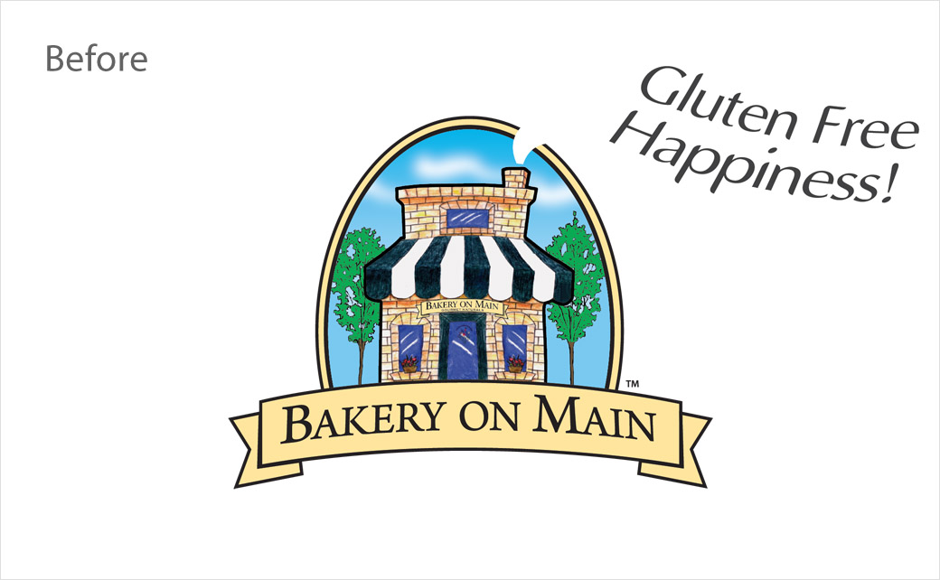
Bakery On Main has debuted a new logo design as well as new look packaging, which the American company says will help consumers to better identify the brand’s gluten-free products on shelf.
Although the refreshed identity combines elements of the brand’s original packaging design, including the ‘quaint’ bakery feel, it nevertheless features updated graphics and more punchier colours.
“Bakery On Main has been a mainstay for gluten-free consumers looking for great-tasting, safe gluten-free foods,” says Michael Smulders, president and founder of the Connecticut-headquartered company.
Adding: “As we continue to innovate and expand our brand families and product lineup, we wanted to refresh the brand look to make it easier to find on shelf, while at the same time, retaining some of the unique retro brand elements our consumers have told us they love.”
The company, which has been making gluten-free and celiac friendly food products since 1992, partnered with Chicago-based creative agency C.A. Branding to develop a singular visual design that highlights brand elements including, more noticeable certification graphics and a bright brand colour palette that is aimed at creating “a strong visual brand block on shelf”.
Bakery On Main’s new logo and packaging is rolling out at retailers across the United States both in brick and mortar and on e-commerce platforms.
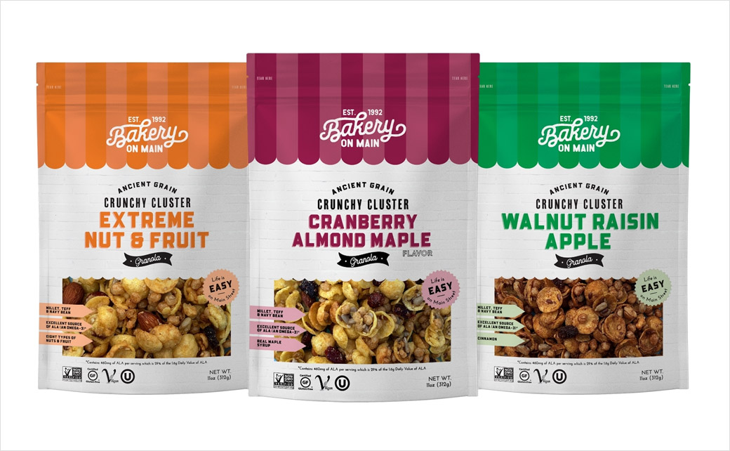
Source: Bakery On Main


