Auto Trader Gets New Look by Studio Output
Studio Output has created a new brand identity for the UK’s leading automotive marketplace, Auto Trader.
The latter’s wesbite gets an average 55 million monthly visits – 70% of those on mobile. Despite all this, some people still think it’s a print magazine for middle-aged men.
The agency says it worked closely with the internal brand, design and UX teams to shift this perception.
“Building on a new brand positioning, we ran a workshop establishing three personality traits to guide the approach. These formed the basis of shared design sprints defining the brand components: colour, typography, imagery, illustration, graphic assets and motion principles,” says Studio Output.
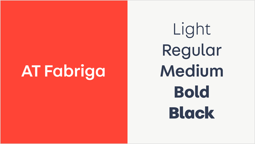
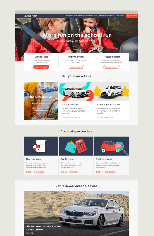
“We evolved the Auto Trader logo to work harder across digital platforms. A wider colour palette appeals to a broader audience base while building on the core blue and red of the brand’s heritage. And a robust new type family brings a more welcoming tone to headlines, messaging and data visualisation,” further explain the designers.
Additional details include the introduction of an illustration system to visualise abstract topics like part exchange or insurance, without resorting to “clichéd” photography.


Studio Output
www.studio-output.com


