Arena Football League Reveals New Logo Design
The Arena Football League (AFL) has officially unveiled its new logo design as part of what it claims is a "monumental shift" in visual identity.
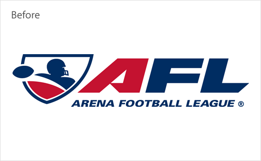
Marking the first time the indoor American football league has introduced a new logo since 2003, the new design signalises "the exciting future of gamification and new technologies the AFL will employ."
"We are excited to announce the League’s new logo, which represents the new direction of the AFL," explains Randall Boe, Commissioner of the Arena Football League. "This marks the beginning of many changes to come from the League, including a uniquely modernised and gamified experience for fans. The new logo represents the high energy momentum of the League that we are excited to share with everyone."
The AFL worked with Chuck Kacsur Design to create the new mark, which is said to have been specifically optimised for digital space. While the font is reminiscent of what was previously used, brighter colours were selected to be "youth-oriented and to convey a higher level of energy".
Various iterations of the AFL’s new logo will be used in different spaces, including mobile application badges and jersey patches, all of which were designed with brand identity and consistency in mind.



Source: AFL


