Air Partner Reveals New Logo and Identity by StormBrands
Global aviation services group Air Partner has launched a new brand identity created by design agency StormBrands.
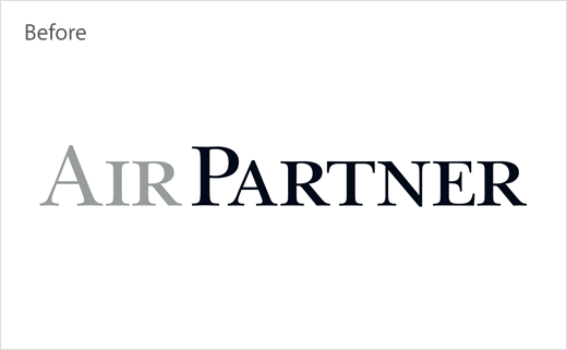
Having originally started out as a flying school in 1961, Air Partner subsequently expanded to include multiple companies with individual identities, naming structures and cultures including group charter, private jet, freight, air evacuation and safety consulting and training.
As a result, StormBrands was given the mission of unifying all of these disparate identities into a single new brand.
“We’ve united the brand equities from all of Air Partner’s services and translated them into a cohesive visual system that showcases its expertise,” comments Mark Chatelier, executive creative director at StormBrands. “Bringing together the full range of acquired identities meant we had to go through a complex trademarking review before landing on the final identity for Air Partner”.
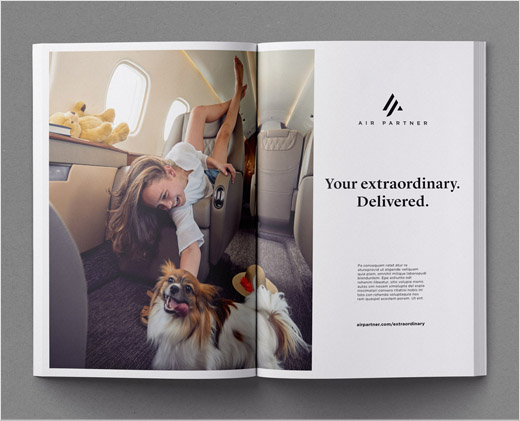
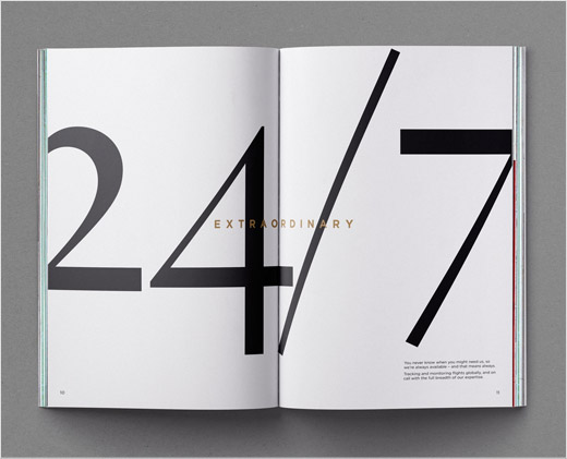
Dubbed “delivering the extraordinary to fly our world”, the new identity is claimed to play on the idea of aviation as ‘extraordinary’.
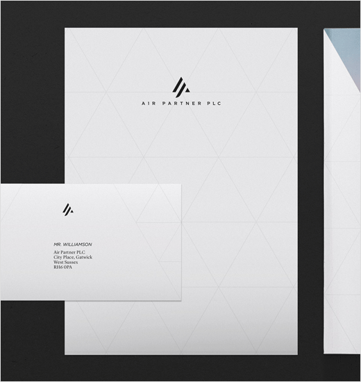
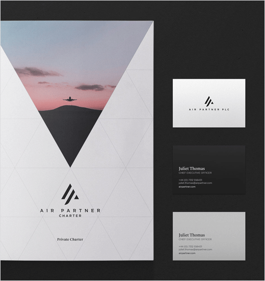
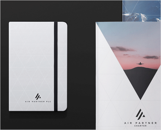
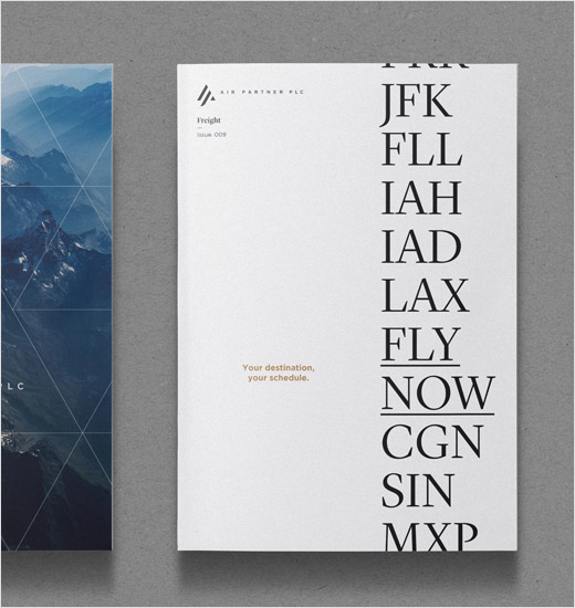
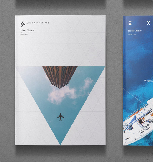
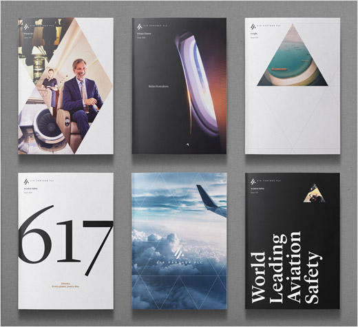
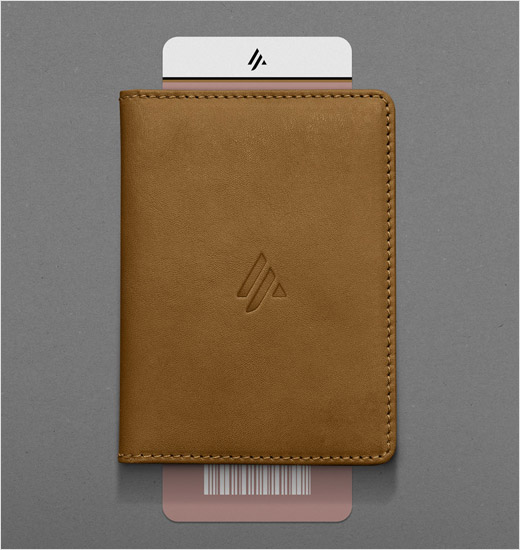
“Anchored by a graphic language of triangles, the identity references birds flying in formation evoking a ‘stronger together’ ethos of shared customer focus. Visually, the logomark continues the triangular motif uniting an ‘A’ and ‘P’ to suggest partnership within a flexible network,” further explain the designers.
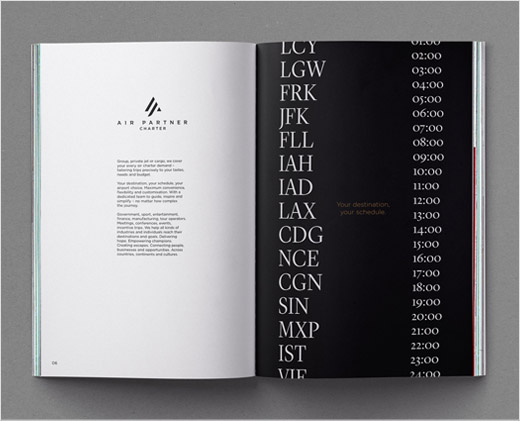
The colour palette, meanwhile, is said to borrow from “the changing narrative of the sky from sunrise to sunset”, and includes bespoke photography the traverses “geographies, time zones and subject matter to capture a world of flight that never sleeps, both on the ground and above it.”


StormBrands
www.stormbrands.co


