Aer Lingus Reveals New Logo and Livery
Aer Lingus has unveiled a refreshed brand with updated logo design and new aircraft livery.
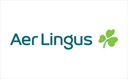
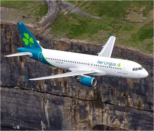
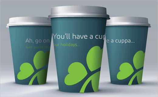
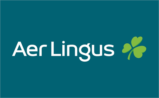
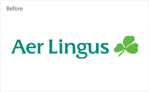
The brand’s new logo retains but restyles the well-known shamrock, adding a tilt “to symbolise dynamism and speed, with heart-shaped leaves reflecting the warmth and hospitality of the brand.”
The Irish company says more than 50 shamrock designs were considered as part of the rebranding process, which has been executed by global consultancy Lippincott – with the lead designer on the project also being a Dublin native, namely, Brendán Murphy.
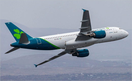
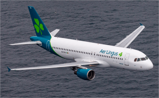
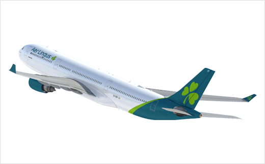
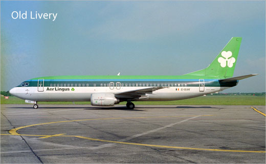
Travellers will see a total of four shamrocks on the new Aer Lingus aircraft livery: The first within the new logo, the second on the tailfin, a third at the door, and a final one positioned on the wingtip “for capturing on social media”.
The Aer Lingus logo font has also been changed to ‘diodrum’ while the dominant colour is now teal; the body of the new look aircraft will be white with a teal-coloured tail and engines.
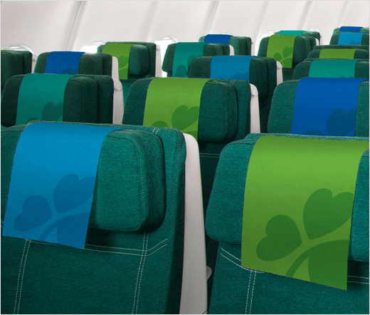
The new look is being rolled out across all brand platforms, and further encompasses a new website design as well as a new app design. It will be visible across all guest touchpoints, from check-in to boarding gate and on to the aircraft.
The refresh, which comes more than 20 years after the previous brand change, is part of the airline’s growth plan which will see Aer Lingus increase its North Atlantic fleet from 17 to 30 aircraft by 2023.
Source: Aer Lingus


