Advice: The Role of Brand Colours in Software UI Design
Colour is one of the most influential design elements in software user experience and interfaces. The thoughtful use of colour in enterprise applications serves functional purposes while also tapping into the psychology of users on a subconscious level.
When leveraged effectively, colour choices in software aesthetics can increase productivity, improve usability, visually organise information, elicit desired emotional responses, and even boost brand recognition for a company.
This article will explore the mechanisms behind colour psychology as well as provide actionable recommendations for software designers and other professionals involved in the custom enterprise application development process who want to leverage colour to improve user interfaces.
We’ll cover foundational colour theory, the meanings and impressions associated with major hues, and tips for applying colour principles based on end-user goals. Read on to unlock the hidden potential in the colour palettes of your business applications.
How Brand Logo colours Influence Software UI colour Schemes
A company’s brand logo encapsulates recognition, messaging, and emotional connections with its audience. The colours used in logos contribute significantly to that brand identity. It’s only natural for enterprise software teams to leverage the prominent hues in their company branding within product interfaces as well. Matching UI colour schemes to logo palettes maintains continuity across touchpoints while also transferring positive brand sentiments.
However, brand colours shouldn’t dictate UI colours entirely. User experience still trumps marketing goals in software. Designers must strike the right balance between brand alignment and UX optimisation when incorporating logo colours into interfaces. Here are some best practices to harmonise these priorities:
Prominent Logo Hues For Primary Theme colours
The most visible one or two colours in a logo make sensible defaults for theme colours in enterprise software. Usually brighter, saturated hues, they establish recognition and continuity. For example, cloud software brand Salesforce utilises its logo’s bold blue for primary action buttons and header bars. This themed colour pairing demonstrates brand alignment at a glance.
Supporting Neutrals For Backgrounds and Secondary Areas
While accent colours reflect the brand, backgrounds need neutral and muted shades for readability and visual hierarchy. Off-whites, grey and black support logo colours without competing.
Thoughtful Accent colours For Visual Interest
Even with established brand hues, UIs need additional colours for visual interest and organisation. Accent colours introduce variety while echoing logo palette tones. For instance, Oracle software accents its dominant red logo colour with complementary secondary greens and yellows. Intelligent use of colour psychology principles guides optimal pairings.
Colour Accessibility Considerations
Regardless of brand colours, designers must ensure accessibility for visually impaired users through sufficient colour contrast. Options like light/dark mode and colour blindness settings override brand palette limitations to meet user needs.
Testing With Users From Scratch
The best practice is still testing logo colour integration with end-users rather than assuming recognition. Seeing if test groups intuitively associate certain colour schemes with a company provides valuable feedback. User acceptance metrics ultimately determine success.
Updating Palettes Over Time
As brand identities evolve from company growth or mergers, UIs should adopt logo redesigns in stages, not all at once. Gradual UI colour shifts better align to users’ mental models.
In summary, brand logo colours can effectively jump-start enterprise software UI colour strategies, but only as part of a thoughtful design process that balances multiple objectives. Thorough testing with users and iterating will best harmonise brand alignment, UX optimisations and future rebranding efforts for maximum impact.
Foundations of Colour Theory
Before diving into the practical side of colour psychology, it’s important to understand some core concepts that serve as the basis for how humans perceive colour. The three foundational components are:
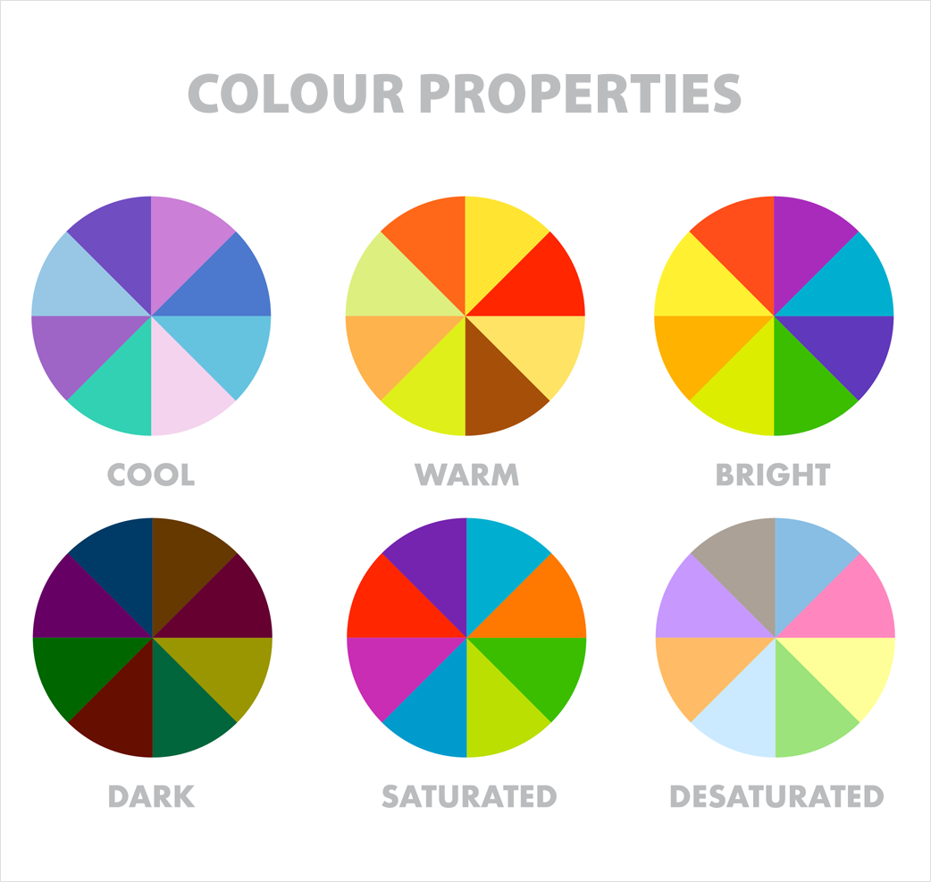
Hue – The attribute that allows us to distinguish red from green from blue. It refers to the dominant wavelength of colour we see.
Saturation – The intensity or purity of a colour, from muted to vivid. Pastels have low saturation, while neon colours are highly saturated.
Brightness – How light or dark a colour appears, ranging from black to white. A brighter blue will contain more white.

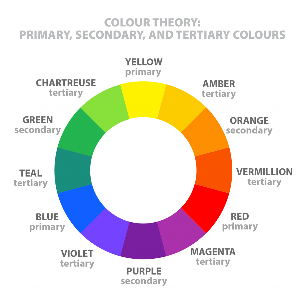
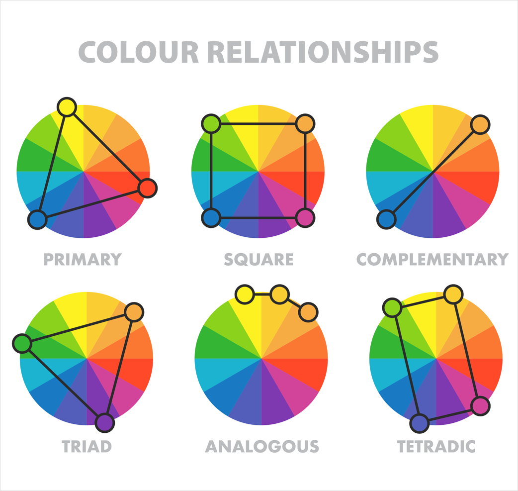
Additionally, the colour wheel provides a framework for blending primary hues into secondary or tertiary colours. Warm colours like red, orange, and yellow contrast with cool colours such as blue, purple, and green. When selecting multiple colours, choosing complementary colours from opposite sides creates pleasing contrast, while analogous shades from nearby on the wheel result in monochromatic harmony.

This groundwork allows designers to systematically modify factors like brightness and saturation to elicit specific responses. It also sets up important context for the emotional associations and meanings behind individual hues.

Psychology of Key Colour Groups
The human reaction to colour stems from both nature-based responses and culturally-learned associations. While reactions can vary slightly across demographics, extensive research has identified consistent psychological and physiological effects linked to major colour groups. Here’s an overview of common impressions for primary hues:
Reds
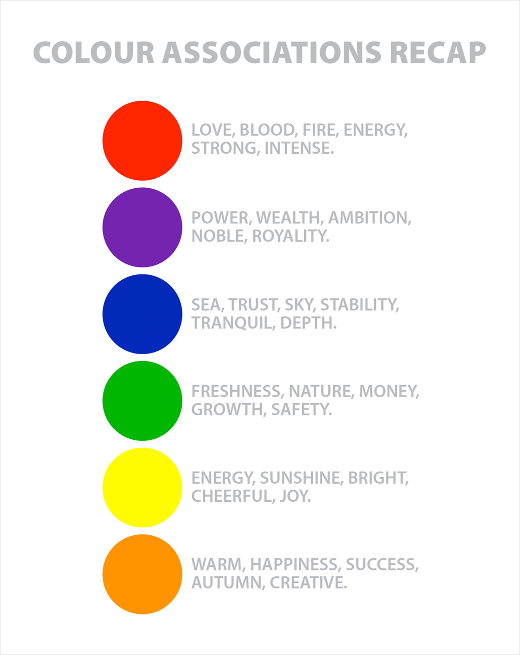
Reds are stimulating “power colours” associated with energy, passion, strength, and excitement. They grab attention while also raising respiration and heart rates. Brighter reds feel more energetic for call-to-action buttons, while deeper shades lend a luxurious or romantic feel. Dark reds are also linked with danger or warnings.
Oranges
Like red, orange has an energetic aura, invoking feelings of confidence, creativity, and happiness. Softer oranges come across as welcoming and friendly. Bright orange accents tend to stand out without being as aggressive as neon red. Dark oranges can signal autumn and earthiness.
Yellows
Bright, light yellows are eye-catching and uplifting, associated with optimism, clarity, effectiveness, and intellect. Soft yellows also enhance concentration. However, duller yellows can signal caution, sickness or decay in some contexts. Dark yellows may impart a sense of instability or irrationality.
Greens
Green is the most restful colour for the human eye and often signals renewal, peace, tranquillity and health. Most greens imply growth and environmentalism. Light greens can represent freshness and safety, while dark greens are more stable masculine and imply wealth.
Blues
Cool, calming blues are universally liked and suggest professionalism, confidence, logic, success and stability. Light blues can be refreshing and friendly, evoking openness and creativity. Navy blues are classic and imply authority and wisdom, while darker shades feel stronger and dependable.
Purples
Regal purples connote luxury, creative magic, and spirituality. Light purples like lavender are nostalgic, romantic and feminine. Dark or muted purples suggest mystery and sophistication. Purples paired with yellows or oranges add visual intrigue.

Colour Applications in Enterprise Software
Now that we’ve covered some of the history and emotional impact behind colours, let’s examine how software designers for business applications can apply colour theory principles to:
- Guide users
- Visually organise information
- Establish hierarchy
- Influence perceptions of a brand
- Motivate desired actions
- And optimise aesthetics for usability
Guiding Users
Strategic use of colour allows designers to direct user focus and attention within software interfaces at a glance. This facilitates learning and information processing. Warm colours like reds, oranges and yellows will attract the most initial attention, especially against cool or dark backgrounds. These hues can highlight key clickable areas or important notifications that require action. Cool blues and greens recede visually, so they effectively colour background spaces you want to deemphasise. Reserving saturated colours for only call-to-action items also helps guide users.
Organising Information
Alternating row colours (zebra striping) in tables or lists helps users accurately distinguish and process line items. colour coding related elements is another excellent way to chunk information for better comprehension. For example, you might designate different shades of blue to variable customer account statuses. Strategically colour coding disparate screen areas also helps users orient themselves within more complex dashboards or data visualisations.
Establishing Hierarchy
Varying colour brightness, saturation and hue in conjunction communicates hierarchy across structural elements. For example, primary navigation links might display in a saturated blue, while secondary menus use a lighter blue with lower saturation. Tertiary links would have the lightest blue shade. Similarly, key data points or totals on a dashboard could use a bold red while supporting data displays in muted oranges and yellows.
Influencing Brand Perception
colour choice directly impacts end-user sentiment toward a company and product. Blue logos and themes promote feelings of stability and trust in financial, medical and technology enterprises. Friendlier orange and green palette with secondary blues appeal to creatives and modern startups. Bold reds feels daring for fashion-forward brands.
Most users also retain colour associations with established major brands like Facebook blue, Twitter light blue or Netflix red. Using similar shades evokes those brand identities.
Motivating Actions
Call-to-action buttons and selected link colours should provide enough contrast without being abrasive. Saturated warm shades like orange, red and pink grab attention while indicating clickability. Darker blue, green or purple buttons also motivate clicks with slightly more formality. Since lighter tints recede, avoid extremely light options for key action triggers.
Optimising aesthetics and Usability
While colour supports many functional objectives, aesthetics still impact reception and usage. Poor colour choices undermine usability and adoption regardless of technical capabilities. Some best practices include:
- Avoid pure black or white backgrounds, which strain the reader eyes and reduce text legibility. Off-whites or grey work better.
- Enable personal colour preference settings so users can optimise views to their needs.
- Use muted, analogous shades to establish general interface colour themes, then leverage brighter accents strategically as described above to maximise impact.
- Be mindful of colour blindness by having secondary visual indicators for key elements besides colour.
Testing with a diverse user panel helps fine-tune shades and contrast for accessibility and appeal. Periodic colour scheme updates also keep interfaces looking fresh and modern.
Conclusion
Colour may seem like superficial window dressing, but it has profound physiological and psychological effects that software design teams can utilise to drive better user experiences.
Through strategic manipulation of hue, saturation and brightness variables plus an understanding of colour associations, designers can build interfaces that better engage users, visually organise complexity, motivate actions and build brand loyalty through positive sentiment.
With some foundational colour theory, a bit of creativity and adequate testing, even complex business applications can harness the incredible power of colour.
The visual language communicated through intentional colour choices ultimately enables software to serve end goals and users alike better.


