Ad Agency Grey London Rebrands as Valenstein & Fatt
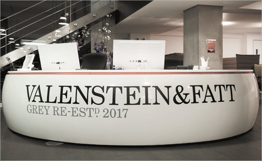
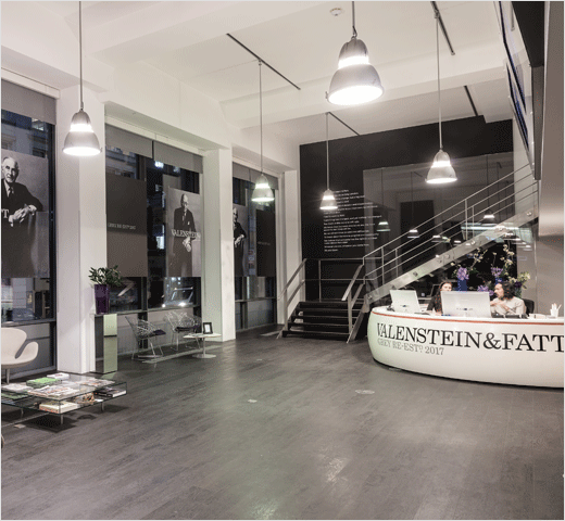
Ad agency Grey London has rebranded as Valenstein & Fatt to mark its centennial year.
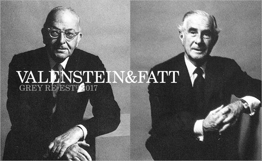
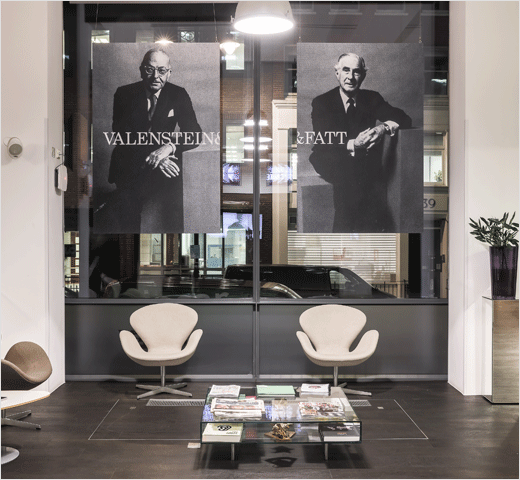
Jewish entrepreneurs Lawrence Valenstein and Arthur Fatt originally set up the company in 1917’s New York. However, due to prevalent anti-Semitism, they opted to call their business Grey instead of using their own names; supposedly, grey was the colour of the wallpaper in their offices.
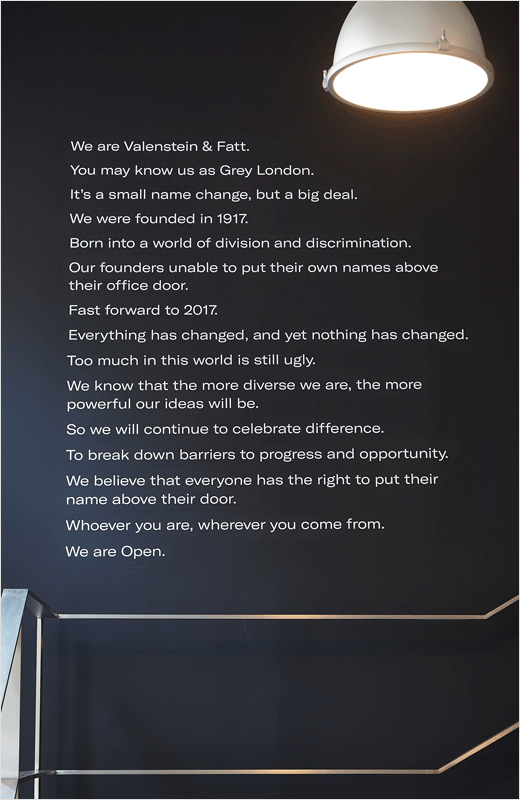
The company says it has now decided to restore the names of its founders as a statement of its “commitment to diversity and openness” and in response to the resurgence of white nationalism and xenophobia in both Europe and America.
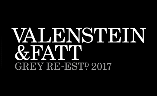
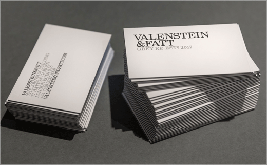
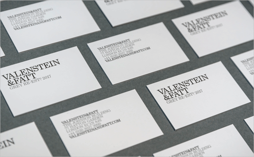
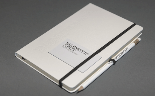
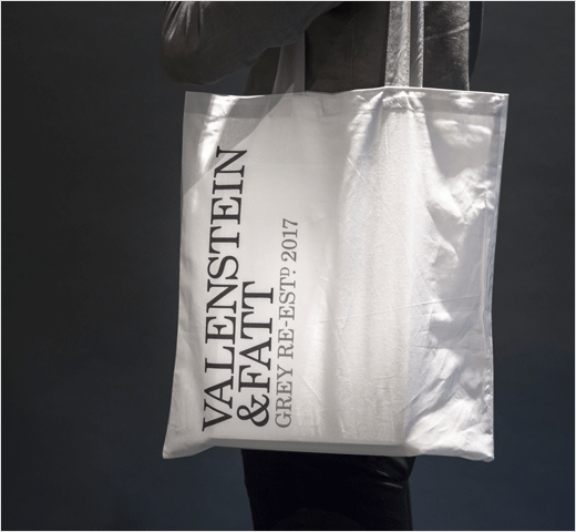
As a result, the all-new identity sees the previous Grey san serif give way to a new logotype set in Century Schoolbook, a typeface that is said to have historical relevance to the agency; it was designed in 1917 by a foundry just a few blocks away from Lawrence and Arthur’s first office.
In terms of colour, the new look adopts a black and white scheme to reference the founders’ time in 1910s New York and to emphasise the fact that diversity isn’t just black and white, according to the agency.
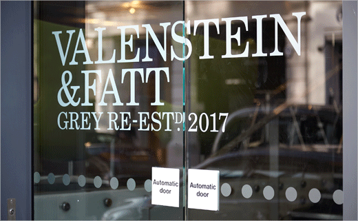
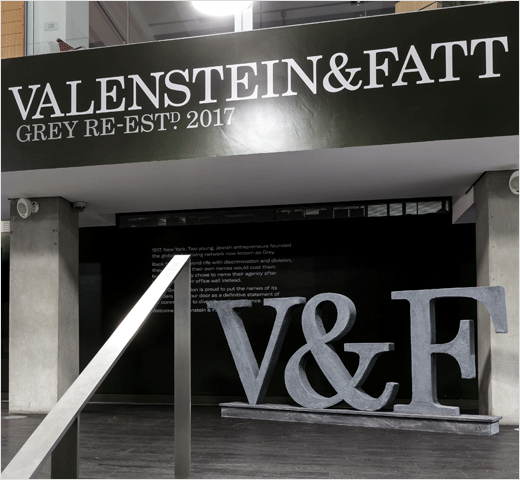
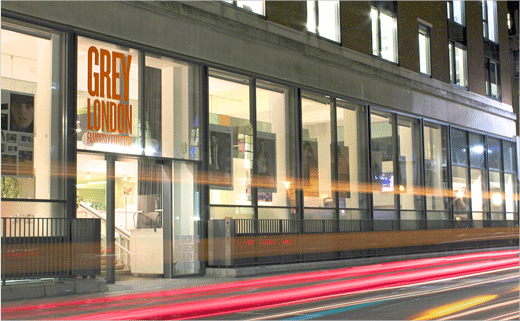
An installation of the Valenstein & Fatt logo set in solid concrete also features at the agency’s Hatton Garden offices in London.
Valenstein & Fatt
www.grey.com


