Soft Drink Brand Crystal Light Debuts New Logo and Packaging Design
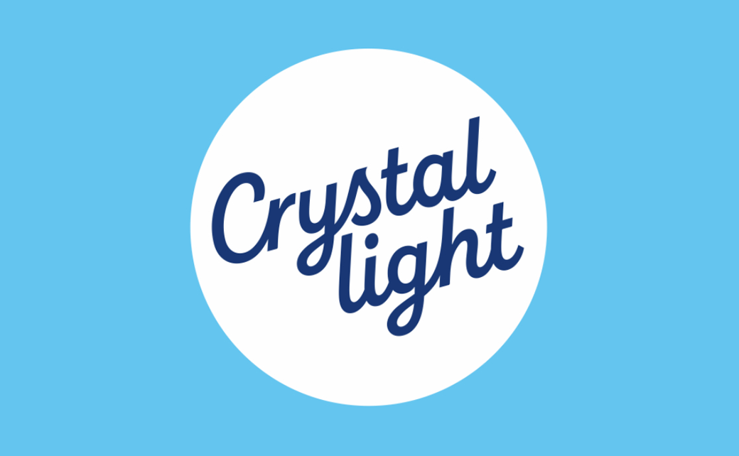
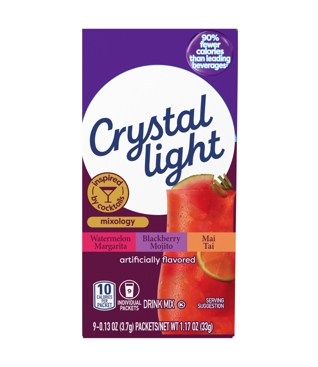
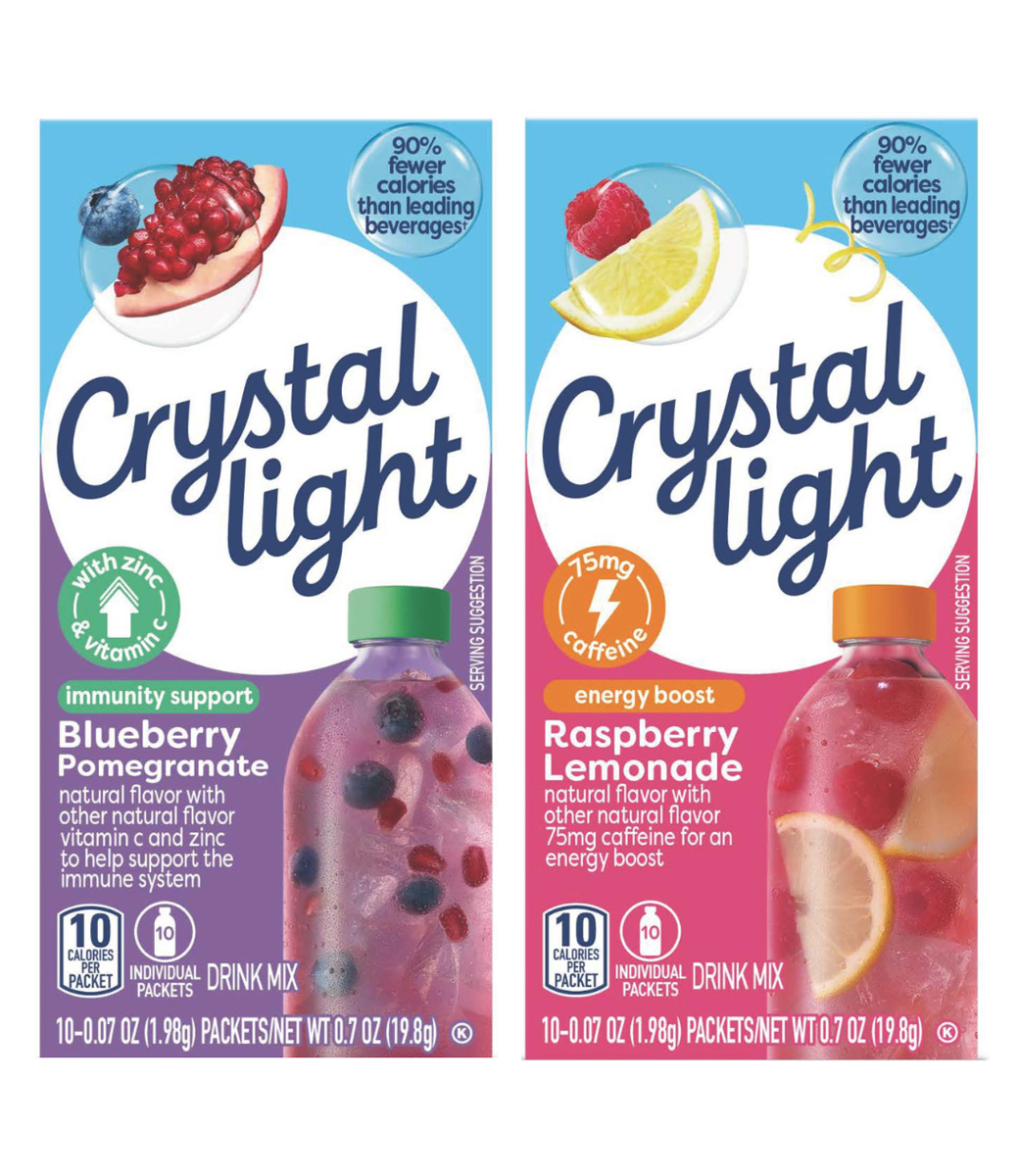
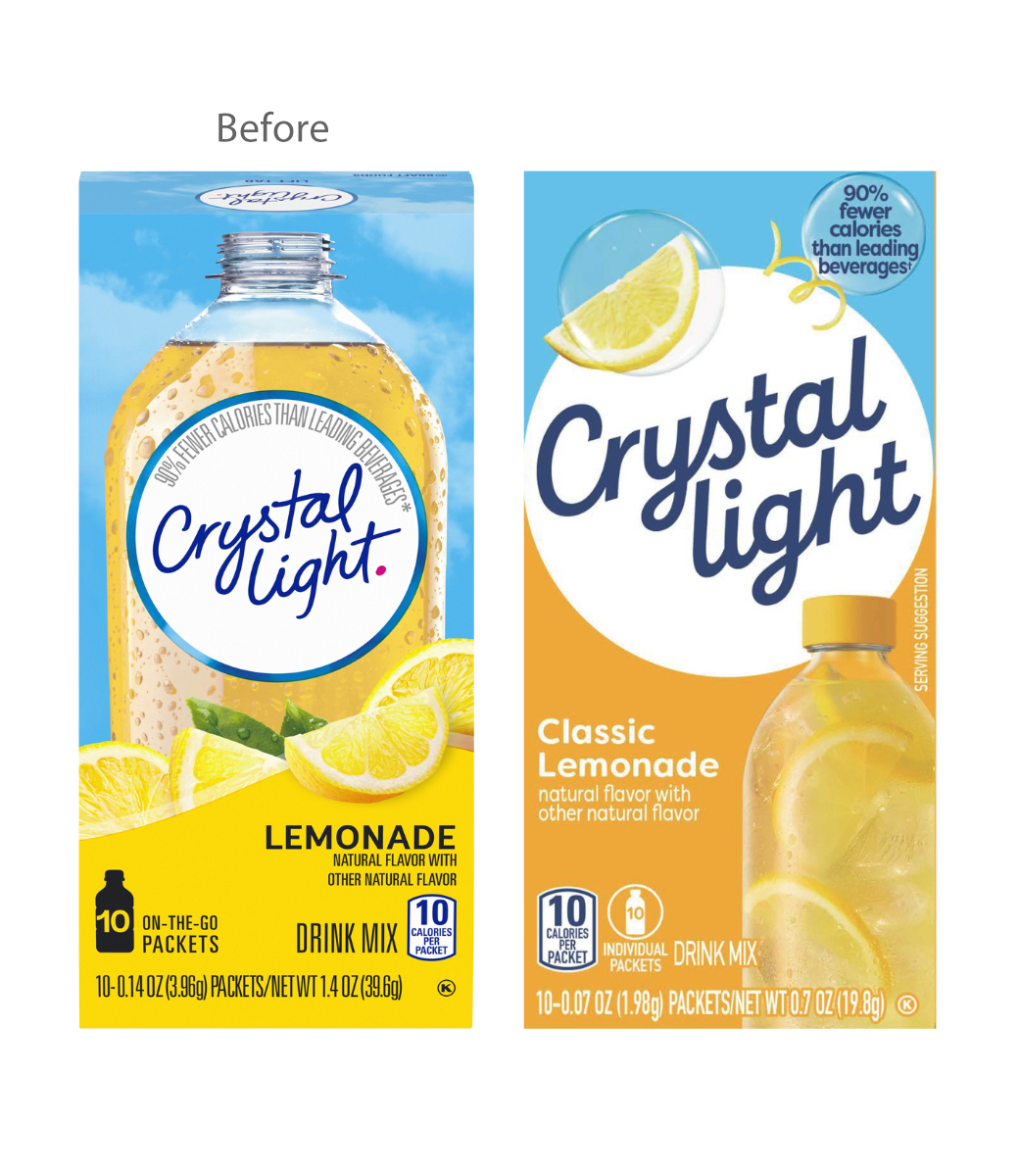
Soft drink brand Crystal Light has unveiled a redesigned look, complete with new logo, typography, photography, and packaging.
The brand refresh represents the American firm’s first logo change in over a decade.
“The new graphics display bright and radiant refreshment cues designed to enhance Crystal Light’s presence on shelf and highlight supporting ingredients. The change was inspired by consumers seeking products that are not only better-for-you but taste great,” says a spokesperson for the company.
As well as a visual overhaul, the zero-sugar brand is also debuting new product lines – dubbed “Mixology”, “Immunity”, and “Energy” – that feature cocktail-inspired flavours and ingredients such as zinc, vitamin c, and caffeine.
“We know consumers are increasingly seeking a wider variety of functional benefits, and as the longstanding leader in the powdered beverage space, we saw an exciting opportunity to innovate around our fans’ evolving preferences,” explains Jeremy Kross, a director at the Kraft Heinz Company, which owns Crystal Light.
Source: Crystal Light


