Digital Whiteboard Platform Mural Reveals New Logo and Branding
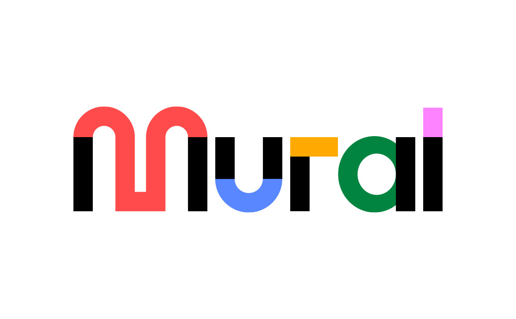
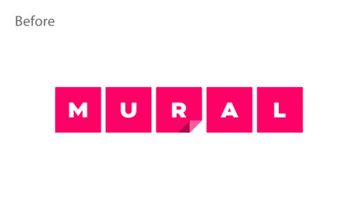
Digital whiteboard platform, Mural, has unveiled an all-new logo and brand identity.
Said to be the outcome of a company-wide effort taking “many months”, the refresh has been completed in collaboration with design consultancy, COLLINS.
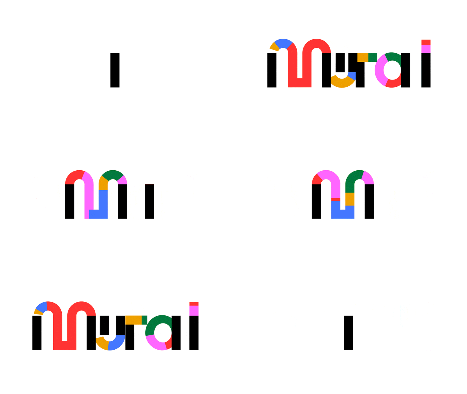
“You can’t miss Mural’s new logo. It’s strong, provocative, and rooted in concepts of structure and play. Those foundational black bars you see on either side of the ‘M’ open up a colourful space with plenty of room for imagination, exploration, and movement,” says the company’s senior vice president of design, Kit Unger.
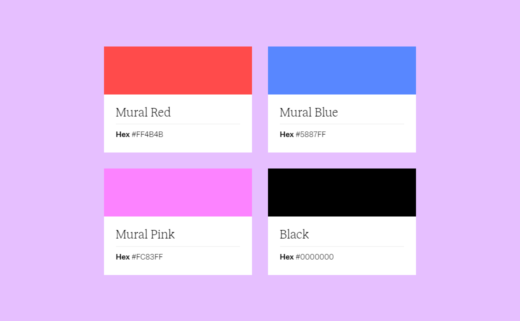
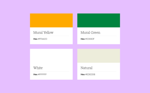
The refreshed colour palette is also described as being “optimistic and energetic” while changes to hue, saturation, and brightness are further designed to improve colour contrast.
Additional details include new typography, illustrations, voice, tone, and the brand promise, “Intentional practices. Extraordinary work.”
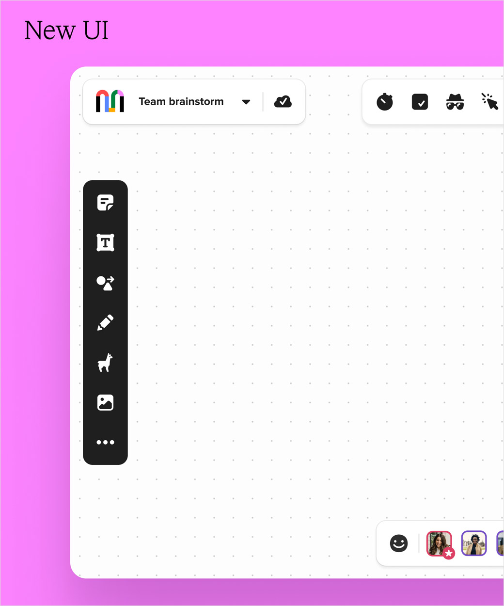
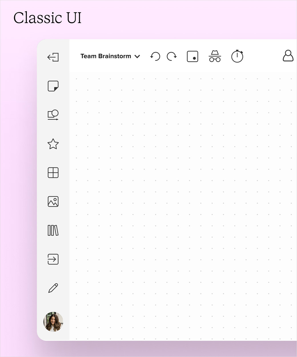
The new look also stretches to a new user interface (UI) and dashboard.
“The new UI is modern looking, fresh, and playful with rounded corners, new icons, colours, animated moments, drop shadows, top left text alignment on sticky notes, and more,” reckons the design team.
Members of Mural’s accessibility team also worked with the Canadian Broadcasting Corporation to improve keyboard and screen reader support within the canvas for those with visually impairments.
“At Mural, everyone is so driven to make their products remarkable, and their customers happy – the enthusiasm is contagious. We became one uncommonly productive and joyful team thanks to them and the Mural tools we get to use every day,” comments Joseph Han, creative director at COLLINS.
Source: Mural


