BrandOpus Designs New Logo and Identity for Investment Platform – Trive
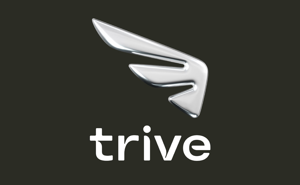
BrandOpus has created the new logo and identity system for multi-asset investment platform, Trive.
The new look is part of rebranding initiative that aims to set the Netherlands-headquartered firm apart from its competitors as well as to help it attract new investors.
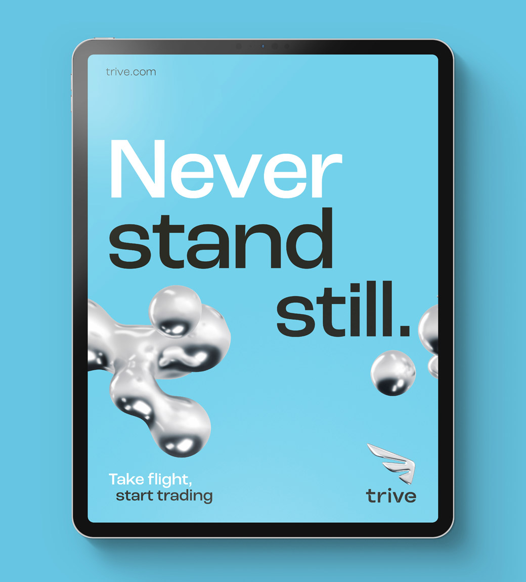
“Leaning on the insight that trading is a form of entrepreneurialism for the target audience, BrandOpus based the brand narrative of ‘never standing still’ around the opportunity for Trive to develop, progress and evolve. An idea that reflects a state of constant motion and adaptability,” says the agency.
Adding: “The new brand identity and visual system reinforce the design thread by elevating the symbolism of Mercury as the inspiration for the brand identity. As the god of trade, he is the vision of perpetual motion reflected in the brand’s logo, but the natural element mercury provides the metallic colour palette allowing for the Trive brand to come to life.”
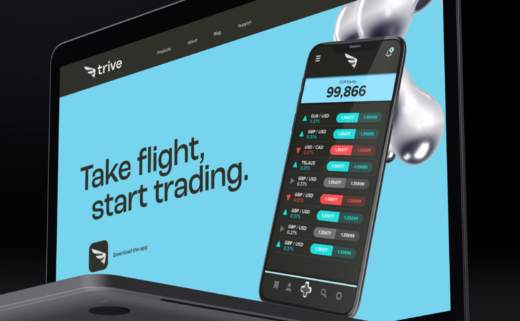
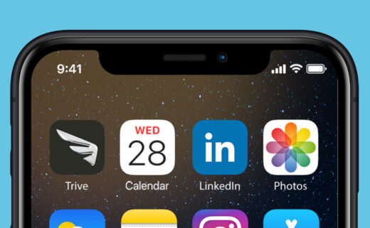
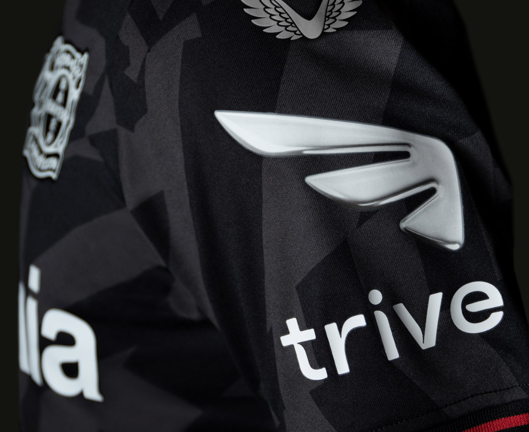
In direct contrast to the current trend for flat design, the new logo takes on a three-dimensional quality, while the accompanying wordmark has been developed in collaboration with type foundry, Colophon.
“The investment category is quite cluttered so, as a totally new brand, we wanted Trive to behave a bit differently to stand out. As well as being visually disruptive, we wanted to build a deeper meaning and mythology. The layers of storytelling for the brand give it a sense of stature and credibility not normally associated with start-up brands,” comments Daniel Wegrzyn, business director at BrandOpus.
“But the idea needed to be motivating as well. For the customers Trive is aiming to reach, trading is a process, not an end goal. We wanted to reflect a shared attitude of learning, growth, and evolution. ‘Never Standing Still’ isn’t a promise, it’s a mindset that,” he adds.
Editor’s Note: Motion graphic elements can be viewed here.



BrandOpus
www.brandopus.com


