Heavenly Creates New Look for Neuromorphic AI Firm – BrainChip
Brand consultancy Heavenly has created the new logo and visual identity for BrainChip, said to be the world’s first commercial producer of neuromorphic IP.
The American firm’s first-to-market ‘brain-inspired’ processor, dubbed “Akida”, is claimed to process data with greater efficiency and accuracy than traditional hardware.
“The brand we inherited was a classic technology play: heavy on logic, light on magic. Recognising the need create more engagement from prospects at the customer level, we flipped the emphasis to focus on benefit. So less about the technology, more about what it can do for you, as the saying goes,” says Richard Sunderland, project lead and CEO at Heavenly, which was engaged by BrainChip in January of 2022 to not only reimagine the visual expression of the brand, but to also highlight the driving forces behind it.
“Upon joining the executive team at BrainChip, a key priority was to reframe and rebrand the company”, adds Jerome Nadel, CMO at BrainChip. “Heavenly guided us through the process of codifying our existential truth to simplify the articulation of what we do, and why it’s important. The complexity of neuromorphic computing was simplified to learning to do less, and essentiality.”
“Strong branding is really about sacrifice, especially in our attention-starved world. Stripping away all but the essentials to really capture people’s imaginations. The concept of sacrifice chimed perfectly with BrainChip, given that’s technically true of what their product delivers. In very simple terms, all we really did was help their brand better reflect their product,” further comments Marie-France van Heel, strategy director at Heavenly.
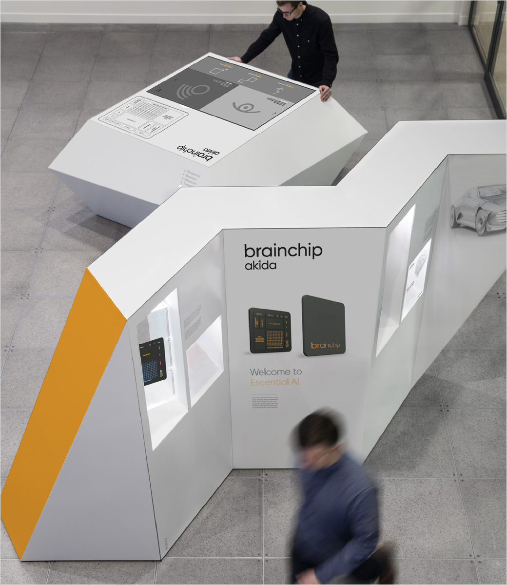
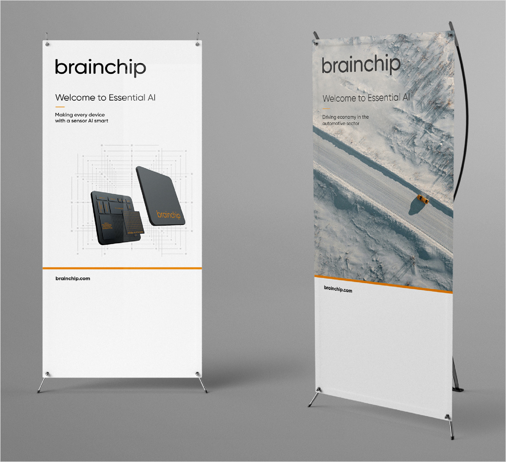
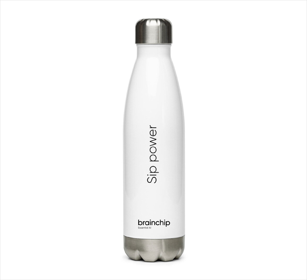
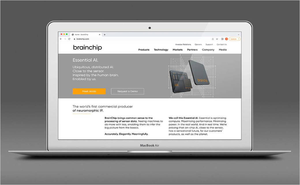
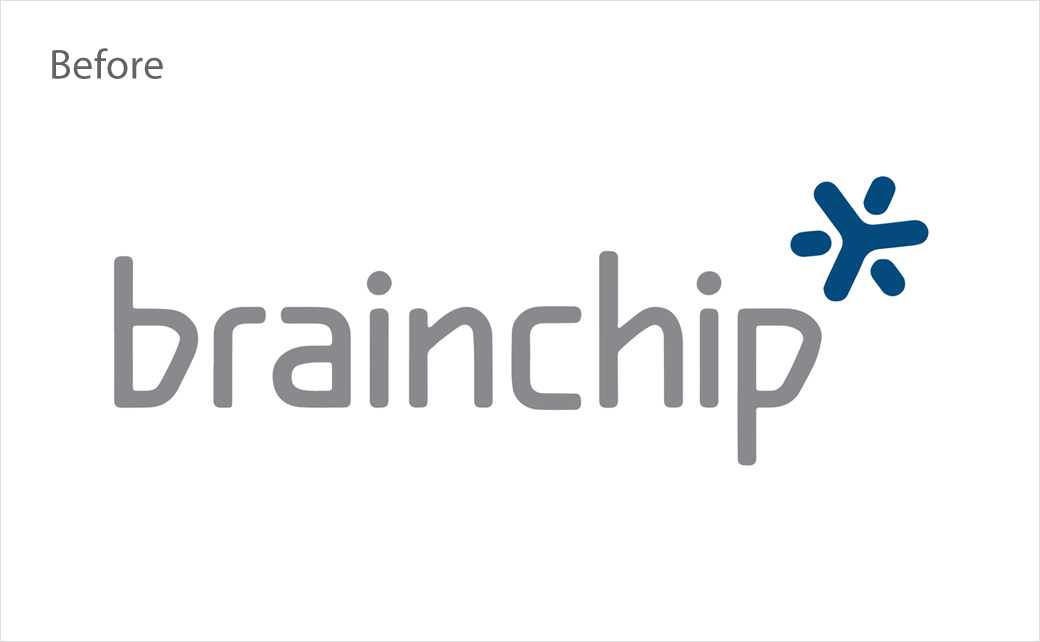
In its latest guise, the BrainChip brand does away with the “busy” wordmark of old, swapping it for a simpler version that can also be locked up with the “Essential AI” tagline, or with a simplified wordmark for the brand’s halo product, Akida.
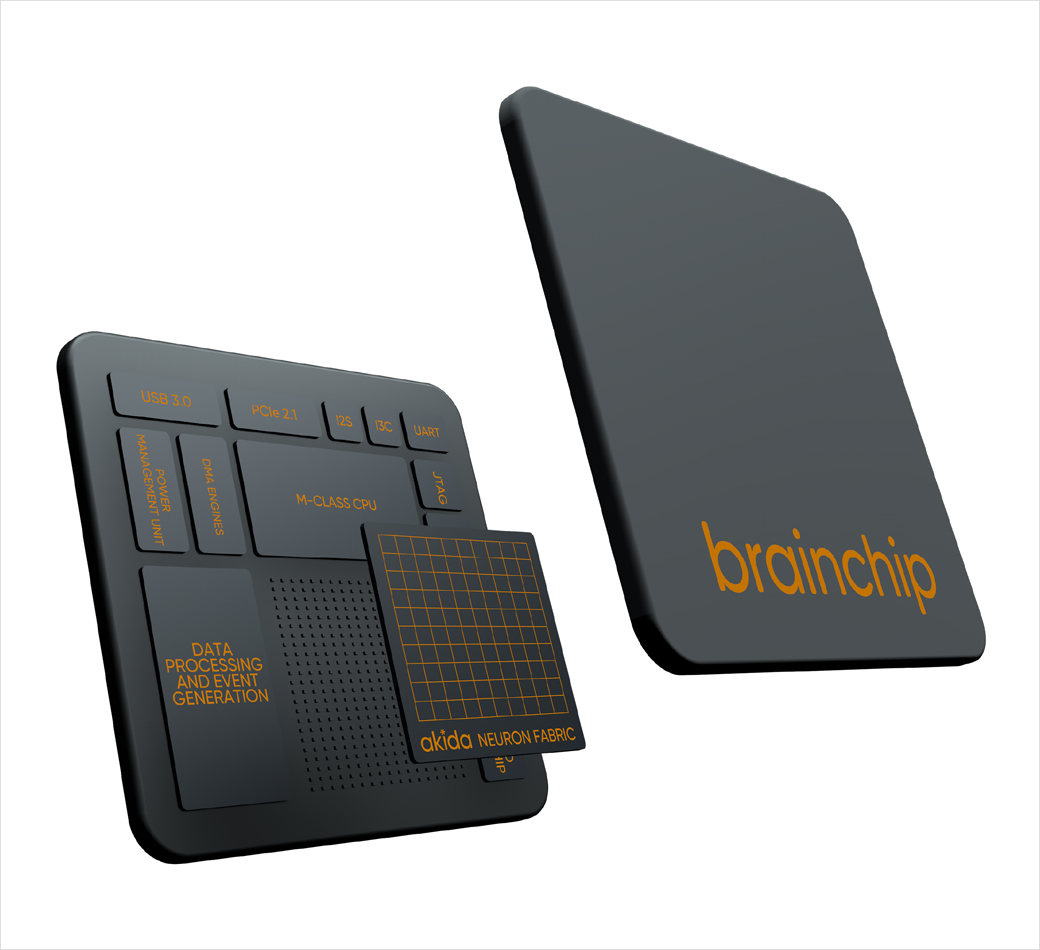
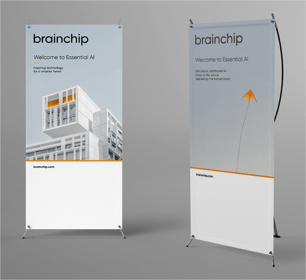
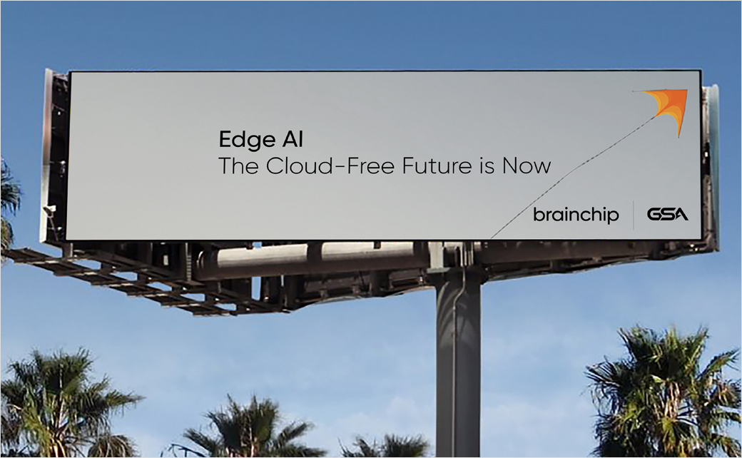
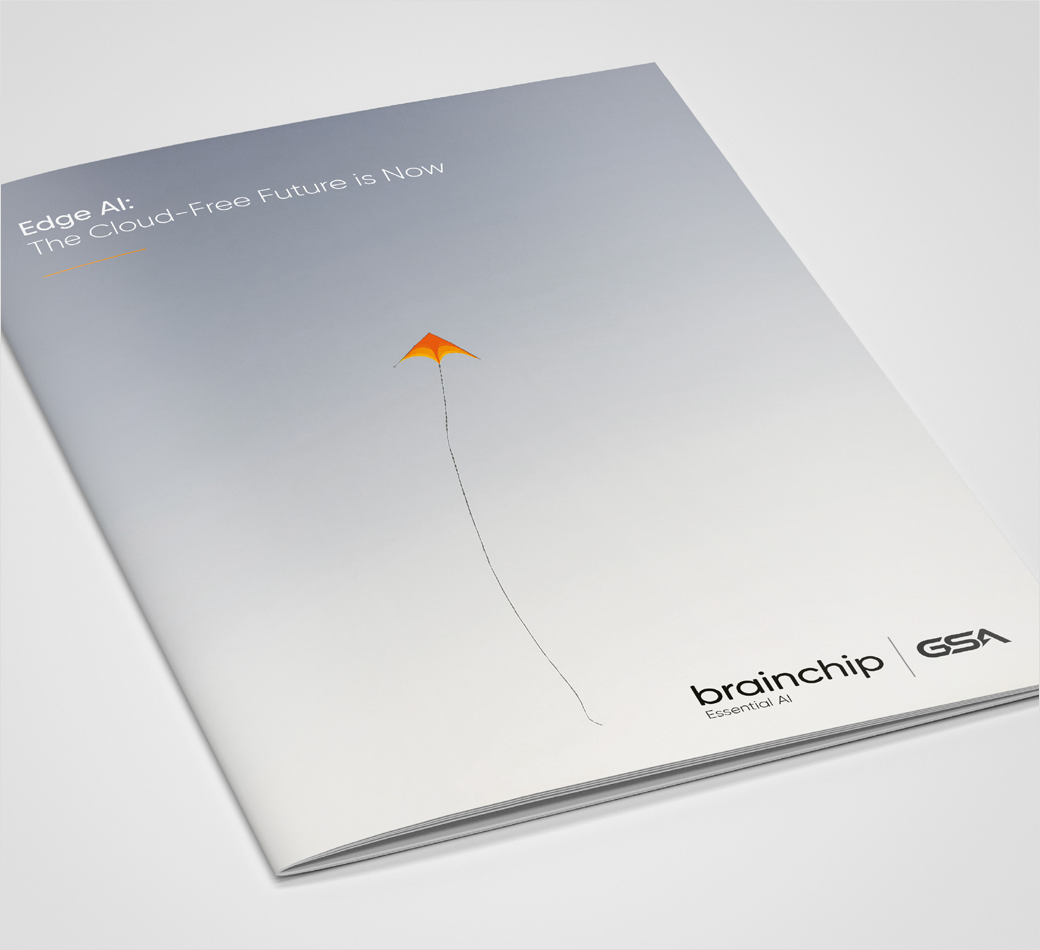
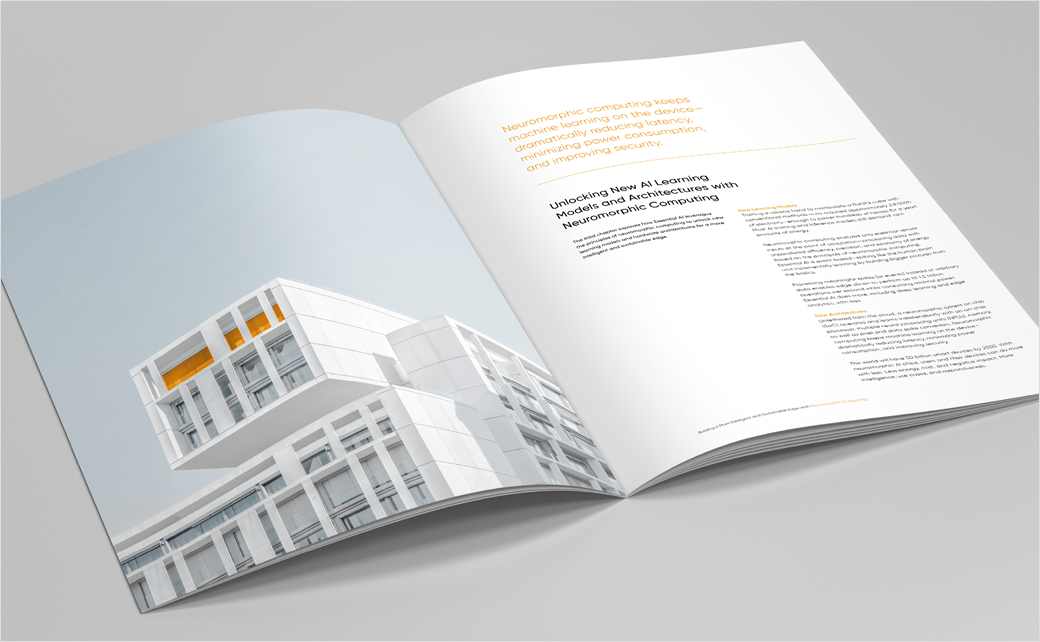
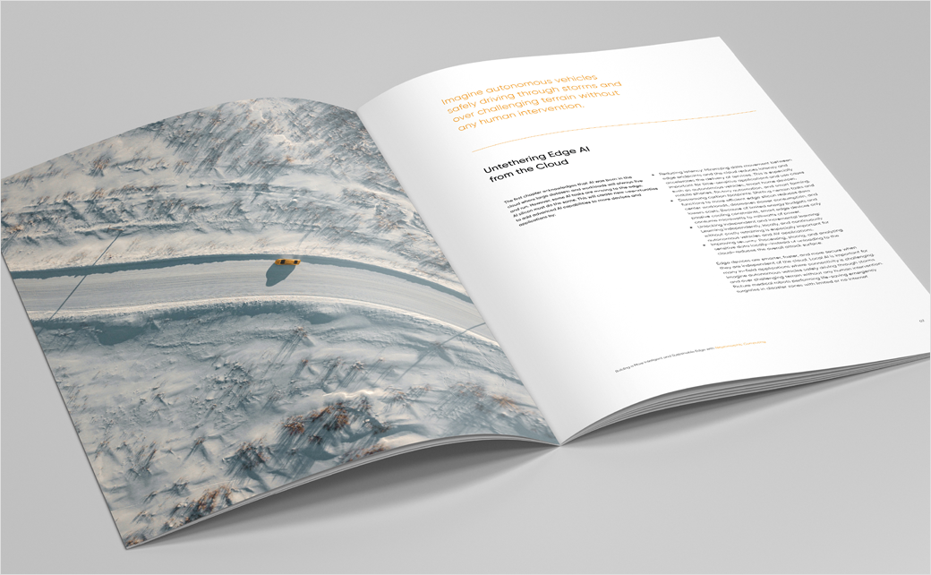
Additional details include a new colour palette; whereas previously the brand used dark navy grey, the designers at Heavenly opted for greys and blacks, mixed with a dash of orange for emphasis.
The revised colour palette is subsequently reflected in the new brand imagery, which uses pops of orange to highlight key elements.
To draw attention to the Akida chip, Heavenly’s design team also created a bespoke neuron fabric graphic to be used as a background element.
Heavenly
www.heavenly.co.uk


