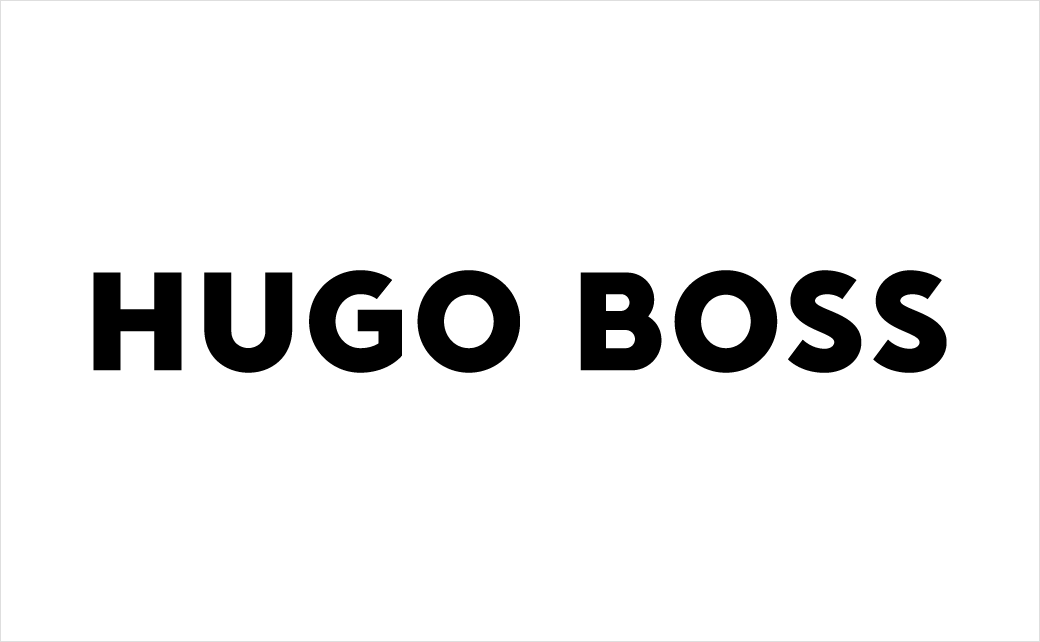
Hugo Boss Rebrands, Updates Logo Design
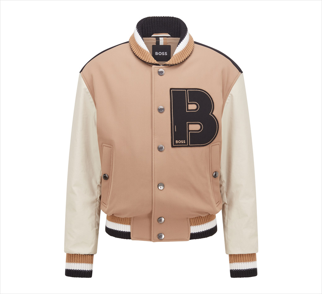
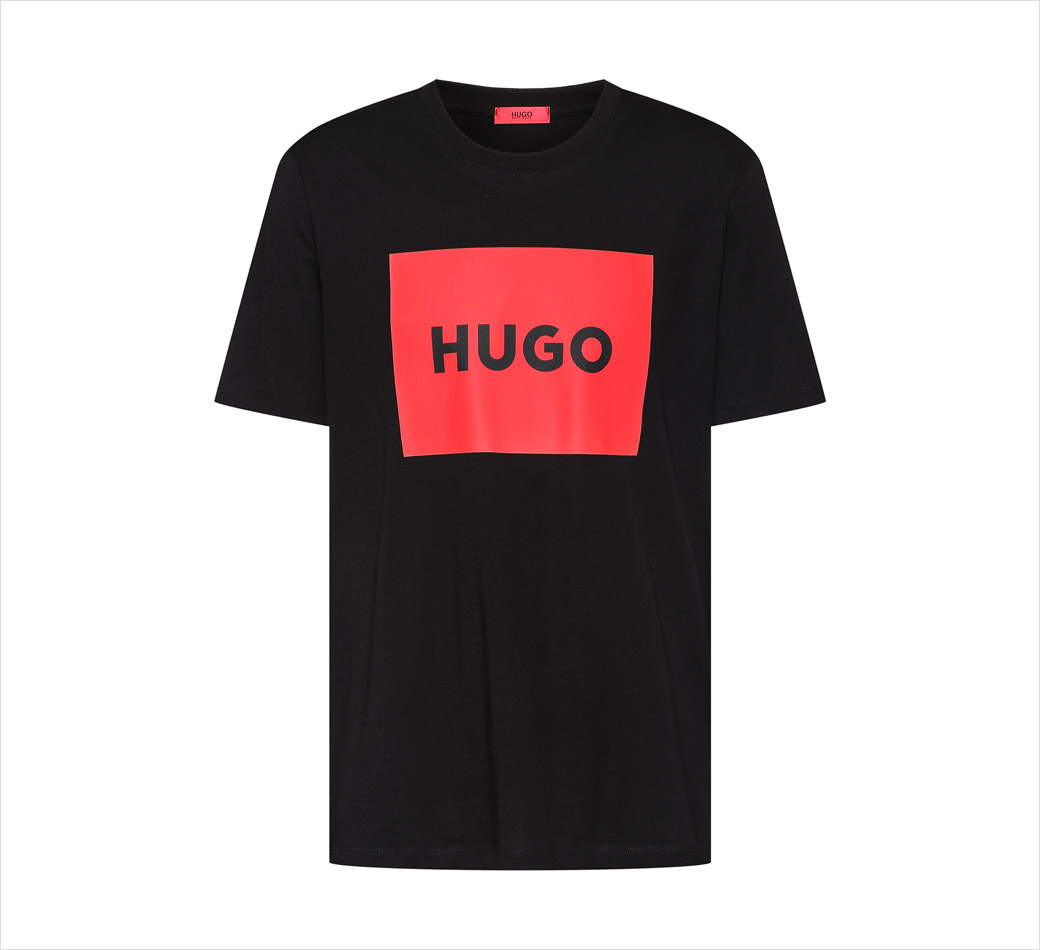
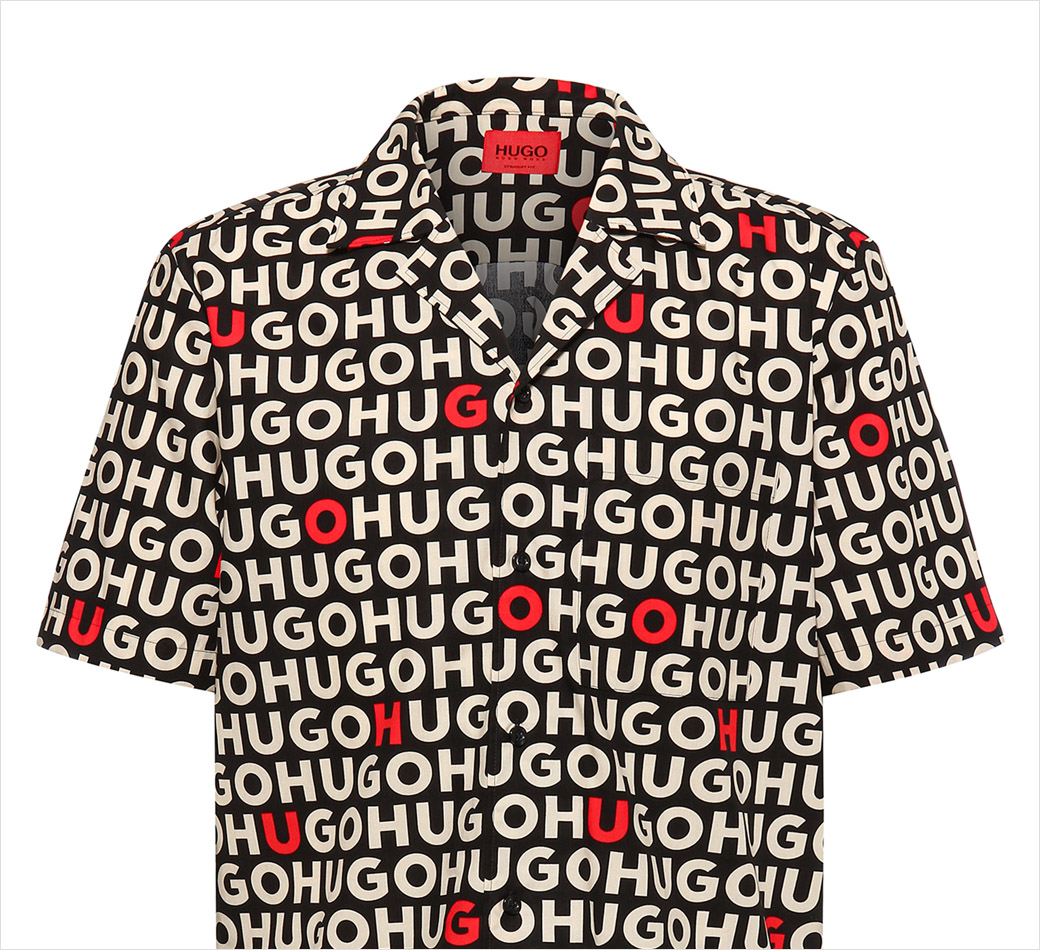
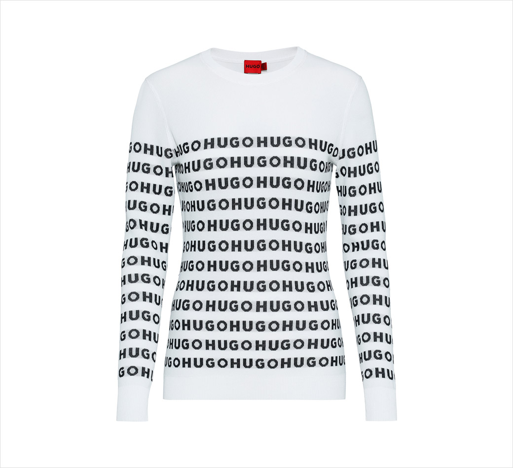
Mid-luxury fashion label Hugo Boss has revealed a facelift that introduces a new logo design along with a rebrand across all consumer touchpoints.
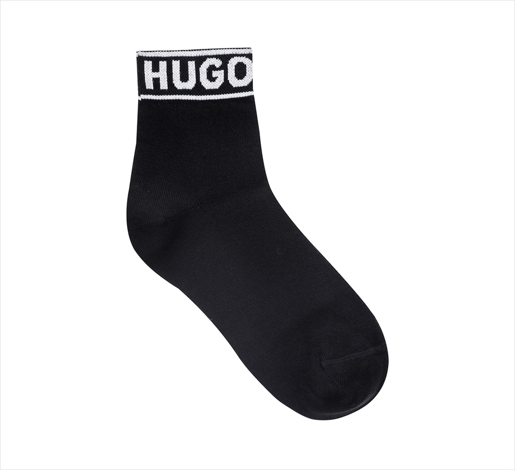
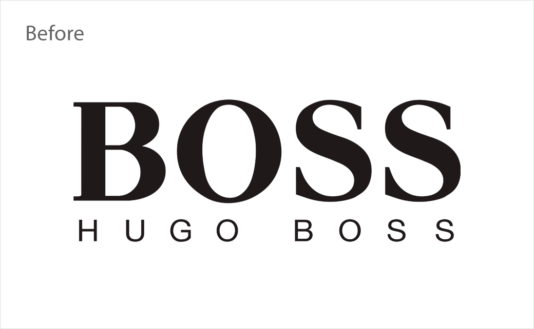
Technically encompassing two brands, Boss and Hugo, the wordmark has been updated for the first time since a previous adjustment that was carried out back in the early 1990s.
“The new logos have been designed to resonate well with the increasingly global pool of consumers, many of whom discover brands via social media and digital channels. The facelift of both logos with a bolder typeface and a more contemporary look, as well as a more impactful visual experience, works particularly well on digital applications,” says company CEO, Daniel Grieder.
The new look forms part of Hugo Boss’ “Claim 5” business growth strategy, which aims to further differentiate the two sister-brands, with Boss envisaged to target 25-40 year-old Millennials and Hugo intended to pursue the even younger Gen Z crowd.
“With the branding refresh,” further explains Grieder, “we are ushering in an entirely new era for Boss and Hugo. It is our aim to excite new and younger target groups and turn them into fans of our brands.”
The updated identity started officially rolling out at the end of last month with the launch and introduction of the fashion brand’s Spring/Summer 2022 collection.
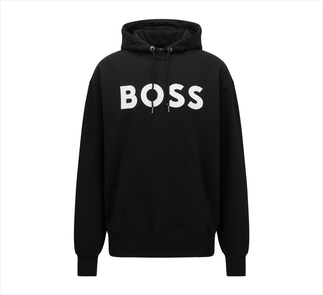
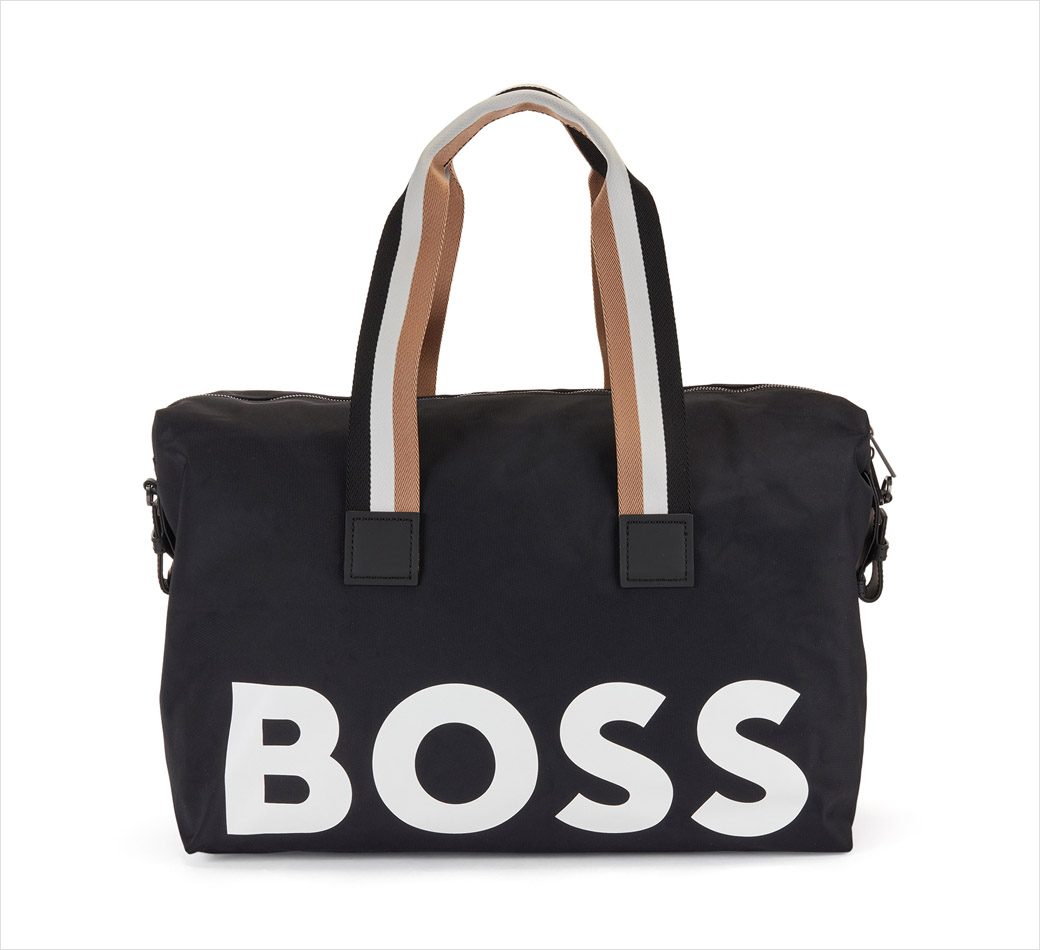
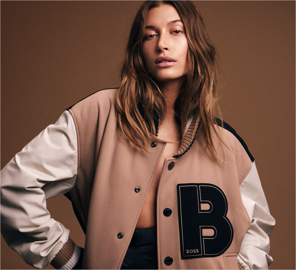
Source: Hugo Boss


