Sanofi Reveals New Corporate Brand and Logo
French pharmaceutical giant Sanofi has unveiled a new look, which brings all of the company’s various brands under a single, common identity for the very first time.
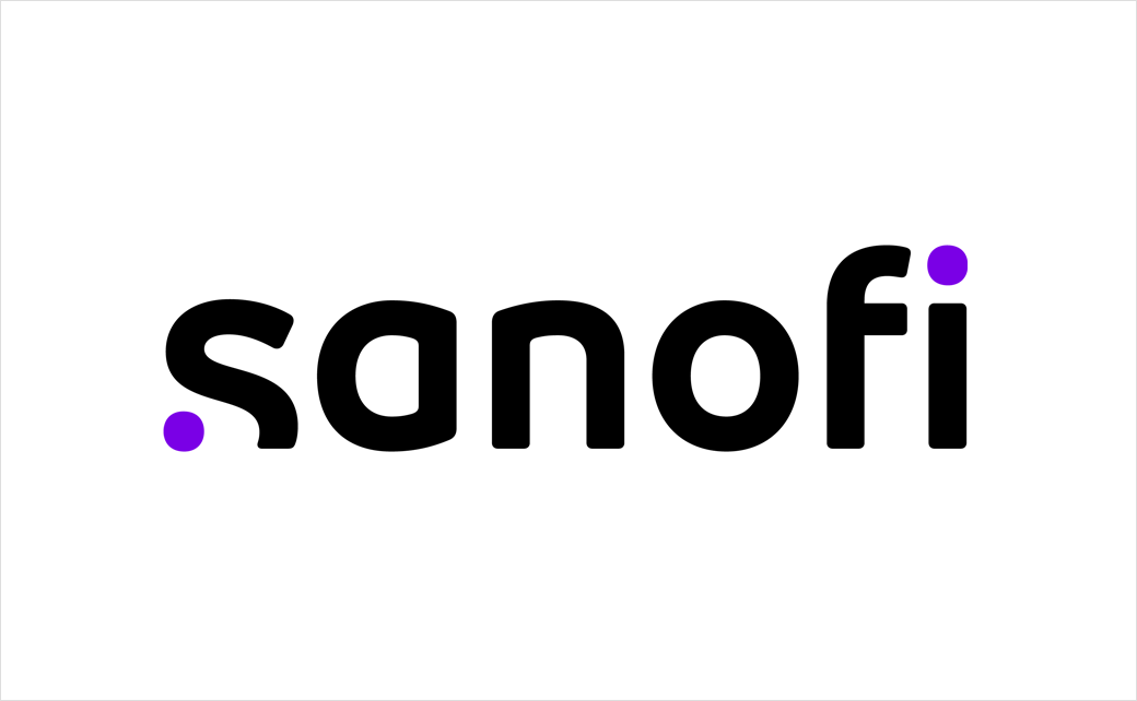
The new logo design is claimed to be a representation of Sanofi’s “Play to Win” business strategy that was initiated back in 2019.
“The two purple dots embody the scientific journey between a starting point – the curiosity of questioning the status-quo and wondering “what if?” – and a finish line – the eureka moment where innovative solutions are unlocked to impact people’s lives,” says the Paris-headquartered company.
“As we approach the half century mark of our company’s existence, we have undertaken the most important transformation and modernisation in our history,” further comments the company’s CEO, Paul Hudson. “In 2019, we launched our Play to Win strategy, which focuses on applying our platform for innovation to produce first- and best-in-class treatments and vaccines. Our new brand is a natural and important next step in this journey and represents the integrated way in which the company will work to achieve our shared ambition to transform the practice of medicine.”
“With our new brand, we have sought to provide our people, our partners, patients and healthcare professionals with a clear and strong understanding of who we are and what we are set to achieve,” adds Josep Catllà, head of corporate affairs at Sanofi. “Sanofi’s attitude is humble, authentic – and a little bit unconventional too. We believe that our new brand and logo carve out a unique space in the healthcare industry that perfectly represents our new purpose to chase the miracles of science to improve people’s lives.”

Source: Sanofi


