wilko Reveals New Branding and Packaging by Free The Birds
British high-street retail chain wilko has unveiled a new brand identity with design by creative agency, Free The Birds.
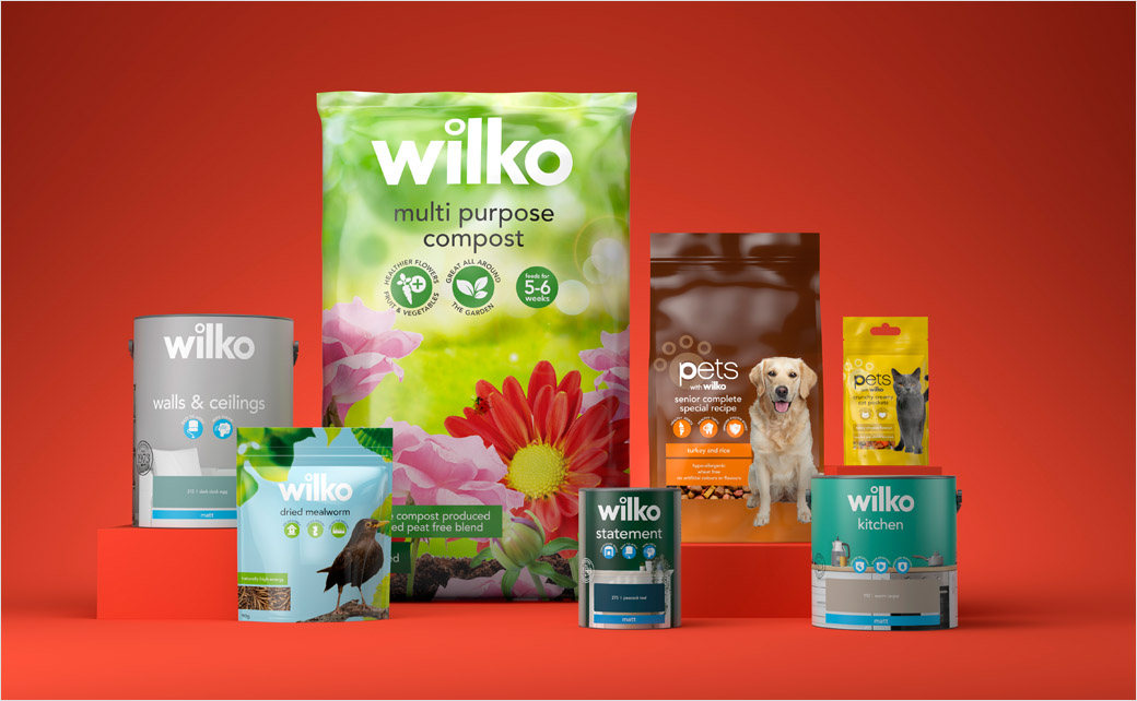
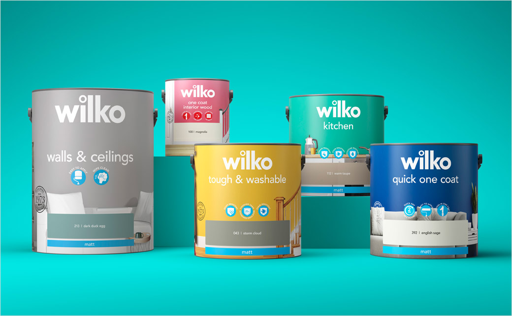
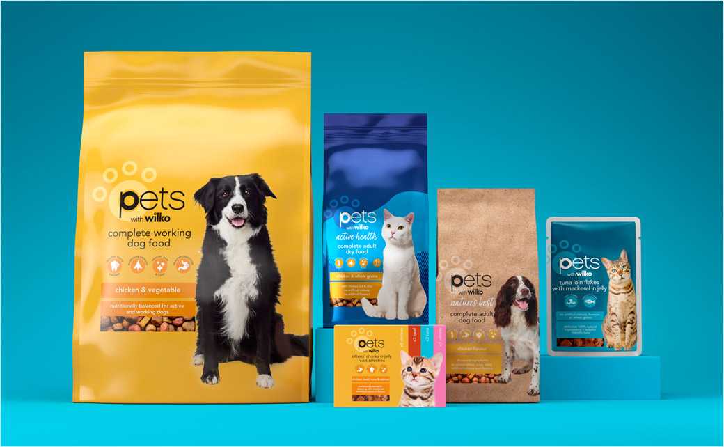
Beginning with wilko’s heritage paint and pet ranges, the brand re-fresh is part of a three-year partnership that will see Free The Birds’ designs rolled out across the company’s entire portfolio.
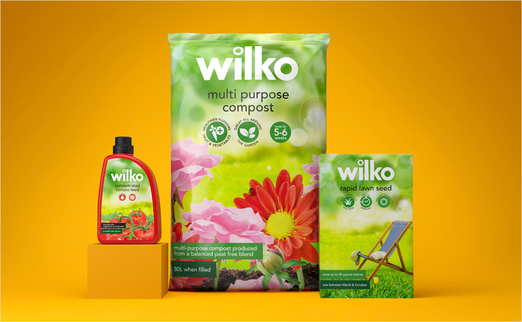
The new look, which encompasses brand architecture, packaging design, typography, illustration, tone of voice, and photography, unifies wilko’s own lines under the same identity for the very first time.
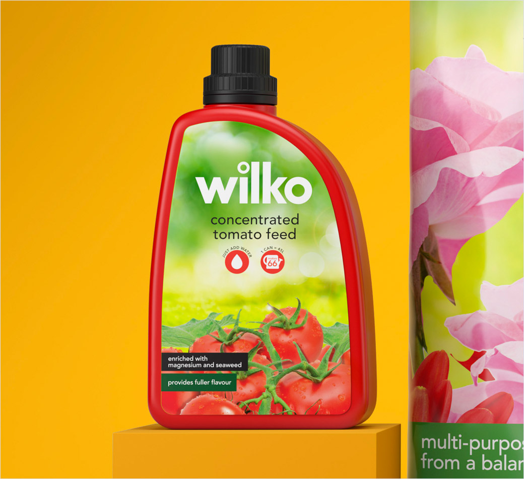
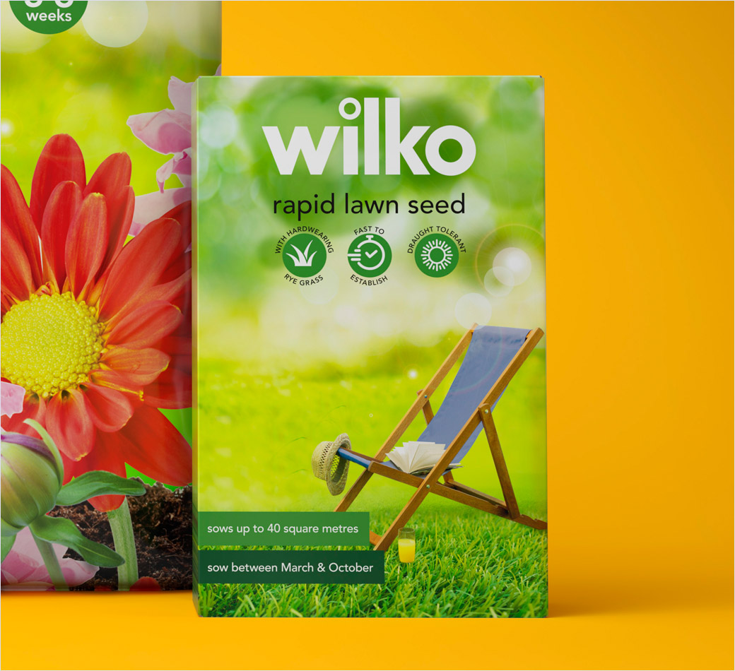
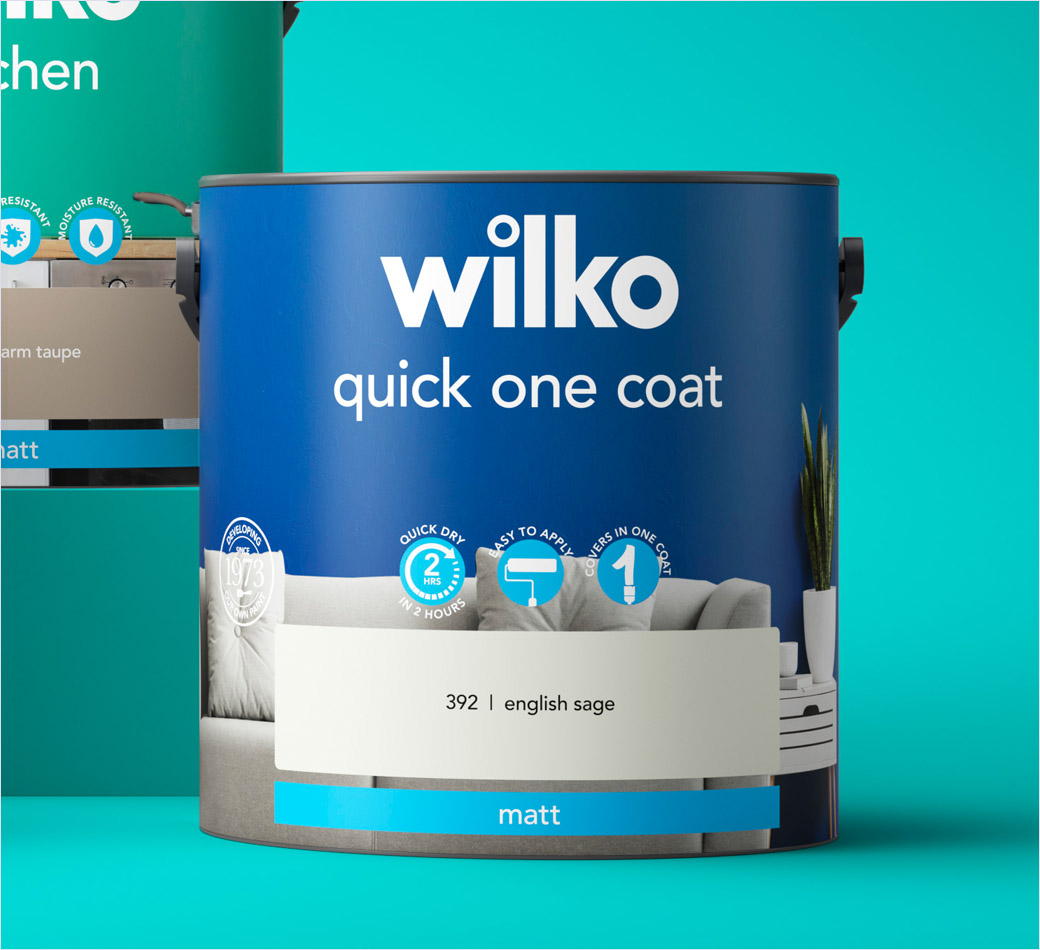
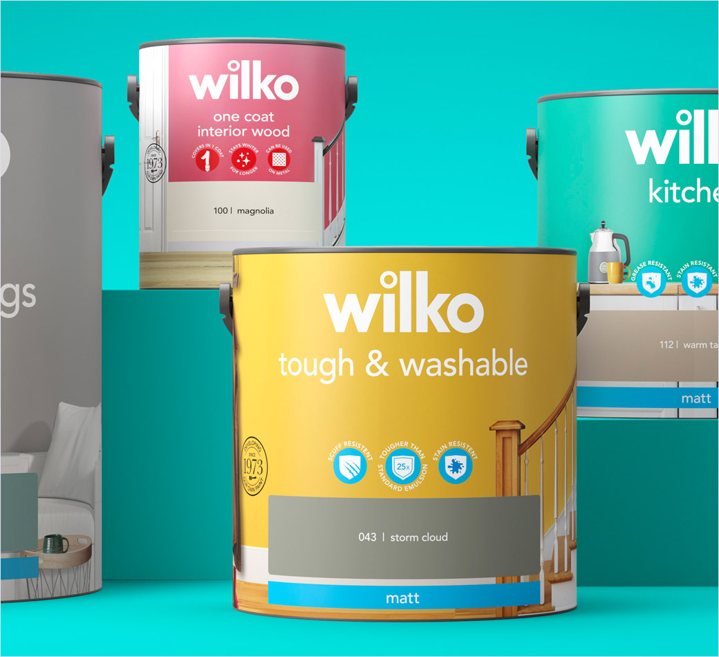
The refreshed packaging design will from now on feature wilko’s logo at the top, followed by the product name below, which the designers claim makes the brand architecture more consistent and easier to navigate.
Other elements of the design include the introduction of new iconography on the front-of-pack to call out the product’s unique selling points (USPs), as well as navigation bars at the bottom “to aid simplicity and browsing on the physical and digital shelf”.
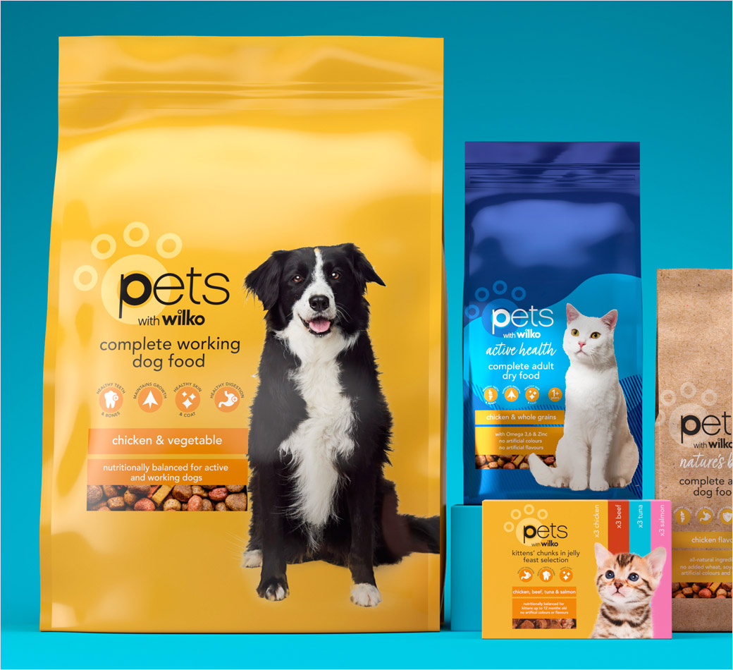
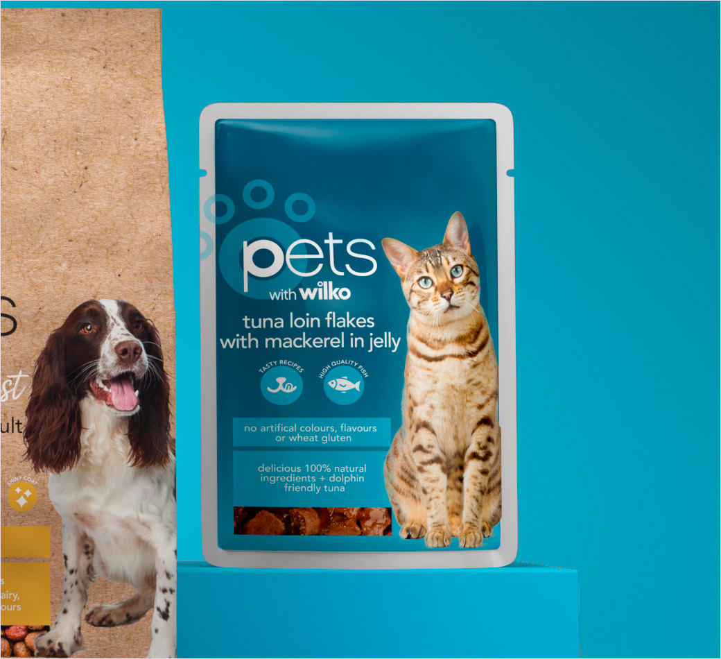
Free The Birds has also developed a new label strategy to differentiate the heritage wilko products from specific ranges such as ‘pets with wilko’ and ‘care with wilko’,while the classic tittle (“.”) that features in wilko’s main logo has been replicated across all the category labels, “to convey a sense of unity with wilko’s consumer set”. The updated visual strategy will be implemented across the nine labels, totalling approximately 15,000 stock-keeping units (SKUs).
“With a portfolio of this size, we had to create a consistent brand thread across varying labels that is delivered simply and effectively. We developed three overarching design structures ‘Core’, ‘Core Light’, and ‘Core Plus’ to help customers distinguish the different ranges. For the Paint and Pet labels, we introduced a coherent colour scheme and photography to offer a level of intimacy with consumers, making wilko feel both engaging and ownable in a crowded category,” says Free The Birds partner and creative director, Nick Vaus.
Adding: “Our challenge was to elevate and evolve wilko’s brand identity to reflect its values and product attributes of durability, ease of use, performance and accessibility. By creating a layered design system with a specific colour palette and messaging on pack, we ensured that the new branding works across the vast range of structures and substrates within wilko’s full portfolio, while helping customers make the right choice and simplifying the brand’s internal processes.”
Free The Birds
www.freethebirds.com


