Autodesk Unveils New Logo and Identity
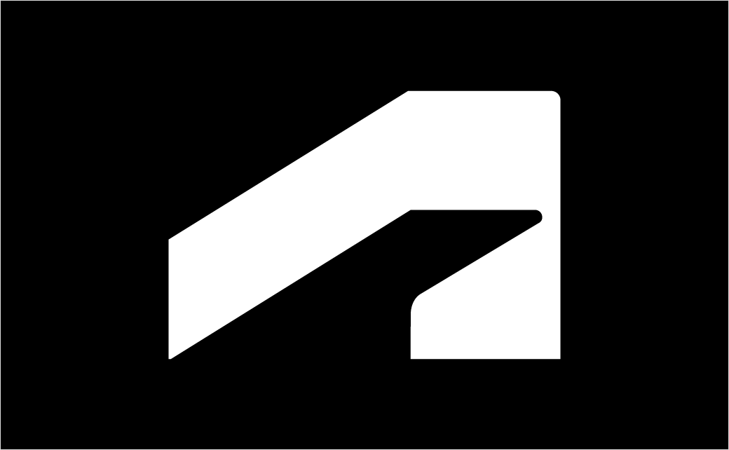
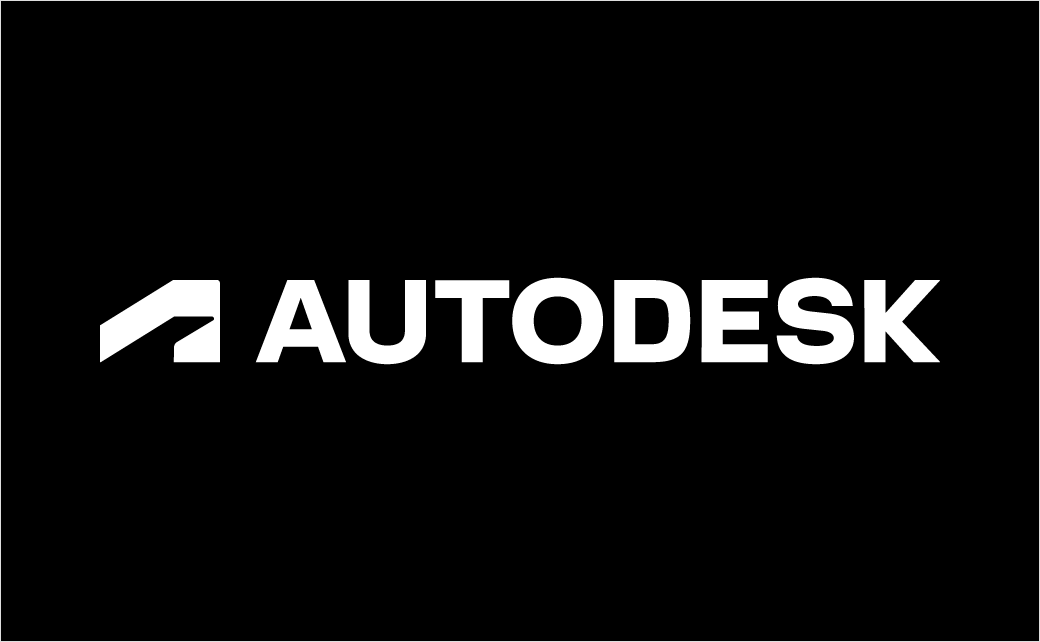
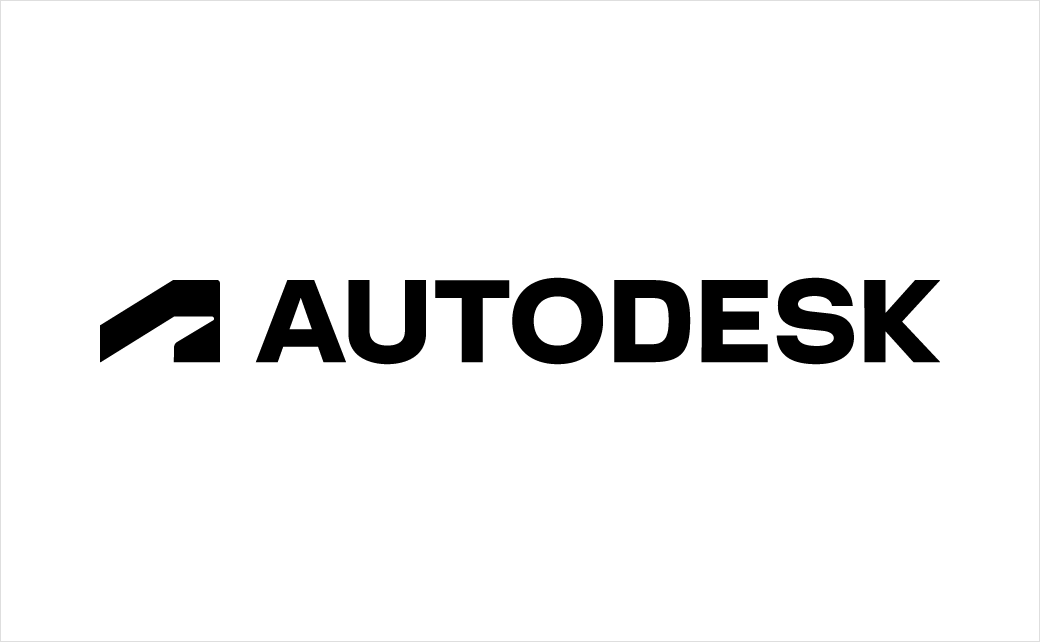
Software giant Autodesk has revealed an all-new look and feel, including a new logo, colours, and imagery.
The change is said to be the first of several “bold moves” that the company plans to make in order to reimagine the Autodesk brand, which serves as the umbrella band for a whole host of computer-aided design (CAD) software programmes that are used throughout the design and engineering industries, as well as other more entertainment-oriented 3D modelling software products such as 3ds Max and Maya that are principally used for game development and creating film visual effects.
“Dynamic, modern, and memorable, the new Autodesk logo represents action, momentum, and a clear direction toward the future. It’s a strong, simple logo that illustrates a brand synonymous with doing,” says the American firm.
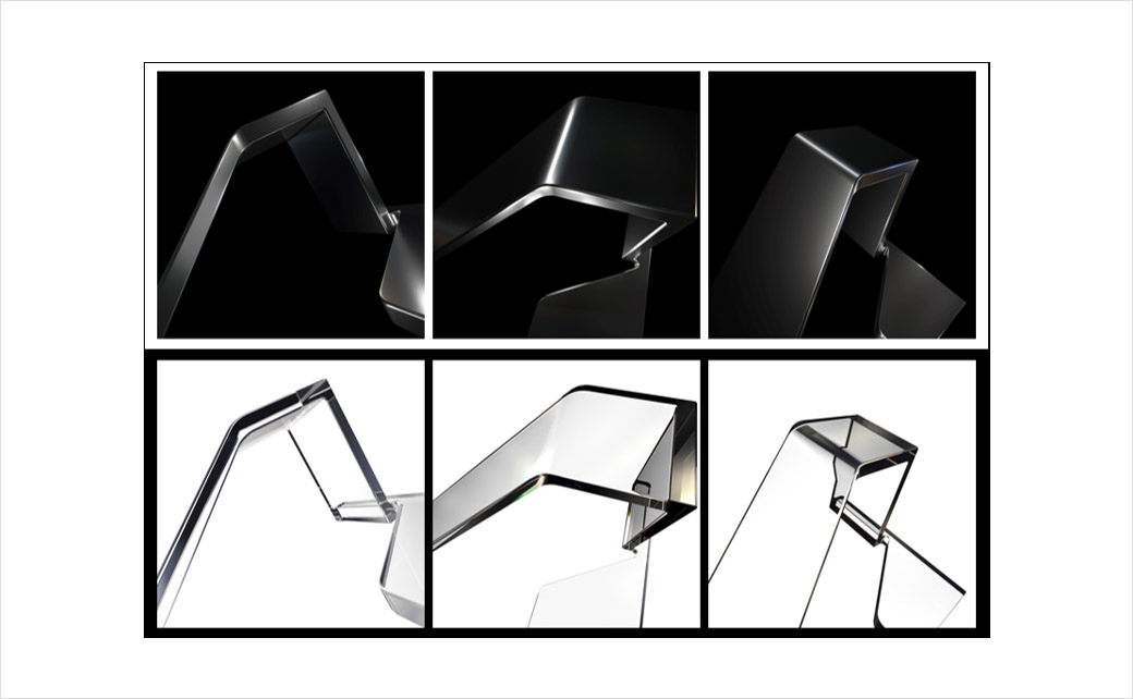
The new brand imagery features abstract 3D geometric forms created by focusing on parts of the symbol in the new logo.
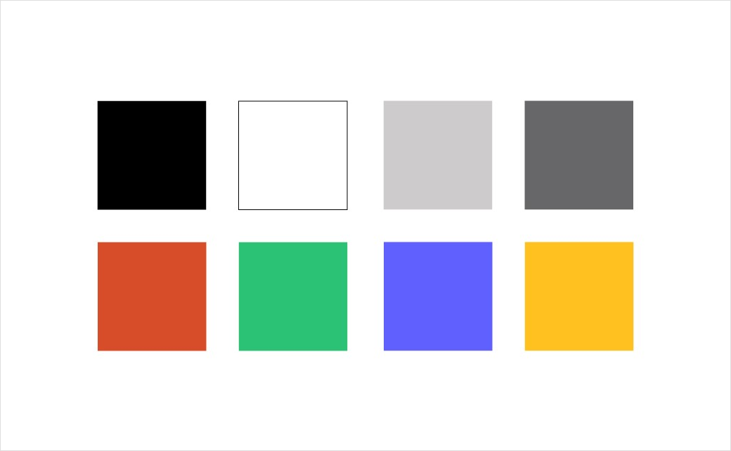
In addition to the new logo, the company has made changes to its colour palette. For example, the old blue-green combination has been updated with “clean and contemporary” primary colours of black and white, which are then accompanied by two new greys as well as four accent colours, namely, “clay”, “plant”, “iris”, and “gold”.
Autodesk says it will unveil additional elements of its reimagined brand in the near future, including new product identities and icons, which the company hopes will help to visually differentiate its range of products across industries and make other icons more easily distinguishable.
Source: Autodesk


