Inter Milan Unveils New Logo and Identity
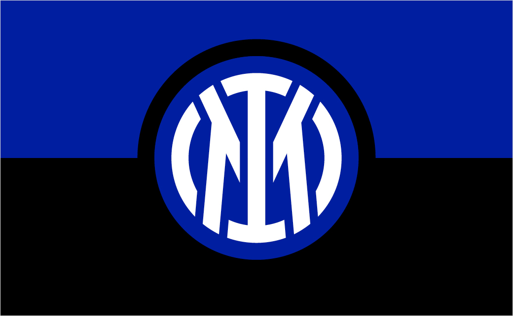
Italian football giant Inter Milan has launched its new logo and visual identity, which will be used as of the 2021/22 season.
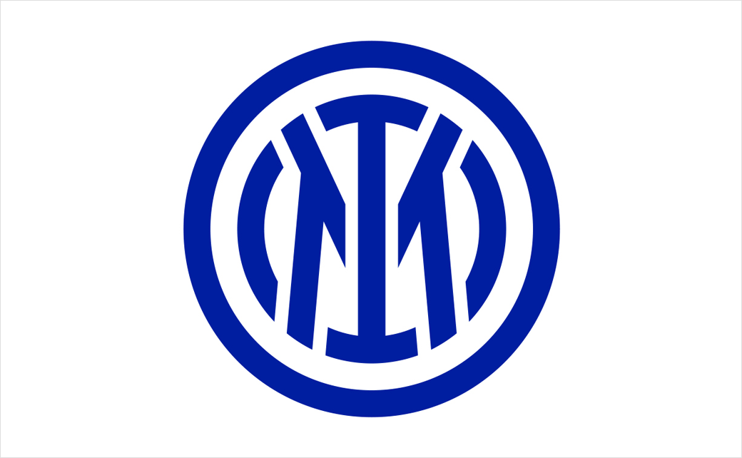
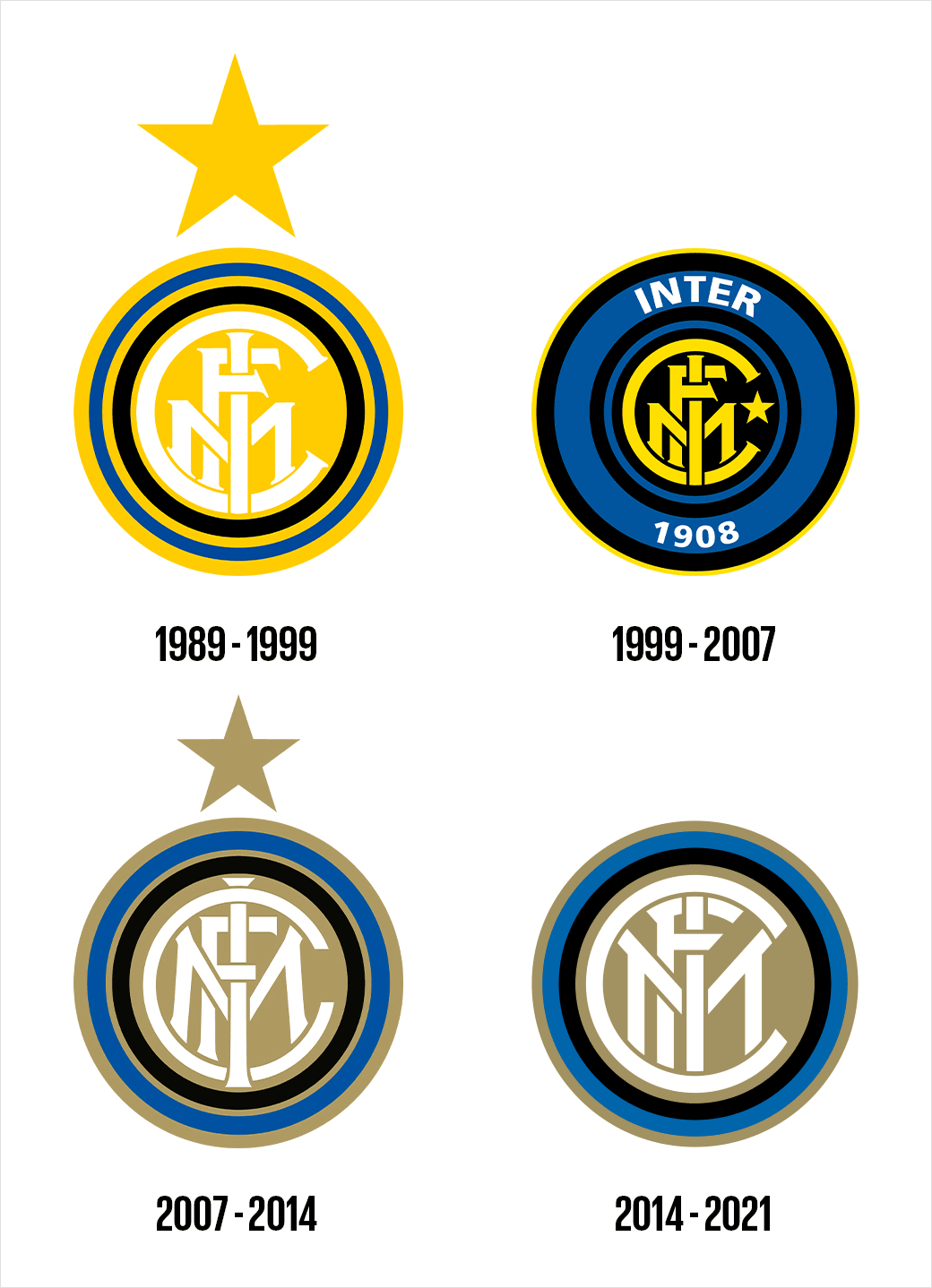
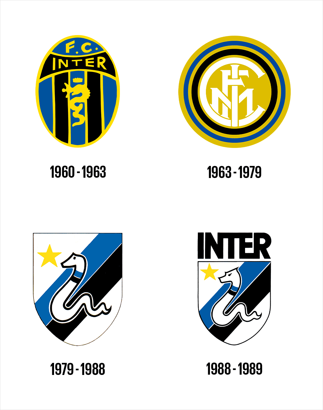
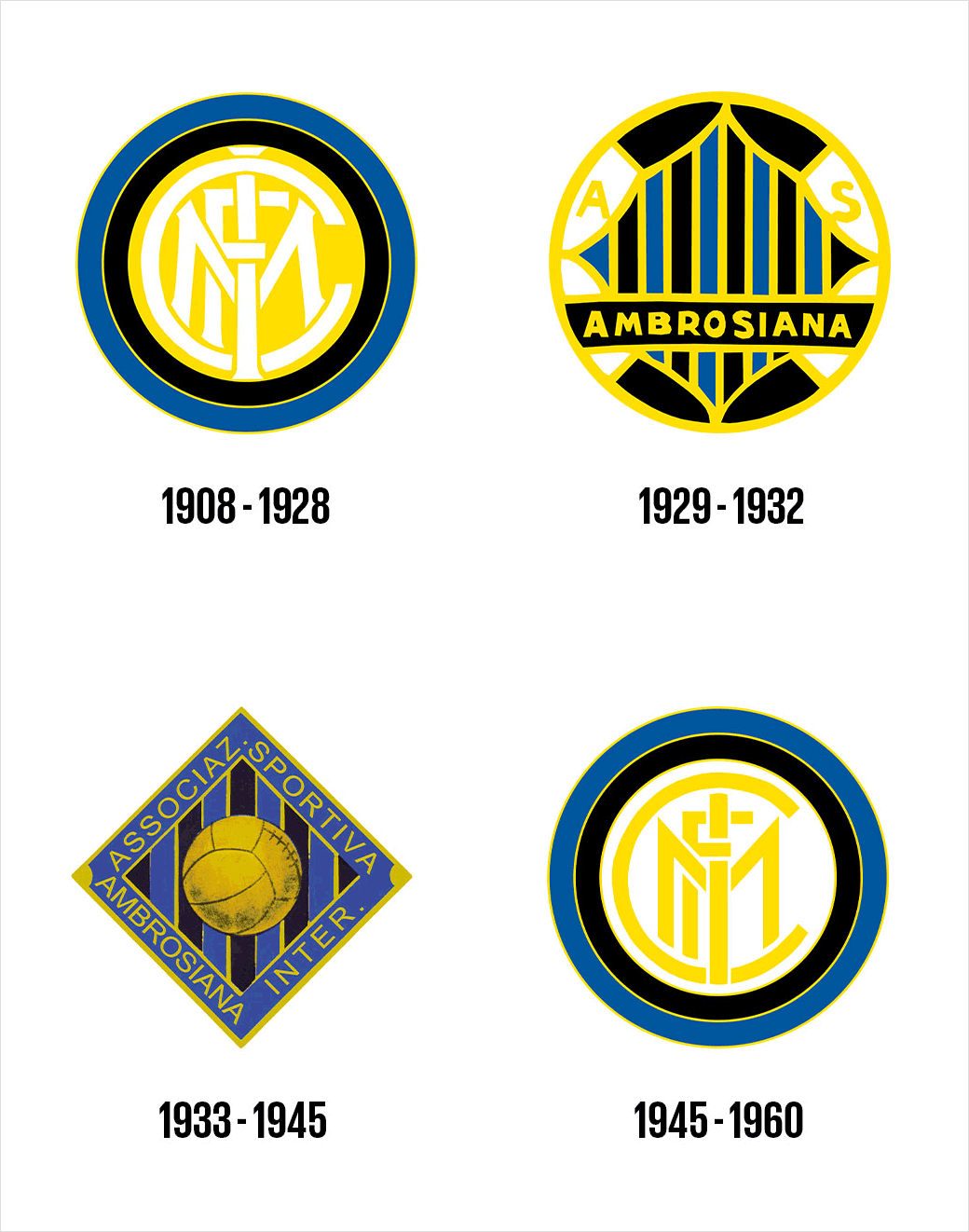
Created by Munich-based graphic design studio Bureau Borsche, the refreshed logo harks back to the Serie A side’s original badge, which was designed by illustrator Giorgio Muggiani, one of the founders of the club, back in 1908.
While the new crest features the letters I and M – in the form of a monogram framed by concentric circles – the letters FC have been dropped, in order to make the design more “streamlined”.
Other details include a brighter shade of blue and the combination of two fonts for the typography, namely, Giorgio Bold for the logo and Univers Roman 55 for all of the secondary text elements.
The story of the club’s new badge and visual identity is then told through a collection of photographs accompanying the expression I M, read as “I am”, which plays on the initials of the club’s name – Internazionale Milano.
“Inter has moved to revamp its visual identity to open up to an audience that is increasingly digital and sensitive to aesthetics, to reach global targets and different age groups, and establish itself as an icon of culture as well as sport,” says the Milanese club.
Adding “The aim is to make the Inter brand relevant and recognisable beyond its fanbase and to allow a younger and international audience to identify with the values of inclusion, style and innovation that have characterised Inter since its foundation.”
The current logo will be used on the Inter jerseys until the end of the season, before being replaced when new lines are launched for the start of next season.


Source: Inter Milan


