Burger King Launches New Logo and Branding
Global fast food giant Burger King has unveiled an all-new visual design that marks the first complete rebrand for the company in over two decades.
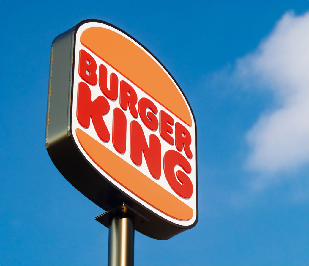
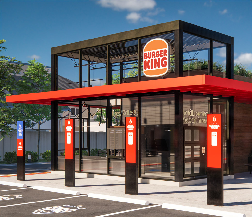
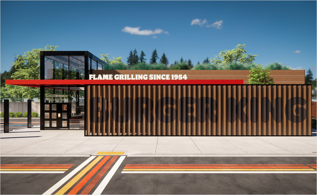
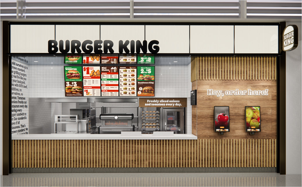
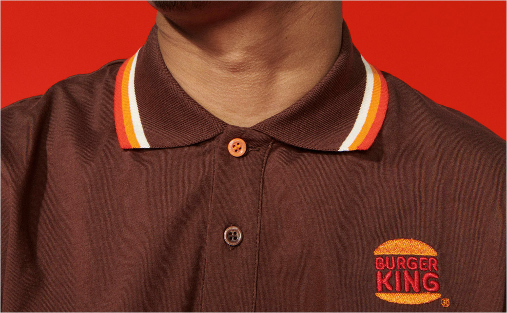
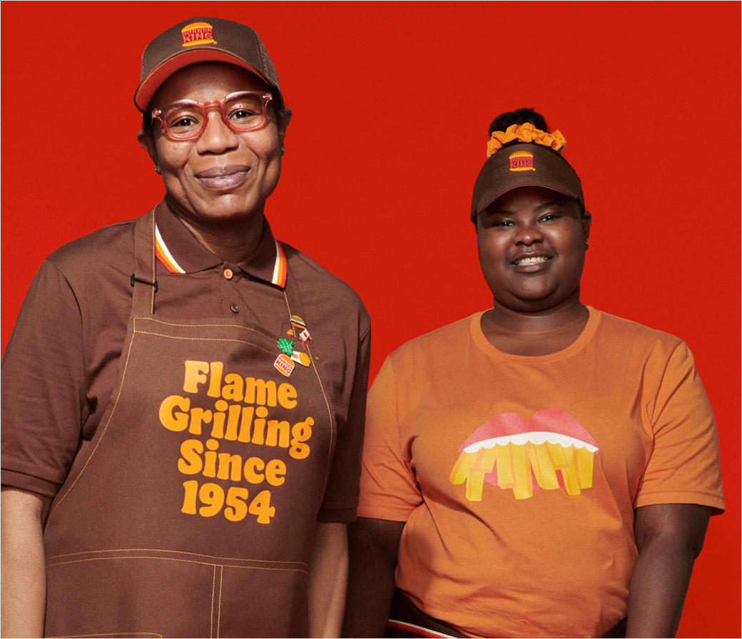
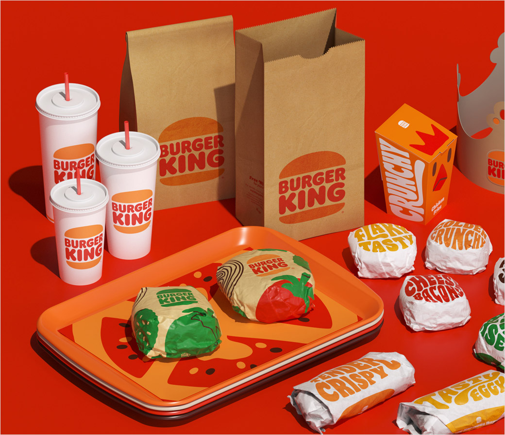
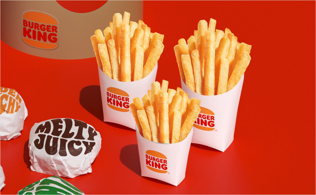
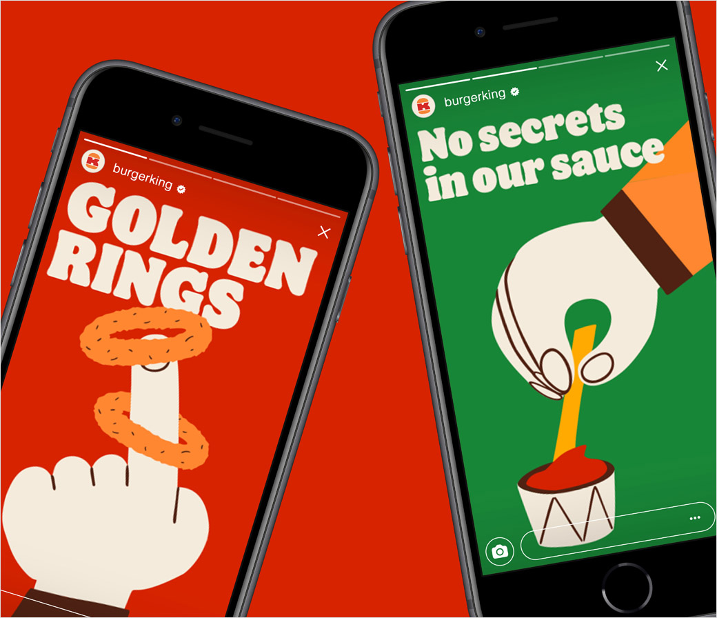
Starting from this month, the famous American brand will be rolling out a new logo, packaging, restaurant merchandise, menu boards, uniforms, restaurant signage and décor, as well as social media and digital marketing assets.
Claimed to “more authentically represent Burger King values”, the refreshed identity is further described as having a “digital-first expression” and comes on the back of recent so-called “improvements” to taste and food quality, for example, through the removal of colours, flavours, and preservatives from artificial sources from menu items.
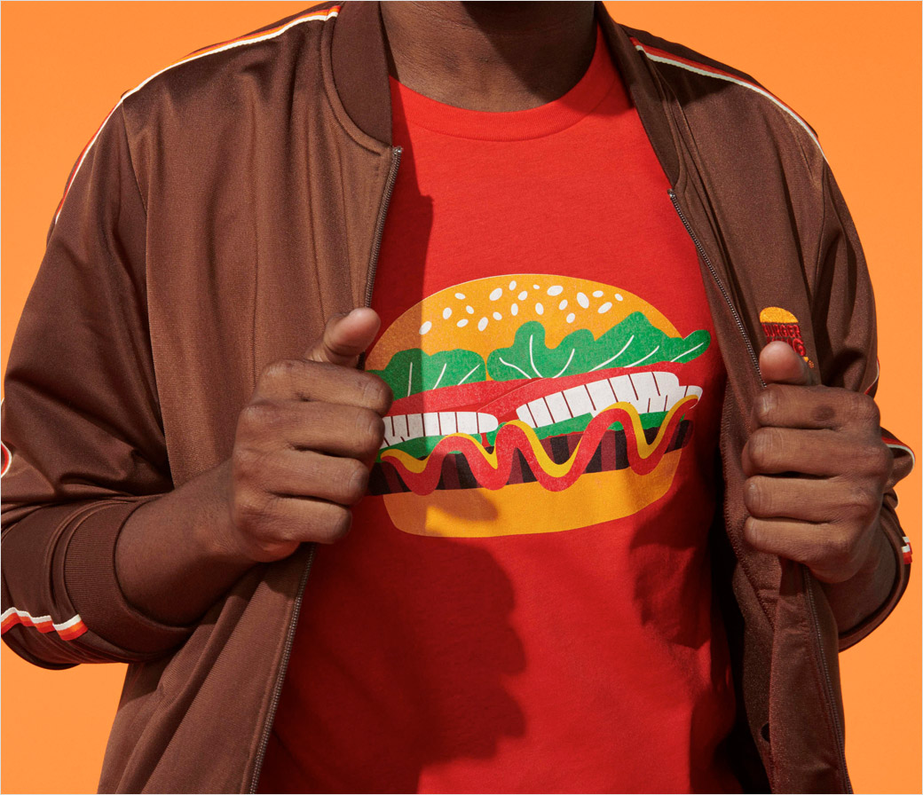
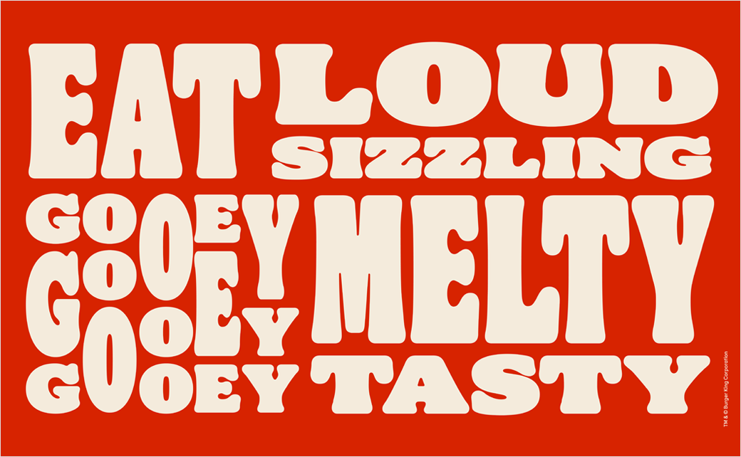
Key design details include a more minimalist-looking logo, colours reportedly inspired by the Burger King flame grilling process, a bespoke font dubbed “Flame”, and packaging that combines strong colours with playful illustrations of ingredients.
“Burger King strives to ensure guests feel good about its food, and this is reflected throughout the visual design, restaurant design and across the entire digital experience,” says the company. “The result is a new look that indicates confidence in the future, while remaining true heritage and what guests love about BK.”
According to Raphael Abreu, head of design for Burger King parent Restaurant Brands International, the new look is rooted in four specific brand tenets, namely, “Mouthwatering”, “Big & Bold”, “Playfully Irreverent”, and “Proudly True”.
“Design is one of the most essential tools we have for communicating who we are and what we value, and it plays a vital role in creating desire for our food and maximising guests’ experience,” he explains. “We wanted to use design to get people to crave our food; its flame-grilling perfection and above all, its taste.”


Source: Burger King


