Louisville City FC Drops New Logo Following Fan Backlash
Louisville City Football Club has dropped its new logo just days days after the design was revealed to the public.
Club president Brad Estes said the new logo had “failed” supporters of the two-time USL championship team.
“We had the best intentions, but we lost sight of our responsibility to engage you in the process,” Estes announced in a statement published on the team’s official website. “We make no excuses; we simply commit to making it right.”
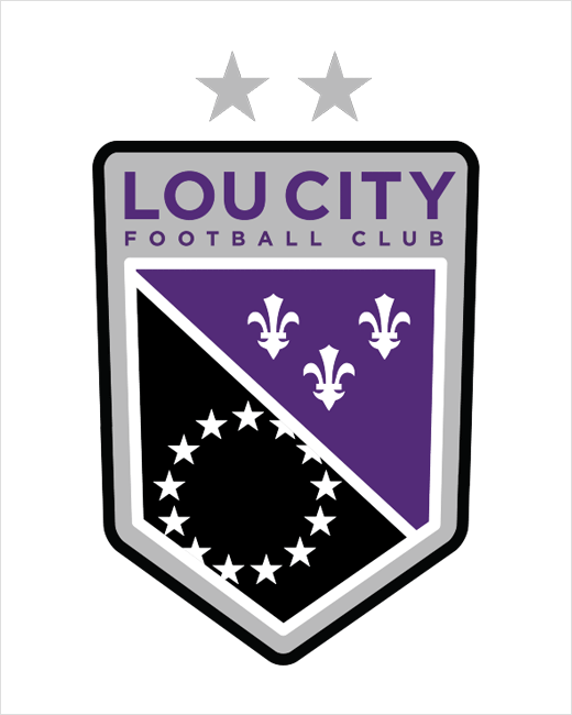
The new purple and black crest was created by local marketing firm Doe-Anderson, and was reportedly the outcome of “hundreds of possible designs”.
Its five-sided profile was meant to reference the five bridges that cross the Ohio River, while the fleur-de-lis and white stars sitting in the middle were inspired by Louisville’s city flag. It also ditched “Louisville City FC” in favour of the team’s nickname “Lou City”.
The club has subsequently ceased production of all its merchandise featuring the new crest and further says that it has “opened dialogue” with supporters for a redesign.
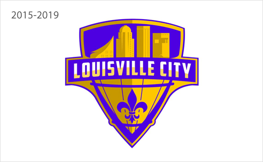
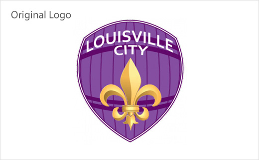
This marks the second time the club has run afoul of fan outrage over the design of its logo. Having only been founded in 2014, the team’s original crest was abandoned in less than a week following an outcry from supporters. A design contest was then held to select an all-new badge.


Source: Louisville City FC


