Chicago Fire Rebrands with New logo and Identity
Chicago Fire has revealed its new primary logo and brand identity as the American soccer club readies for its 2020 move to a new stadium, namely, Soldier Field.
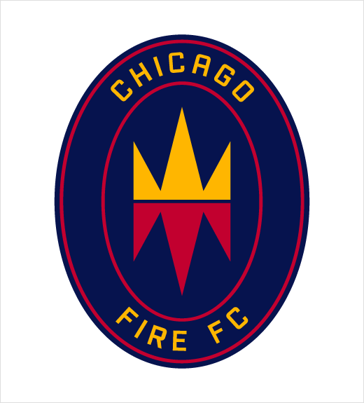
As part of the new identity, the team will now be formally known as Chicago Fire Football Club, with Chicago Fire FC serving as the Club moniker on first reference and on the badge itself.
“As a Chicagoan, it was important to me that our new brand identity reflect the power of our city’s origin,” says Chicago Fire FC owner Joe Mansueto. “I’ve always loved the Chicago Fire name. I think of the people who rolled up their sleeves and committed to rebuild what would become a world-class city, one that my family and I love so much. The new badge including the Fire Crown represents that spirit.”
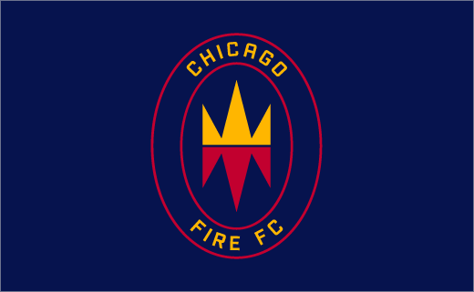
The new badge is built around an icon that is claimed to reflect the origin story of modern Chicago
“The mirrored icon – with flames inverted to become a crown, hence the Fire Crown – tells the story of a dramatic rebirth and a city’s triumph,” says the club.
The logo references the Great Fire of 1871, which devastated downtown Chicago, leaving up to a third of the city’s population homeless as a result. An effort to then construct a new, urban centre came to be known as the “Great Rebuilding”.
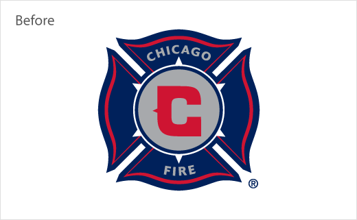
The badge’s oval shape, meanwhile, is claimed to be the first of its kind in Major League Soccer (MLS). Versions of the team’s primary colours – red and blue – remain in the visual identity, while grey has been replaced by gold. The club has also added secondary colours of ivory and “flag blue”, a nod to the city’s flag, that will be seen in future brand elements and kit designs.
“The Club’s pillars – Be Chicago. Be Football. Be a Club. – are fused into the new badge,” comments Chicago Fire FC president and general manager, Nelson Rodríguez. “We appreciate all the fans, partners and staff who contributed to helping us evolve the identity of the Club.”
The branding exercise, which lasted over 18 months, is said to have included consultation, focus groups and surveys with fans, partners, staff and the MLS. Upon completion of the research, the badge, secondary marks and a new typeface were designed by creative agency Doubleday & Cartwright.

Source: Chicago Fire FC


