PB Creative Refreshes Logo and Packaging for Foamburst
London-based design agency PB Creative has refreshed the brand and packaging identity for Imperial Leather’s Foamburst shower gel.
The latter first arrived on the market a little over two decades ago, with the most recent redesign in 2013.
In an effort to set it apart from regular body-wash brands, Imperial Leather recently decided to push forward with an all-new identity.
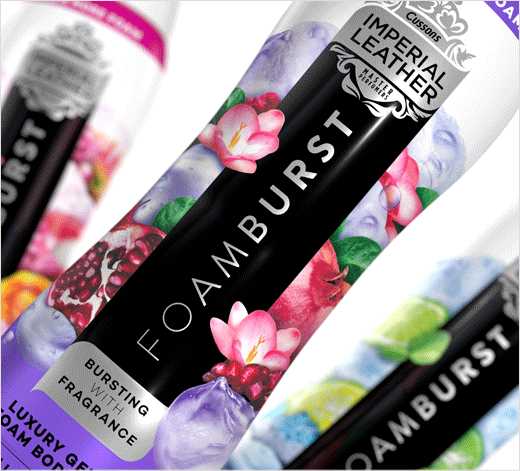
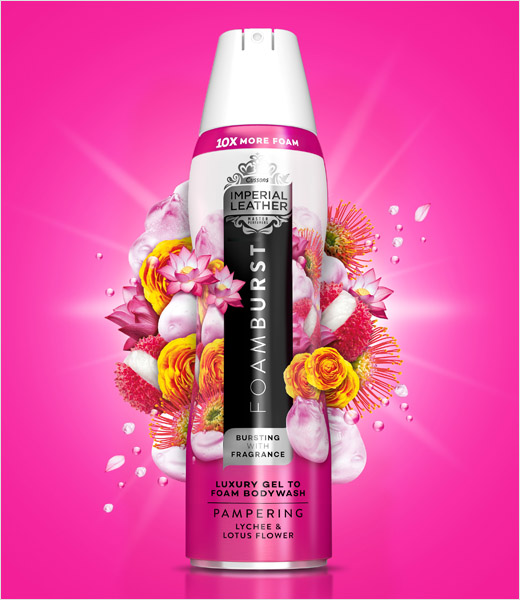
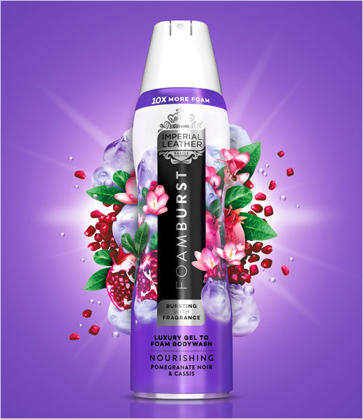
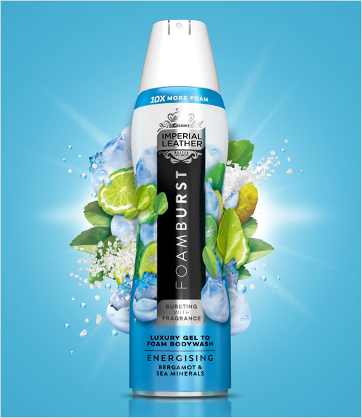
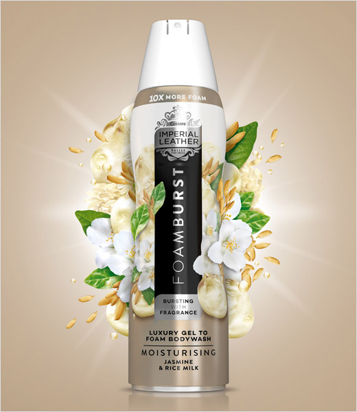
“Central to PB Creative’s strategic approach was to communicate Foamburst’s fragrance and transformative nature on pack. Unlike many of its foaming competitors, only a small amount of gel is decanted from canister to hand, before it develops into a luxurious, abundant lather like no other,” explain the designers. “To communicate this magical transition, the background colour of each canister graduates from rich at the base, representing the gel, to shimmering white at the top, depicting the foam.”
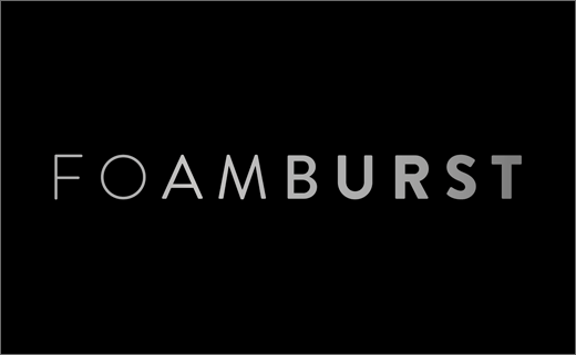
The Foamburst wordmark, sitting on a vertical black panel, also transitions from light to bold, further “amplifying the transformational messaging”.
Additional design details include the use of bold colours that are said to represent the scent in each variant; these are then accompanied by images of the various fruits, flowers and herbs used to create each scent.
Using metallics and changing Imperial Leather’s famous red flag to silver for the first time also gives Foamburst a more premium look, according to the designers.
“Foamburst is all about fragrant ingredients and a sense of abundance and luxury, but this had become a lost on the more regressive black canister that preceded our rebrand. Our approach has created strong, premium brand-blocking on shelf in a way that complements the expressive and vibrant product proposition,” says Pete Hayes, managing partner at PB Creative.
PB Creative
www.pb-creative.com


