Pure Leaf Tea Gets Brand Refresh by PB Creative
Pure Leaf has relaunched its premium teas in the UK and Netherlands, with a global brand and packaging redesign by London agency PB Creative.
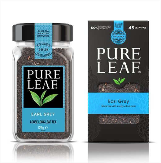
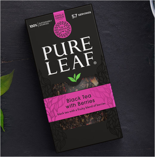
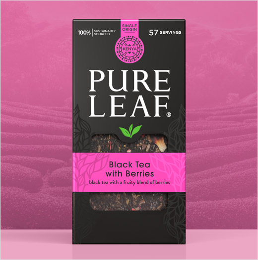
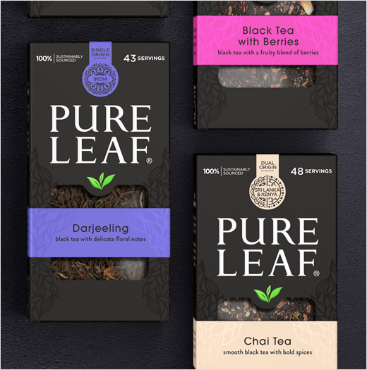
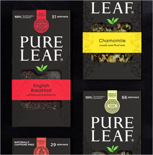
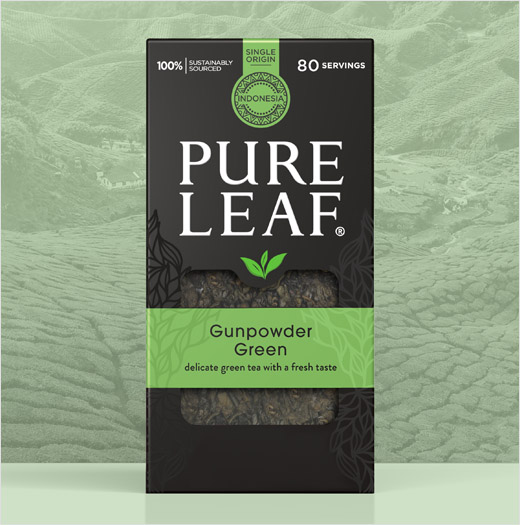
As well as shifting Pure Leaf from plastic jars to a more sustainable carton format, the design consultancy has also reverted to a black colour scheme across all of the brand’s various blends for “a sense of luxury and taste appeal”.
“Strategically it was imperative to create shelf stand-out and set Pure Leaf apart from its largely kaleidoscopic competitors. So PB Creative capitalised on the original core brand colour – black – which had taken a back seat to variant shades in previous design iterations,” explain the designers. “This approach instantly unified and premiumised the range and created the opportunity for dramatic brand blocking.”
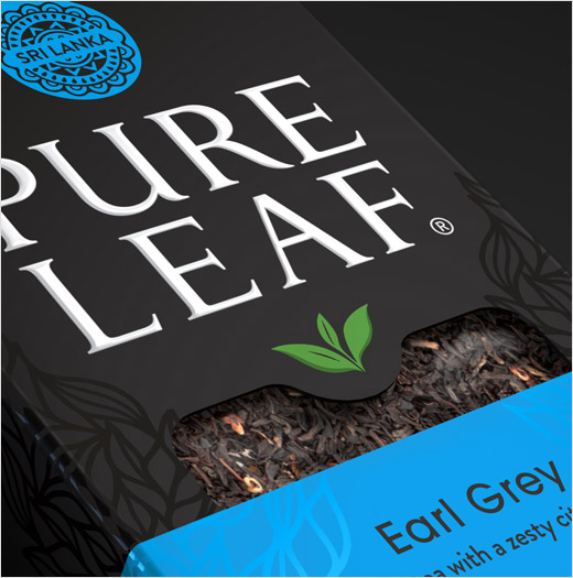
The agency has also used spot-varnish finishes and embossing to further denote tea type and give a more tactile look and feel to the pack. And to further highlight the origin of each variant, unique box tags have been included that feature patterns inspired by each tea’s source.
“Building on the story of provenance and everyday premium quality was key to this brand redesign. Pure Leaf wanted to celebrate its story and the amazing quality of its products, which proved fundamental to our new look. We set out to achieve greater brand clarity and stand-out, and the results have an elegant, high-end look and feel,” says PB Creative’s creative director, Lloyd Moffat.
PB Creative
www.pb-creative.com


