Mr B & Friends Gives Bristol City FC a Makeover
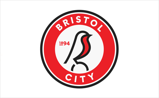
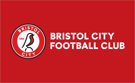
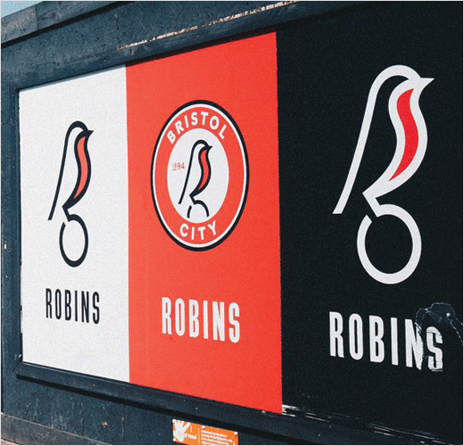
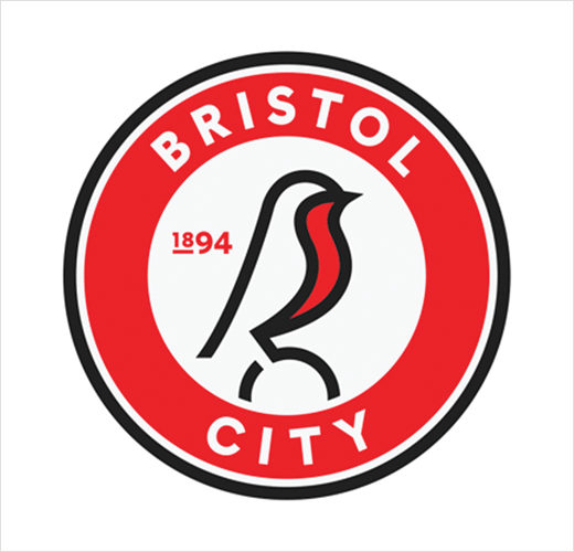
Branding agency Mr B & Friends has designed the new logo and identity for Bristol City FC.
Following its successful rebrand of Bristol Bears rugby team in 2018, the agency was asked by Bristol Sport, the company that owns the Championship football side, to carry out the latest refresh.
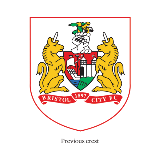
The club’s former crest was derived from Bristol’s coat of arms – which has always belonged to the city of Bristol and not Bristol City Football Club.
To begin solving the club’s identity – or lack of one – the agency says it started off by conducting a series of interviews, including with key members of the club, namely, CEO Mark Ashton, vice-chairman Jon Lansdown and head coach, Lee Johnson.
That was followed up with two separate large-scale supporter surveys that went out to all season ticket holders and club members, as well as a focus group.
“Two insights emerged that led the development of the identity; the robin was well-loved and people were keen to see it make a return and fans were looking for a more modern take on the crest,” explain the designers.
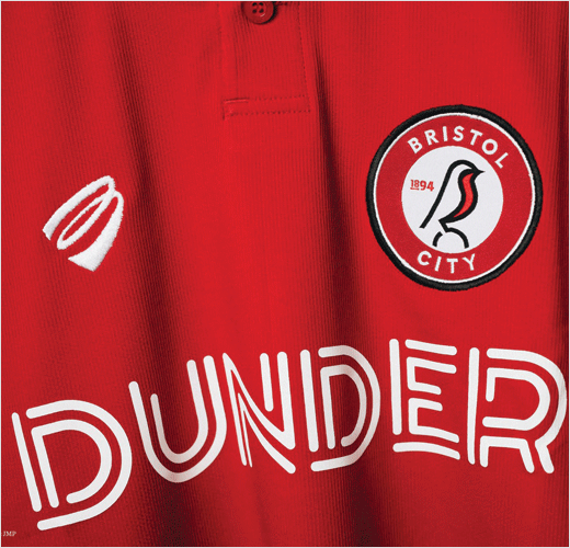
“The graphic style emerged after exploring a range of routes with the client – from heritage to modern. Clean lines and a contemporary rounded font are offset by slightly softened secondary colours while the existing red remains loud and proud,” they add.
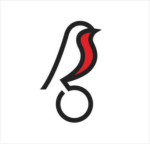
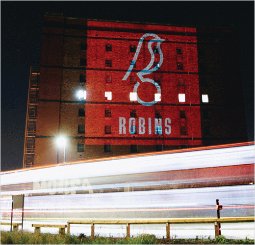
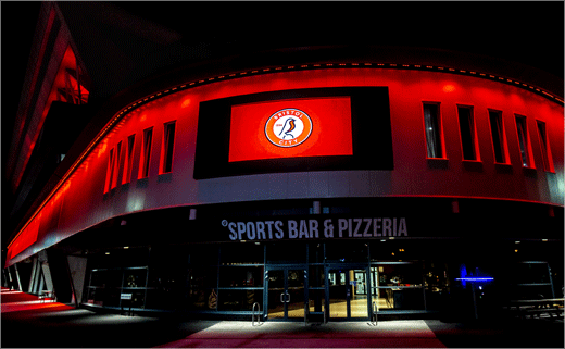
The robin itself is designed to work on its own or as part of the crest where it is positioned atop a football.
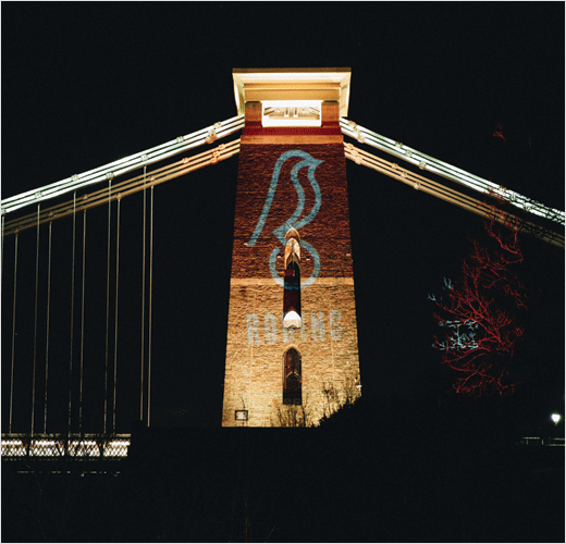
Other key assets, such as Bristol’s famed suspension bridge, also form part of the supporting identity collateral.
Mr B & Friends
www.mrbandfriends.co.uk


