Here Design Creates New Identity for the Royal National Orthopaedic Hospital Charity
The Royal National Orthopaedic Hospital (RNOH) Charity has revealed an all-new identity created by Here Design.
The charity is responsible for the fundraising and administration of donations that go towards improving the hospital’s facilities and patient care.
Here Design says the strength of the charity’s identity had become diluted over time as a result of the different mediums through which they communicated, with a mix of different logos and brand expressions in circulation.
The agency was subsequently asked to create a modern, simple identity that would encapsulate the organisation’s history and which, at the same time, could be easily used on a range of marketing materials without diluting the RNOH brand.
“The RNOH Charity provides outstanding support to a world-leading medical site and its invaluable specialist staff,” says Caz Hildebrand, creative partner at Here Design. “To continue this level of support, the charity needed a powerful, contemporary and highly-flexible identity to connect with a modern audience.”
The new identity revolves around the human body, with Here Design introducing a theme of connectivity through the creation of graphics and patterns that focus on support and physical connections.
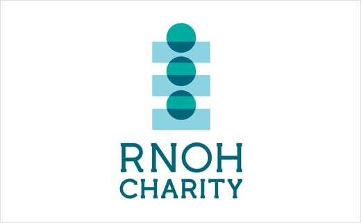
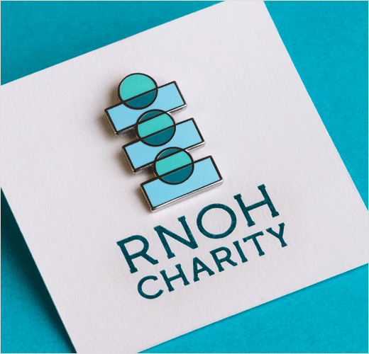
As the ‘backbone’ of the RNOH, the core icon is therefore a graphic representation of the spine, made up of flexible shapes that can be repositioned for a wide range of applications, from digital apps to apparel.
For example, the designers say the graphic shapes can be reconfigured to act as visual metaphors, such as vertebrae down the back of a t-shirt or coins falling into a fundraising pot.
Here Design also worked with RNOH staff to design a patient welcome pack that includes useful items such an eye mask and ear plugs, as well as an information booklet on how to use the TV and radio.
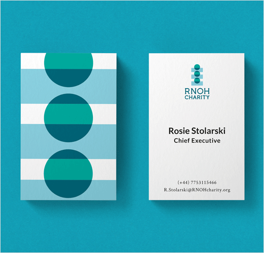
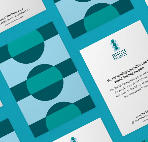
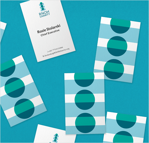
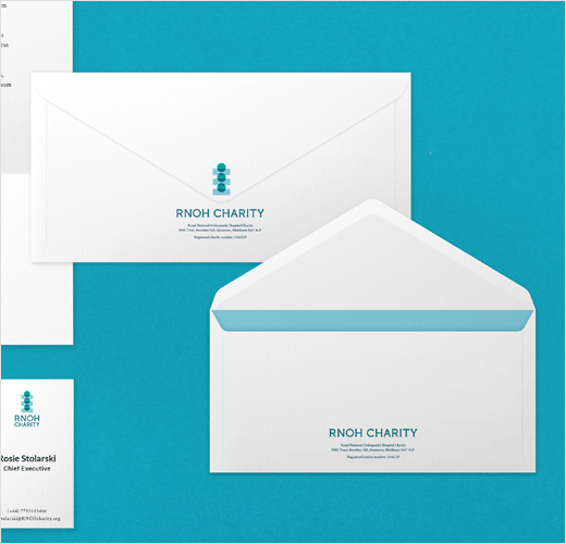
The flexibility of the brand assets also sees secondary shapes scaled and repeated to create patterns used across fundraising packs, apparel, notebooks available in the hospital gift shop, the RNOH website and corporate materials.
Currently in development is a digital app for patients, providing an educational platform including games for children, and wayfinding and procedural information.
“Hospital can be an overwhelming place and small design touches can have a large impact on a patient’s stay. It can make the experience more human and reassure people in times of need, whether that’s through cheerful, positive assets, the uplifting copy in an ad campaign or simply offering a cosy pair of socks and clear, easy-to-read information about the hospital when they arrive,” explains Josh Williams, lead designer at Here Design.
Here Design
www.heredesign.co.uk


