Zara Reveals New Logo Design by Baron & Baron
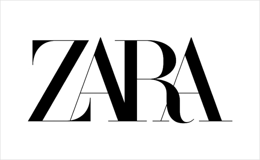
French branding consultancy Baron & Baron has created the new logo design for Spanish fashion label, Zara.
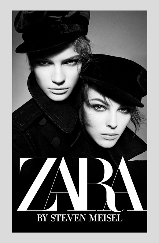
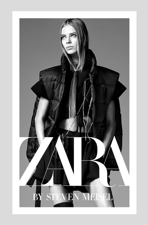
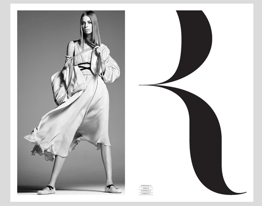
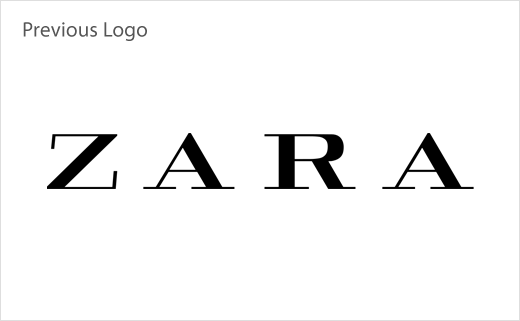
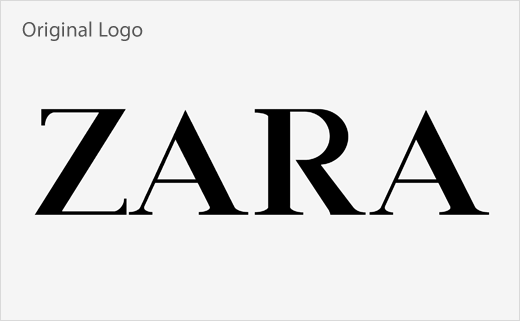
An evolution of sorts of the company’s old logo in that it remains an all-caps serifed typeface, the revised wordmark nevertheless incorporates condensed, overlapping lettering as well as more vertical proportioning than the previous design.
In point of fact, the new logo – along with its typographic styling – appears to be virtually identical to that seen in an advertising campaign designed by Baron & Baron for Zara back in 2017.
At the time, the designers said the logo and accompanying visual imagery, all of which can be seen pictured below, blended “elegance with edge” and, further, that it added “an artful new elevation” to Zara’s branding.
Founded and headed by namesake Fabien Baron almost thirty years ago, Baron & Baron has a history of working with luxury fashion brands, having previously created a mix of television, digital and print campaigns for the likes of Calvin Klein, Givenchy, Fendi, Burberry, and Michael Kors, to name just a few.
Baron & Baron
www.baron-baron.com


