Ice Cream Brand Yorica! Given New Look by Brandon
Design consultancy Brandon has refreshed the logo and identity for London ‘free-from’ ice-cream parlour, Yorica!
The business, which first opened in 2016 selling ice-creams that are claimed to be free from all 14 major allergens, has recently made the shift from gelateria into the supermarket retail trade.
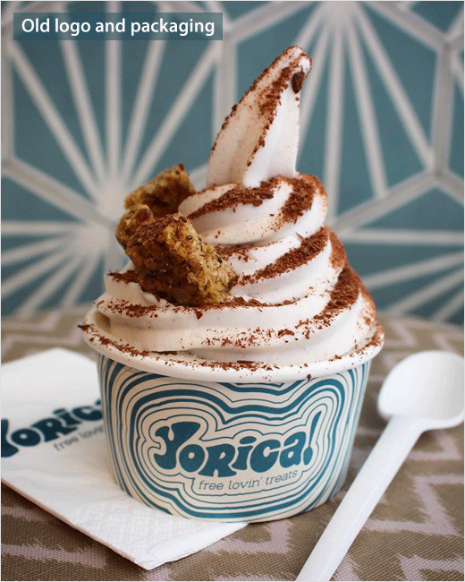
“Yorica! has a very distinctive 1960s-inspired free-spirit identity that has proved hugely successful in its two London parlours, but it was felt that the demands of the supermarket space – including a limited consumer ‘dwell’ time and cluttered competitor shelf – required a brand refresh to ensure it stood out on the shelf,” says Brandon.
The Manchester-based consultancy further says it has merely “amplified” the brand’s existing assets instead of devising a completely new look.
“To maintain brand familiarity and trust – essential in the allergen-free and vegan sectors – Brandon took some of the existing assets and amplified them to create a simple yet iconic brand identity that translates the Yorica! story to the retail trade,” explain the designers.
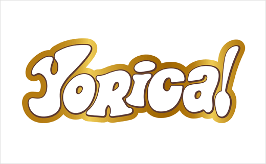
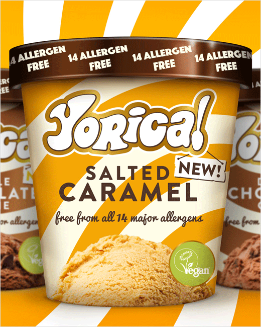
Tweaks include a modernised logotype which now features a gold ‘halo’ as well as a black keyline that it is claimed helps ‘lift’ the brand mark off pack.
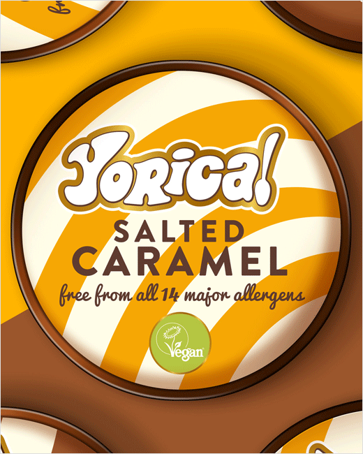
There are also updates to the packaging, for example, the swirls from the original parlour livery have been evolved and made larger, while the colourways now represent the flavour within. Additional details include the adoption of a Vegan Society symbol and a ’14 Allergen Free’ message on the lid.
“Yorica! has a devoted following that love it, and we were extremely careful to respect that. We’ve taken the brand on a journey, while elevating the product for the retail trade, driving stronger premium cues and disrupting with a patter than stands out like a sore thumb,” says Brandon’s managing partner, Richard Taylor.
Brandon
www.brandon-consultants.com


