Best Buy Reveals New Logo and Branding
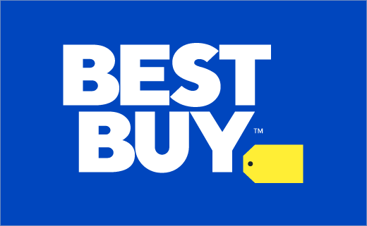
American consumer electronics retailer Best Buy has revealed a refreshed logo design as part of a new branding effort.
“For the first time in almost three decades, we’ve updated our logo. It’s now more modern and easier to read, especially in today’s digital world,” claims company spokesperson, John Vomhof Jr.
“Best Buy” still appears in a bold all-caps font, but now resides outside of the brand’s signature yellow tag. The tag is further described as a “graphic punctuation” and a “visual connection” to the company’s history.
“The updated logo is true to our heritage, but it’s really cleaned up,” explains Whit Alexander, Best Buy’s chief marketing officer . “It’s an evolution toward the future, and we’re really excited about that.”
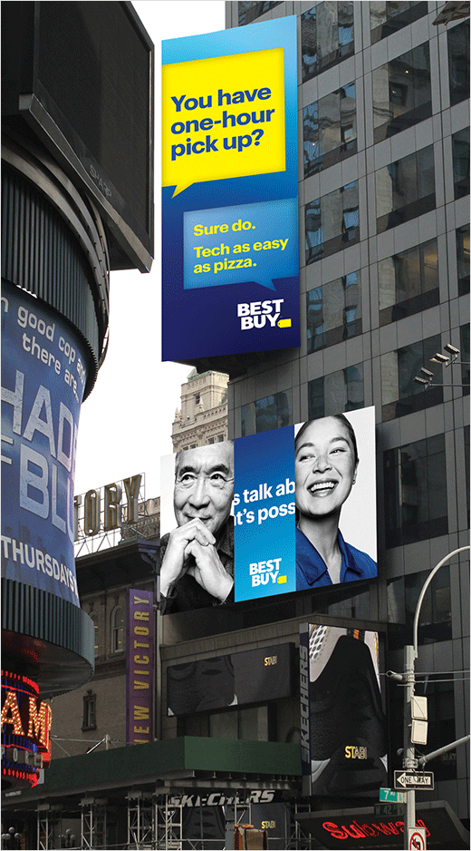
The new logo, which is accompanied by updated colours, photography and “conversational language”, has already appeared on BestBuy.com and in a series of digital ads and TV commercials.
It is now expected to roll out across uniforms, shopping bags and signage over the next few months.
Source: Best Buy


