Yukon Government Unveils New Logo Design
The government of Yukon, which is one of Canada’s three federal territories, has rolled out a new visual identity that includes a refreshed logo design as well as a new website.
Over the past 40 years, Yukon’s government has accumulated a wide array of sub-logos that have collectively been described as being “inconsistent”.
“Nearly all of these will now be replaced by a single logo and collection of graphic elements that reflect Yukoners’ values. The new logo is at once familiar, modern and clear making it easier to identify government services, information and locations,” said an official government spokesperson.
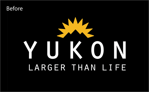
Developed in consultation with the public via a series of focus groups, the new logo design carries over key elements of the old version such as the sun-over-the-mountains brandmark. However, instead of being placed centrally, the symbol is now shifted to the right to sit above the letter “o”.
Additional details include a thicker-set font for the word “Yukon” and the absence of the “Larger than Life” strapline that was an integral part of the previous logo lockup.
Besides the master logo, the new identity includes supporting graphics that are claimed to be based on the “soft waves of the aurora”.
The overall rebrand, including the new website, is said to have cost the government in the region of $500,000.
Source: Yukon Government


