Form Creates New Look for ‘Film and Furniture’ Blog
London-based design and branding agency Form has created a new look for Film and Furniture, an online blog all about furniture and décor from the world of cinema.
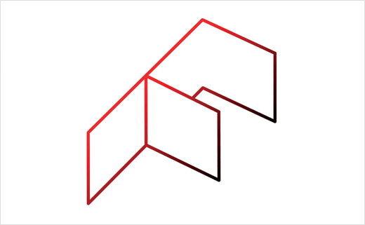
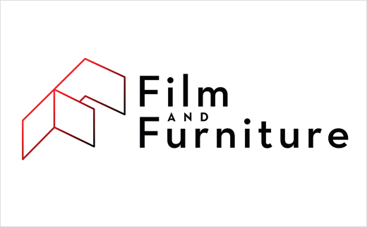
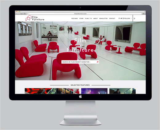
The refresh sees the introduction of a new, three-dimensional ‘F’ logo mark, which subtly communicates the 3D space of a film set and the scenery flats used to create rooms in the movies.
The updated identity also makes use of the brand’s established use of red, originally said to have been a nod to the red Djinn chairs in Kubrick’s ‘2001: A Space Odyssey’.
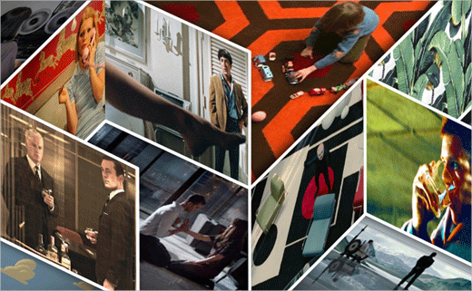
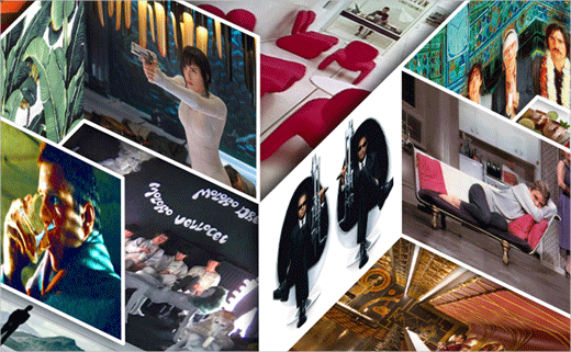
A series of illustrations have additionally been created which incorporate the new 3D ‘F’ logo into a maze of angled film stills for use on marketing materials and social media banners.
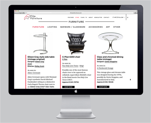
Working together with Paris-based web developers Bleeps and Blops, Form have further redesigned the website to incorporate a new store feature, which enables visitors to identify and buy their favourite pieces from movies old and new.
“A key part of the brief was to help the site become more commercial without loosing any of the passion and ‘fan feel’ it has become known for and to help it stand apart from competitors influenced by the site’s content and success,” explains the website’s founder, Paula Benson.

Form
www.form.uk.com


